This was an inexhaustible source of inspiration, in which he would isolate one figure, frieze or motif for printing on upholstery, furniture, trays, umbrella stands, plates, ashtrays – the list goes on for miles.
Nastassja Haidinger — “Artist”, “collector”, “practical woman”, “trickster”… Annette Messager is a multi-faceted artist who likes giving herself different names according to the work in question.
Annette chose to leave Berck, her native town, to study at the École des Arts Décoratifs in Paris. And yet it was Jean Dubuffet’s art brut that had the greatest influence on her, as well as all forms of popular – and often pooh-poohed – expression : votive offerings, embroidery, crafts, serialized novels. This is what set the stage for her subsequent artistic endeavors. Starting in 1970, Annette began experimenting with whatever she found to hand : colored pencils, scraps of fabric, bits of string, as well as notebooks and magazines – so many different “useless” materials she sought to restore to favor with a wiliness that was to become her trademark.


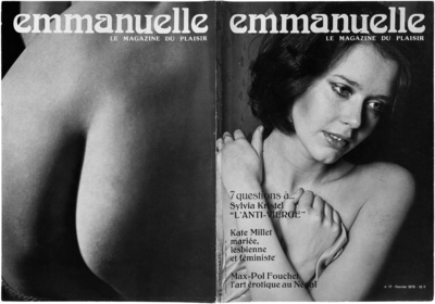
Sylvia Kristel on the cover of Emmanuelle: Le magazine du plaisir, No. 17, February 1976 (photographs by Jean-Pierre Roux). Photograph copyright Fabrice Schneider. Collection Museum of Mistakes, Brussels.
From the get-go, she collected various everyday odds and ends, bits and bobs, thereby becoming “Annette Messager collectionneuse”: cooking recipes, manuals, newspaper clippings, which she assembled in a series of albums. This “chick stuff” was to serve as the inspiration for her “midinette” character, whose obsessions she has showcased in various diary-style albums asserting the value of these purely feminine, and generally ignored or disparaged, domains. This is one way of making art, seeking one’s place as a woman and artist, by focusing on the intimate. Her collections look like “women’s works”, as she puts it herself, but go beyond that. For even if they tend to reproduce fragments of the real world, they nonetheless warn us against trusting appearances. She presents cliches, proverbs, snapshots of trivialities and news in brief, a reality popularized by the press and advertising, notably in Les tortures volontaires (Voluntary Tortures, 1972): an assemblage of advertising photographs extolling the remedies to which women are willing to subject themselves in order to attain conventional beauty.
Annette avails herself of a set of cliches ascribed to women in the 1960s, exploring their domestic lives, love lives, sex lives. She showcases women’s bodies with the help of touched-up photographs or pokes fun at the fantasies of starry-eyed girls. In 1975, Thierry Rupert, a journalist friend of hers, wrote an article for the men’s magazine Emmanuelle, which ran from 1974 to 1976, whose risqué stories were to interact playfully with certain works by Annette, such as Les approches (The Approaches, 1972), in which the artist secretly photographed the flies on the pants of men who were perfect strangers to her. Annette stuck a tongue-in-cheek business card “découvrez la truqueuse collectionneuse femme pratique page…”, (discover the tricky collector practical woman on page…) on the cover of an issue of the magazine (No. 4, January 1975) showing a woman’s buttocks, and sent it to the journalist.
This mix of playfulness and deviousness was already manifest in the layout of her own apartment, which was divided into two distinct areas : while the dining room served as a studio, reserved for the artistic work of “Annette Messager artiste” (objects to be worked on, such as Les pensionnaires [The Boarders, 1971–1972], a flock of birds made or stuffed and exhibited in a glass case), her bedroom was used for her collecting activities : writing, clipping, pasting, sorting, assembling. A double personality, which further fragmented in the sequel (from 1974, she became a truqueuse [trickster], femme pratique [practical woman] and bricoleuse [tinkerer] as well), analogous to the condition of women in general, who must tackle multiple roles simultaneously. It was in her home that Annette first exhibited her collections, her “chamber works”. But she still had to find a way to reach the public, to create a network for herself.
At that time, her woman artist character and her first collections with possessive titles were “ambiguous” and “scarcely admitted into the art world”, as she later recounted. “I didn’t know anyone, but we had some addresses from Flash Art.” When she began sending out letters, making the envelopes herself and enclosing items from her albums or homemade business cards, it was above all as a means of distributing her work. “It was a way of introducing people to my work, almost anonymously, without telephoning them.” A shy newcomer to the art scene, Annette preferred simple and yet enigmatic messages, as on her business cards stating her name and various identities. The magazines she enclosed in the parcels were for the most part “strange” ones, such as Détective, which recounted sordid crime stories, and from which she cut out photographs, a method she used notably in the album Ma vie illustrée (1973). Into this magazine she inserted the card that says “l’hebdomadaire détective vous est offert par Annette Messager collectionneuse” (this detective magazine is a gift from collector Annette Messager). Worlds apart from periodicals like Art Press and L’Art vivant that people in the scene were accustomed to reading, these mailed magazines suggested that there was a different way of making art. Annette’s multifarious mailings, accompanied by her various cards, were thus a means of putting Messager’s message across – subtly and effectively, as in her artworks.
Serge Lemoine, Christine Poullain
Annette Messager: comédie tragédie 1971–1989, Grenoble, Musée de Grenoble, 1989
Garance Chabert — The young artist who on the front of her visiting card places a picture of herself with her back turned knows full well that she is thus making a point about the utility – or futility – of showing a recognizable approximation of one’s face in order to make a name for oneself. In any case, the back of the card provides information and context ; but what’s in a name, or a status? Not enough, which is why she has decided to sign her work in lower case letters, augmenting it with a quasi-archival label: documentation céline duval. A visiting card featuring the photograph of the owner with her back turned, because she refuses to associate name and face, is the first step toward conscious withdrawal.
Or else it’s a sign of modesty ! Yet in its apparent banality the photograph in question is more complex than would appear.
First of all, it is neither retrieved nor anonymous, though the viewer has no way of knowing that. When you’ve been photographed by Pierre Leguillon, you may as well own up to it ! Even for as discreet a soul as Céline Duval, the photographed photographer is at least as iconic a theme as the Biter being bitten (and this is the case of young Céline Duval in the historical veracity of her role as photographic subject, a role she has since given up), even more so if the person photographing you behind your back as it were is the person you live with and someone whose centers of interest closely mirror yours. This visiting card is therefore the result of an initial exchange since Céline Duval created the image for Pierre Leguillon’s visiting card. The movie lover mentions shot/countershot while the girl looks through the family album ; she thinks it’s the parallel portrait of a couple. As Céline Duval and Pierre Leguillon soberly and simultaneously expressed it, it is a “private correspondence made more or less public, to coincide with the moment when we were defining the artistic parameters of our photographic investigations.”
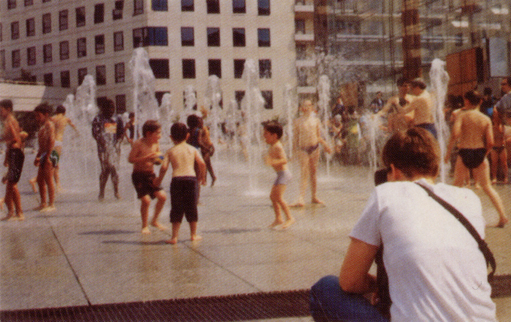

Secondly, the body of the artist is not front and center ; wide framing pushes it to the right while focusing on the background : a playground in the fountains of the Parc André Citroën, so eminently recognizable through its architecture and greenhouse pavilions, well-known and beloved by Parisians of the left bank. Let us also mention that off-camera is a hot-air balloon worthy of Nadar – lover of aerial photography under the patronage of whom Pierre Leguillon places himself in his mirroring visiting card : synchronicity on such a level can in no way be accidental !
However, to get back to the heart of the image, here is the portrait of the artist before a rather typical scene since paid vacations elevated amateur photography to the rank of art by practitioners of postwar humanist photography : the person on the receiving end of this card must have known that with the young woman seen in flagrante delicto of hyper-referential scopohilia, pictures would be the thing. And that person would have been correct ! Though she appears photographed unwittingly, she is conscious enough to use the resultant image on a visiting card ; not to mention that the picture most certainly served as an indicator of work to come from young Céline Duval.
When considered in the teleological light of the history of photography, that image summarizes in and of itself themes beloved by photography lovers, themes on which documentation céline duval has chosen to focus. What could be more photogenic and photographed than the joyous screams of children, or people relaxing and having fun swimming and splashing in a swimming pool ? The work of documentation céline duval regularly features children learning to swim, and would-be fashion models working out or just hanging out doing nothing, looking playful or lazy or fashionista sexy, and whose individual stories and paths are crisscrossing routes in which one sees recurring illustrations of self, of family, and of life’s small pleasures. They come from the plethoric collection of photographs both anonymous and not, that she juxtaposes in curated sequences. Thus the diffidence the artist flaunts on her visiting card is programmatic in every sense of the term. “For most of history, Anonymous was a woman,” Virgina Woolf wrote. This sentence was also quoted by Pierre Leguillon at the end of a beautiful text about Céline Duval. Yesterday and today too, I could not have said it better myself.
Rebecca Topakian — Mattresses, model airplanes, prostitutes and the Mississippi River: a list of words, common nouns, objects, places, types of people, all thrown together in no logical or alphabetical order, with no classification or narration, a list that looks at once peremptory and wide open to the play of possibilities. Twenty-five words carefully chosen by the artist, and yet they do seem borderline random. Every fan of Alec Soth’s work can, with no little amusement, spot references among the enumerated items to some of his most illustrious photographs. The half-submerged mattress in Sleeping by the Mississippi, the woman in a swimsuit lying on a bed, or that man in the snow holding a model airplane in each hand. Then again, come to think of it, there’s also that mattress on a veranda, the one in the middle of an old room and the one in a hotel. These words describe not only some specific photographs, however, but Soth’s whole imagination, inhabited by obsessions, images, hints of a visual and poetic world that recur in his work over time and over the course of his photographic series.


His occupation, which his business card is supposed to convey, is summed up in the words “Photography/Wandering”. A business card is supposed to serve commercial purposes, to consolidate a brand image and to sell its holder, but Soth prefers to proclaim he belongs to the world of artists, choosing to distance himself from professional photography by adding a twist to the keyword used by the image industry. His life and work are one, wandering and photographing are fused. Without any ranking of preference, the subjects of his pictures, like the objects of everyday life, follow one after another in this list of “things” seen or to be seen, unique or recurring, left there at the disposal of the card’s recipient like tasks, word-points of unstable contours whose infinite field lines impressionistically define Soth’s space, the symbolic geography of his wanderings. His card was made in 2003, a year before he joined Magnum, an agency better known for its photojournalists, and it asserts his desire to take a lyrical approach to looking at the world. Swimming against a journalistic tide on which “storytelling” reigns supreme, Alec Soth embraces the anti-narrativity of the photographic image. Frozen in time and (en)closed, eminently enigmatic, an image cannot tell a story and should rather confine itself to what is at once its strength and its weakness : its suggestive power. The wandering artist gathers objects and images as he passes, reconstructing a symbolic world in a photographic series or book or in a picture hanging on a wall. This card asserts that the artist’s identity is not above all his name or function, but the sum of what he does and discovers. Over and against the narcissism of the auteur photographer, it is prostitutes, sheep, border collies, model airplanes and wandering that make Alec Soth who he is.
Alec Soth — At the time I made this card, Sleeping by the Mississippi wasn’t published and my pictures were completely unknown outside of Minnesota. When I made the card, I was playing off some of the images I made during that project, but also off of other things in my life. For example, I had a border collie at the time. I also had a full-time job at an art museum and liked to photograph the museum guards.
Rebecca Topakian — Those items refer also to recurrent obsessions of yours. You photographed several mattresses and model airplanes in different stories. Would you consider that your wandering activity consists in looking for things that obsess you and that you seek in every project ?
Alec Soth — There definitely are recurring themes. It is hard to avoid. But now when I see a mattress I run the other way! It has become a personal cliche. And sedans have become a more generalized cliche in photography. But I still love many of the items on the list.
Rebecca Topakian — I read once you consider your work as more poetic than documentary. Do you think your wandering is a way to build and give shape to your already existing imagination?
Alec Soth — Absolutely. The reason I made this card was to proclaim (at least for myself) that I was a lyrical photographer rather than a photojournalist. It is worth noting that just a few years later I received my first business card from Magnum Photos. That card gives off a very different feeling.
I was not familiar with the term “branding” when I made this card, and I sort of hate the word now, but it is useful. Business cards are fundamentally an act of branding. They are created as a way to establish your presence in someone else’s mind. I have always been uncomfortable with the limitations of branding. Early in my career I did a series of portraits of sheep and was becoming known for this in Minnesota. I was worried that I was going to become “the sheep guy” ! I didn’t want that brand. I wanted people to have a less fixed idea of me and my work. I still battle this perception today. This is in some ways why I created Little Brown Mushroom. It is a brand that lets me work without boundaries.
Pierre Leguillon — Piero Fornasetti turned twenty in 1933, the year Adolf Loos died, the avowed enemy of decoration, who wanted the following words engraved on his tomb: “Adolf Loos, der die Menschheit von unnützer Arbeit befreite” (Adolf Loos, who freed mankind from superfluous work). Fornasetti would clearly have sided more with the French novelist Pierre Loti, who noted in his diary on August 27, 1910, in Istanbul: “Nothing is urgent but the decor. Learn that one can always do without what is necessary and conventional.”
Fornasetti spent his life covering the world of objects with motifs and images, in what sometimes became dizzying decors. None of these motifs was chosen randomly ; each bore within itself a slice of history.


So over the years Fornasetti built up a huge image bank for his own use : a collection of playing cards, books, prints, pages from magazines, which he ceaselessly hoarded in his live-in studio on via Bazzini in Milan. All these fragments, exhibited or reprinted, were spread around the world again from the interface of his via Brera gallery in the 1970s.
Someday someone should draw up an inventory of the various analog 20th-century visual encyclopedias that prefigured the advent of Google Images, each compiled with different intentions according to the various affinities of these early modern pack rats. Aby Warburg’s famous Mnemosyne Atlas was only one such pictorial treasure trove : others included Jules Maciet’s donation to the Paris Musée des Arts Décoratifs, the New York Public Library Picture Collection, designer Mariano Fortuny’s collections in Venice, the pictures covering the walls of Spanish writer Ramón Gómez de la Serna’s apartments in Madrid and Buenos Aires, and the thousands of slides amassed by American designers Charles and Ray Eames or New York painter Ad Reinhardt.

Piero Fornasetti, Autoritratto (Self-portrait) from the series All’insegna della Baita Van Gogh (At the Chalet Van Gogh), edited and published by Vanni Scheiwiller, Milan, 1966. The original pen drawings were made in 1945 during Fornasetti’s internment in Switzerland in a 12 × 18 cm notebook he had bound by hand. Copyright Immaginazione s.r.l., Milan.
All the pictures, documents and objects Fornasetti collected – estimated at seven thousand items – were painstakingly sorted into files and drawers and, above all, indexed for ease of access. This was an inexhaustible source of inspiration, in which he would isolate one figure, frieze or motif for printing on upholstery, furniture, trays, umbrella stands, plates, ashtrays – the list goes on for miles. It’s as though he felt the world inside ought to be covered with a skin mirroring everything in the outside world: a big fish printed at the bottom of a tray, a map of a Palladian villa engraved on a crystal glass, Jerusalem on a folding screen, mandolins on a table, the front pages of international newspapers on chair seats, butterflies on a bathtub, the Procuratie Nuove arcades of St. Mark’s Square on Venetian blinds etc. etc.
He insisted on sticking these motifs only on objects of great formal simplicity, pure surfaces, so as to glorify the images and accentuate their trompe-l’oeil effects, thereby imbuing his interiors with a collective memory that commingles the history of art and architecture with popular culture without any hierarchical distinctions.
Fornasetti’s collections of ephemera included geographical and street maps, invitations, cut-outs, wine labels, as well as a panoply of engraved 18th-century visiting cards. In 1950, Fornasetti lithographed these visiting cards and invitations onto the white lacquered wood surface of a writing desk on slender brass legs, flanked by two drawers on either side, for the Casa Lucano in Milan, the first of his illustrious collaborations with architect Gio Ponti (1891–1979), with whom he designed every element of the house’s interior together. Ponti had been particularly taken with Fornasetti’s many printed scarves ever since the mid-1930s. Many of these scarves feature playing cards, rebuses or board games, and one of them, from 1939, features various colored visiting and business cards flung pell-mell onto the surface of the fabric.
Another scarf composition (1950), aligning hundreds of screws, ringed round in black then colored in and arranged in order of size, clearly recalls the spirit of the “accumulative” and reproducible aesthetic Andy Warhol was developing during the same period based on a system of tracing for illustrations to be used in ads or fashion magazines, then with silk-screen printing for his paintings.
Antonia Jannone, with whom Fornasetti ran the Galleria dei Bibliofili he founded with friends in Milan, recalls his habit of saying, “New doesn’t exist – everything has already been done.” Warhol echoed the sentiment : “But why should I be original ? Why can’t I be non-original ?”
Barnaba Fornasetti, Ginevra Quadrio Curzio (eds.)
Piero Fornasetti: One Hundred Years of Practical Madness, Milan, Corraini Edizioni, Triennale di Milano, 2013
Dave Hickey et al.
Andy Warhol: “Giant” Size, New York, Phaidon Press, 2009
Pierre Loti
“Suprêmes Visions d’Orient”, Voyages (1872–1913), Paris, Robert Laffont, 1991
Pinuccia Magnesi
I sonetti grafici di Piero Fornasetti: tessuti e foulards, Turin, Avigdor, 1989
Patrick Mauriès, Ettore Sottsass
Fornasetti: Designer of Dreams, London, Thames & Hudson, 1998