DEPERO È UN GENIO
Eva Fabbris — “Self-promotion is not a useless, frivolous, exaggerated expression of megalomania, but an absolute NECESSITY for making your own ideas and creations known to the public quickly.” Fortunato Depero acted on his hypothesis, producing a copious series of studies for the promotion of his Casa d’Arte Futurista, or House of Futurist Art: whether for the manufactory in Rovereto or its counterpart in New York, Depero designed various logos for letterheads, brochures, outdoor signs etc.

One of three folders in a message sent by Fortunato Depero to Carlo Carrà in Milan, 1915. Copyright Fortunato Depero Estate.
© 2023, ProLitteris, Zurich
The spirit of the movement first championed by Filippo Tommaso Marinetti was incompatible with the idea of exhibiting artistic productions in galleries and museums. The applied arts were deemed a true testing ground for the proliferation of Futurist ideas in life and society. This concept gave rise to various “Houses of Futurist Art” in Italy right after the Great War : those of Prampolini and Recchi, Bragaglia, Giannattasio and Melli in Rome, those of Rizzo in Palermo and Tato in Bologna. Inspired by the theoretical principles he had set forth with Giacomo Balla in the 1915 manifesto Ricostruzione futurista dell’Universo (Futuristic Reconstruction of the Universe), Depero eventually started up his own manufactory in Rovereto in 1919. His famous mosaics in colored wool fabrics were produced in this workshop, then toys, furniture and other objects designed to usher in a radical “reconstruction” of man’s everyday environment. These creations helped make the artistic explorations of post-Boccioni Futurism familiar and accessible to a wider public – the same “new” public targeted by his ads for major brands of the modern era : his playful and experimental designs for Campari – including his iconic conical Campari Soda bottle – have proven unforgettable.
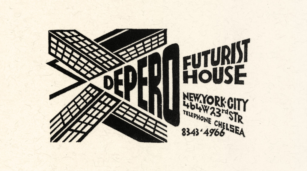

In September 1928 Depero took off for New York, intent on experiencing life in the great American metropolis first-hand. The twenty-four-month period he spent there constitutes a pivotal phase in his artistic lifeline. The shock of the city was exhilarating – and complicated. He opened Depero’s Futurist House, an American branch of the Rovereto firm, but it fell short of the success he had hoped for. So he made a living chiefly from advertising, designing costumes and stage sets for the Roxy Theater and decorating restaurant interiors. Urban America, its subway, its skyline of towering skyscrapers and its teeming crowds, perfectly epitomized the Futurist lifestyle – and provided a foretaste of the isolation and alienation to come. His paintings and graphic compositions at the time underwent a transformation, reflecting his experience of the urban realm as a mighty machine of cogs and gears. While his more famous studies for the Rovereto company logo featured a human figure working, bent over a desk, reminiscent of St. Jerome in his study, those for Depero’s Futurist House in New York focused entirely on the powerful graphic effects and dynamic thrust of skyscrapers. Repeated and tightly wedged into his linear compositions, these jutting highrises became dynamic arrows, purging any trace of romanticism from the expression in vogue at the time in Italy, an expression certainly used by those who merely dared to dream of New York : grattanuvole, i.e. “cloudscrapers”.
In September 1928 Depero took off for New York, intent on experiencing life in the great American metropolis first-hand. The twenty-four-month period he spent there constitutes a pivotal phase in his artistic lifeline. The shock of the city was exhilarating – and complicated. He opened Depero’s Futurist House, an American branch of the Rovereto firm, but it fell short of the success he had hoped for. So he made a living chiefly from advertising, designing costumes and stage sets for the Roxy Theater and decorating restaurant interiors. Urban America, its subway, its skyline of towering skyscrapers and its teeming crowds, perfectly epitomized the Futurist lifestyle – and provided a foretaste of the isolation and alienation to come. His paintings and graphic compositions at the time underwent a transformation, reflecting his experience of the urban realm as a mighty machine of cogs and gears. While his more famous studies for the Rovereto company logo featured a human figure working, bent over a desk, reminiscent of St. Jerome in his study, those for Depero’s Futurist House in New York focused entirely on the powerful graphic effects and dynamic thrust of skyscrapers. Repeated and tightly wedged into his linear compositions, these jutting highrises became dynamic arrows, purging any trace of romanticism from the expression in vogue at the time in Italy, an expression certainly used by those who merely dared to dream of New York : *grattanuvole*, i.e. “cloudscrapers”.
Nicoletta Boschiero, Maurizio Fagiolo dell’Arco (eds.)
Depero, Rovereto, Museo d’Arte Moderna ; Milan, Electa, 1988
Roberta Cremoncini
Fortunato Depero: Carnival of Colour, Salford, Lowry Press, 2001
Roy Lichtenstein — Benetton has associated its name, in a risk-taking, with intense controversial, sometimes political and often charming photography that promotes understanding between diverse cultures of the world. They are at the vanguard of advertising art.
Roy Lichtenstein
“Statement” (1994), Chantal Michetti-Prod’Hom (ed.), Benetton par Toscani, Pully-Lausanne, FAE Musée d’Art contemporain, 1995
(Passage quoted in extenso)
Peter Halley — Despite the Benetton company’s protestations, it is hard to imagine that the Benetton advertising strategy has not used its controversial subject matter – war, Aids, ethnic conflict – as a means of brilliantly multiplying the impact of its advertising spending. When a controversial new Benetton image appears, the accompanying protest and press attention generate media coverage of an intensity that could never be garnered by mere clothing.


Further, Benetton’s issues – Aids, multiculturalism, ecological responsibility – are not exactly an anathema to its target market, young people in cities around the world who have been acculturated in the “lite” political atmosphere of MTV and similar media products. It would be really shocking if Benetton were to embrace conservative causes – isolationism, militarism, laissez-faire capitalism – but doubt that ideology would do much to create growth in sales or to promote identification among young people who buy trendy clothes.
It is also disturbing, as one reads promotional material given out by the Benetton Group, that the people behind Benetton’s image do not seem to have much tolerance for those who find their advertising objectionable. This is especially troublesome since Benetton’s politics would seem to be based on the promotion of tolerance. To cite a clear example, Benetton tells us that there was opposition in “the black community in the United States” to a photo of a “black woman breastfeeding a white baby”. Apparently some African-Americans felt the photo “portrayed the stereotypical image of the black nurse relegated to a subordinate role”. But the Benetton text assures as that, “the true spirit of the photo, i.e. that equality goes beyond kneejerk reactions and conventional perceptions, was, however, understood internationally”. Seemingly the image-makers at Benetton have little patience for those who “read” their images differently than they do.
Equally disturbing, is Benetton’s resort to endorsements by the grieving to give validation to their media strategies. In response to objections raised when Benetton used an extremely dramatic photograph of a young man on the verge of death from Aids as part of a publicity campaign, Benetton replied that the family of the man had “declared their support of the initiative at a press conference held in New York to present the campaign”. When Benetton uses a photograph of the bloodstained clothing of a dead soldier from the Serbo-Bosnian war, the company assures us that the victim’s father wishes “that all that is left of my son be used for peace and against war”. Such recourse to the authority of the grieving and injured is extremely manipulative. We cannot argue with people whose tragic losses make their utterances unassailable.
Lastly, Benetton seems to feel that the causes it promotes separate it from other international companies. However, I would argue that Benetton’s ideology is perfectly aligned with the goals of liberal merchant capitalism – to create a world without borders of war, where goods and capital can flow freely among optimistic, healthy people. Certainly, Benetton is actively pursuing this goal. In reading another press release by the Benetton Group, we learn that “Benetton’s production and commercial network which has its main operational centres in Italy, France and Spain, extends to 120 countries with 7,000 points of sale”. We should also take note that “in 1993, the Group, which has exported 70 percent of its production over the past decade, achieved consolidated sales of over 2,700 billion lire, an increase of 9.5 percent on the previous year”. Clearly, as the press release itself states, “the Benetton Group is at home throughout the world”.
Peter Halley
“Untitled” (1994), Chantal Michetti- Prod’Hom (ed.), Benetton par Toscani, Pully-Lausanne, FAE Musée d’Art contemporain, 1995
(Passage quoted in extenso)
Sophie Gayerie — The three-wheeled Piaggio Ape was born in 1948 to engineer Corradino D’Ascanio and industrialist Enrico Piaggio. First cousin to its recent predecessor the Vespa (Wasp), the Ape (Bee) was soon adopted by Italian shopkeepers as their delivery van of choice thanks to its small size, maneuverability and extraordinary carrying capacity (up to 700 kg, which means, if we’re to believe a famous photo, it could transport an elephant). Above all, because it could be driven without a license, the Ape caught on fast to attain an unlooked-for degree of popularity. Loaded with crates of wine, fish, vegetables and other merchandise of all sorts, it became the symbol of Italy’s postwar miracolo economico.
1949 saw another addition to the Piaggio family : the Ape Calessino, with a more finely wrought design, prevailed as the preferred means of transportation among stars vacationing along the Italian shores. In Forte dei Marmi, Capri or Portofino, it rubbed wheels with its larger cohorts. Soon licensed for manufacture in India, the “bee” gave birth to the autorickshaw, which spread unstoppably throughout Asia before extending its influence to South America.

The versatile and nonconformist Ape was to undergo some parallel and no less poetic metamorphoses at the hands of Swiss artist Roman Signer, who transformed it into a fountain (Fontana di Piaggio, 1995/1997), a launch pad for hot air balloons (Aktion Konstanz, 1998) or explosives (Raketenstation, 2005), a base for a miniature mobile home (Piaggio mit Haus, 2012) and a stunt vehicle doomed to crash (Accident as Sculpture, 2008). In 2003, an epic river-crossing (Floß) took the Ape to Poland, where Signer was studying for a year and drove his signature three-wheeler down a summer ski jump (Piaggio auf Schanze, Polen [Piaggio on Jump, Poland]). Signer recalls that daredevil exploit on the Polish slopes : “We were once at a ski jump in Poland, for example. We rode a car, a Piaggio, down the jump – it flew through the air ! Everybody thought it would somersault, but it flew through the air and landed intact. Before going to the ski jump we’d heard that a priest was blessing automobiles. We asked him to bless our car and he came over with two altar boys and some holy water. He glued a St. Christopher to the steering wheel and said that the saint “wished me an accident-free ride”. He didn’t know what we were up to…” (“Roman Signer by Armin Senser”, Bomb Magazine, No. 105, Fall 2008).
Yann Chateigné Tytelman — To Raymond Hains, the history of art, especially that of his day and age, was one of “personified abstractions”: as the artist was in the habit of pointing out when discussing certain works that form part of the narrative and memory we construct collectively, we say of such and such a blue monochrome, for example, that it is an Yves Klein. Taking this trope to its logical conclusion, the whole material world, our visual environment, the objects, the nature that surrounds us, as well as the ideas that populate our minds, the miscellaneous material artists have drawn on over the centuries to reveal, design and appropriate forms, becomes a landscape teeming with figures that call for as many signs and signatures. Hains’s writing constitutes a unique language born of a vital urge for identification that makes use of elements in motion on the stage of the world, including the whole universe of images and texts, to construct an invisible theater composed of the infinite connections between all things. What, then, does the calling card of a man whose oeuvre is based on the concept of intervals tell us about him? At first sight, nothing, or nearly nothing. Above all, it presents letters and nothingness: the artist’s name in black letters against a neutral background. No personal title, no profession, no address: for those who knew him, Raymond Hains was an artist based at the rue Delambre in Paris. Though not the sort of artist you would pop in to see in his studio. From the mid-1940s on, he was an agent on the move, out in the street, peering through a rippled-glass lens to capture the pictorial, abstract, fluid language of the city (his hypnagogic photographs), then, by the end of that decade, peeling off posters to extract their poetic matter (his décollages with Jacques Villeglé, François Dufrêne). He was the sort who would come to you when he felt like it, who would meet you in a specific place whose history or mere name resounds in the ears of those who can hear, before vanishing without leaving an address. As he did, at the other end of our story, in the run-up to his “retro-prospective” at the Centre Pompidou in 2001, when he was seized with an umpteenth fit of dromomania (a.k.a. traveling fugue) and went AWOL till the eleventh hour, only to reappear as if by magic right before the show opened.
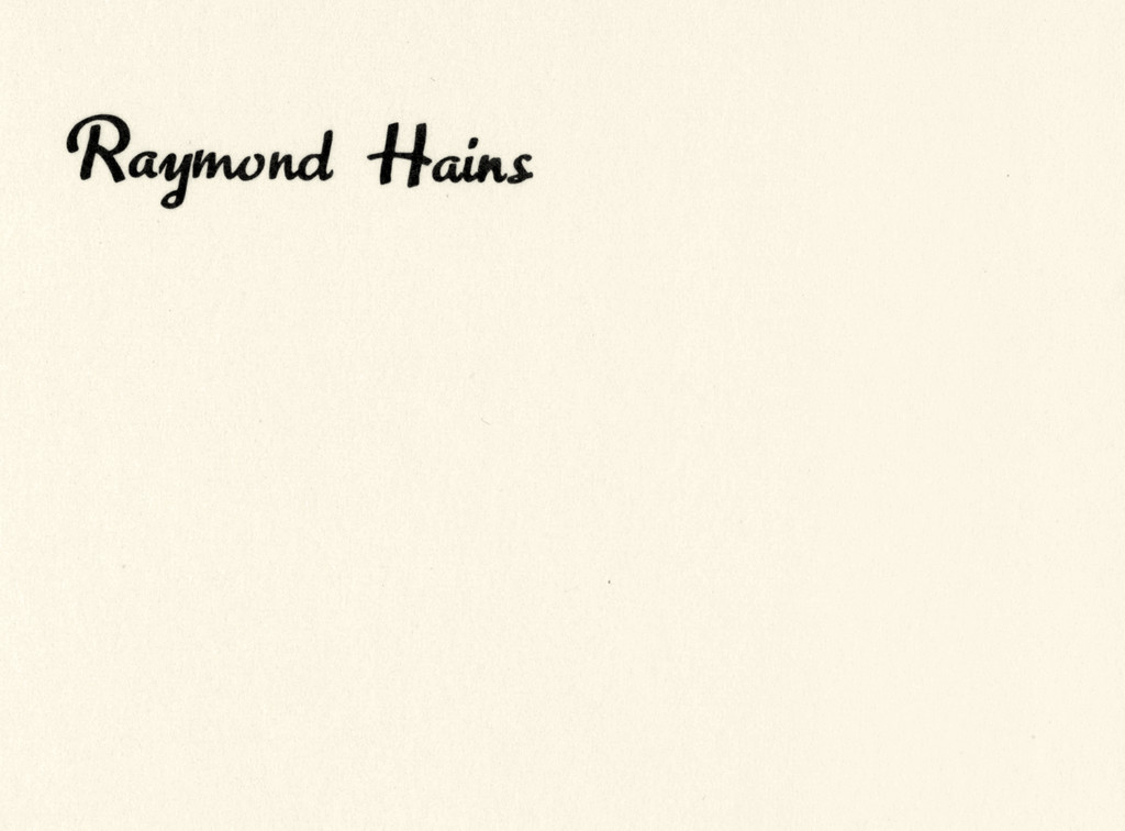

The layout of his card reveals the way in which Hains presented himself as a medium in both senses of the word. The artist saw in pictures, in text, what others could not. His passion for Antonin Artaud – who he heard speaking in tongues at the Théâtre du Vieux-Colombier in January 1947, possessed, spouting otherworldly glossolalia – was not unrelated to his interest in Hélène Smith (the Surrealists’ “Muse of Automatic Writing”) over in Geneva, who spoke in Hindi and in a Martian tongue, albeit without ever having traveled quite that far. If the white background of Hains’s card is indeed an image of the “intervallic medium” into which he evolved, the choice of an oblique typeface might also symbolize the function of liaison which Hains had assigned himself : beyond that of an author, his role was that of a bond, oblique, connecting the dots on a mental map whose points of reference were ceaselessly redistributed (friends, artworks, anecdotes, conversations, reading, places, historical facts). In Hainsian space-time, things are reversed : artworks are characters, objects are signs. The artist’s card thus becomes something other than a business card. For an artist who, to employ a cliche, would “make his life a work of art”, his calling card would be the name-and-title plaque to an artified body and lifetime, a mark of achievement. With Hains, it’s the reverse : the card becomes an emblem of inaction (as he called himself an “inaction painter” whilst taking possession of posters torn by passersby). His work became the caption to his card, residing at the center, not the fringes, of his output ; and works by others became captions to another card of his, the immense, fragile, intimate geography of his mnemonic theater ; his plain name printed on a white background, an overflowing void, became the trace of his simple, discreet (omni)presence, his perennial navigation of urban and intellectual seas, making his card an announcement of a situation.
This card speaks to us, and one detail clearly shows us how absolutely coherent his minute liaising efforts were. The typeface, inspired by the cursive handwriting of the card’s designer, Marcel Jacno, who also designed the Gauloises cigarette pack, is called Gaulois. It was Jacno’s pride, giving him a sense of signing thousands of objects in the public realm – which Hains would most certainly have noted with interest, given his love-hate relationship with affichisme, i.e. poster art. In his eyes, Cassandre was a poster artist, whereas he himself was an artist (which brings us back both to Cassandre’s famous ocean liner poster – in front of which Hains posed for his retrospective at the Centre Pompidou [a.k.a. Le Paquebot for its resemblance to such an ocean liner] – and to the navigating artist). But from the late 1950s, Hains, who had begun appropriating construction site hoardings in his ongoing quest for torn posters, was a great admirer of the Marquis de Bièvre, too, who wrote the entry on puns for the supplement to Diderot and d’Alembert’s Encyclopédie in 1777. The Marquis was also the author of a 1770 verse tragedy called Vercingentorixe [sic], which Hains and his friend Lettriste Dufrêne relished as a tour de force in the art of playing on words. Later on, when the New Realists were forming, Hains remembered that Dufrêne just happened to be born on the rue Vercingétorix in Rennes.
Besides his gigantic Pop Art reproductions of SEITA (French) and SAFFA (Italian) matchboxes, he liked to recall that he and Jacques Villeglé knew a journalist, a “devotee of the druids”, who would say when passing by rue Vercingétorix, “Buvez Gaulois, buvez de l’hydromel et pas du Coca-Cola !” (Drink Gallic ! Drink mead, not Coke !). The card might have come full circle here when Hains, a history and anthropology buff, recollected Georges Dumézil’s 1947 essay about the Greek and Latin tendency to “personify abstractions”, which begins : “Tout d’abord, y a-t-il un dieu gaulois dans la pose bouddhique ?” (First of all, is there a Gallic god in the lotus position?).
Fabienne Radi — One might put it like this: Sylvie Fleury customizes the zeitgeist. Or perhaps along these lines: Sylvie Fleury or intertwining Prada and the Dalai Lama. The Genevan artist appropriates, parodies, juxtaposes, fuses, atomizes, deconstructs. Mostly objects from the world of luxury, fashion, automobiles, but also from that of self-help and Eastern philosophies. The latter re-emerge from this operation with a substantial addition of both glamour and perversion (in the sense of diverting them from their original function).

Her takeoffs on Mondrian’s paintings are the most well-known examples of this penchant for crossover, which she has been developing in manifold variations since the mid-1990s. First there were the fur paintings, in which she replaced the Dutch abstract painter’s fields of color with fur of the same hue. Installations soon followed, juxtaposing these fur pictures with Yves Saint Laurent’s Mondrian dresses (which were already takeoffs themselves) or boots in the same patterns. Most recently, she put on performances featuring young women clad in those Mondrian dresses nonchalantly walking dogs (C’est la Vie, 2013). Speaking of parodies and fur, it should be noted that Fleury is wholly in the tradition established in 1936 by her compatriot Méret Oppenheim with her infamous sculpture Déjeuner en fourrure (known in English as Fur Breakfast).
But the most effective way of talking about Fleury’s work is still to enumerate the titles of her works. Breaking them down by family, let’s start with a few quotes culled from the world of advertising and fused with parodied statements from minimal art :
Be Amazing
We Love Our Customers
Every Minute is Special
Moisturizing is the Answer
C’est la Vie!
Do not think of the color blue for 30 seconds
Miniskirts Are Back
Be Good Be Bad Just Be
We Love Our Customers
Every Minute is Special
Moisturizing is the Answer
C’est la Vie!
Do not think of the color blue for 30 seconds
Miniskirts Are Back
Be Good Be Bad Just Be
Or the famed Zen-style mantra Yes to all, though not forgetting the Ô that got away from a famous French brand of cosmetics. Then we have works whose very description forms the title:
Fur Fetish
Car Wash
Gold Cage
Beauty Case
Dog Toy
Chanel Yeti Boots
Road Test
Catwalk
Chromoquartz
Car Wash
Gold Cage
Beauty Case
Dog Toy
Chanel Yeti Boots
Road Test
Catwalk
Chromoquartz
Some titles are borrowed from songs and B-movies, or composed of words picked (partly) for their tongue-clicking potential, e.g.:
Formula One Dress
Intimate Body Special
Deep & Dark
Color Lab Performance
Camino del Sol
She-Devils on Wheels
Faster! Bigger! Better!
Intimate Body Special
Deep & Dark
Color Lab Performance
Camino del Sol
She-Devils on Wheels
Faster! Bigger! Better!
And let’s conclude with a moniker that is more mysterious, but equally alluring thanks to the repetition: Salad Salad Salad. The titles of her solo shows likewise furnish telltale hints:
Paillettes et dépendances ou la fascination du néant
L’Œil du vampire
Life Can Get Heavy, Mascara Shouldn’t
Is Your Makeup Crashproof ?
All You Need
Ich möchte alles haben, was gut, ächt und schön ist!
L’Œil du vampire
Life Can Get Heavy, Mascara Shouldn’t
Is Your Makeup Crashproof ?
All You Need
Ich möchte alles haben, was gut, ächt und schön ist!
It is interesting to note that the first mentioned, Paillettes et dépendances ou la fascination du néant (Sequins and Dependencies or the Fascination of Oblivion, a show held at Geneva’s Mamco in 2008) was initially a criticism of the artist’s work by a journalist at the Journal de Genève. In the same vein, the title of one of her works, Please no more of that kind of stuff, is a request made in a New York gallery’s guestbook by a visitor who had clearly had enough of her works. These two anecdotes, recounted by the artist herself, reveal her undeniable gift for taking up criticisms and turning them inside out like a glove. Dissolution of the antagonist by means of phagocytosis.
Like Bret Easton Ellis, Sylvie Fleury first came to the fore in the late 1980s and has been surfing a wave of success ever since. Like the American writer, moreover, she has created a world symptomatic of the consumption of luxury goods that has burgeoned since then. Both of them take a seemingly superficial look at a world in which they themselves thrive like fish in water – Bret perhaps with a thicker coating of irony, Sylvie with a more unabashed veneer of lightness.
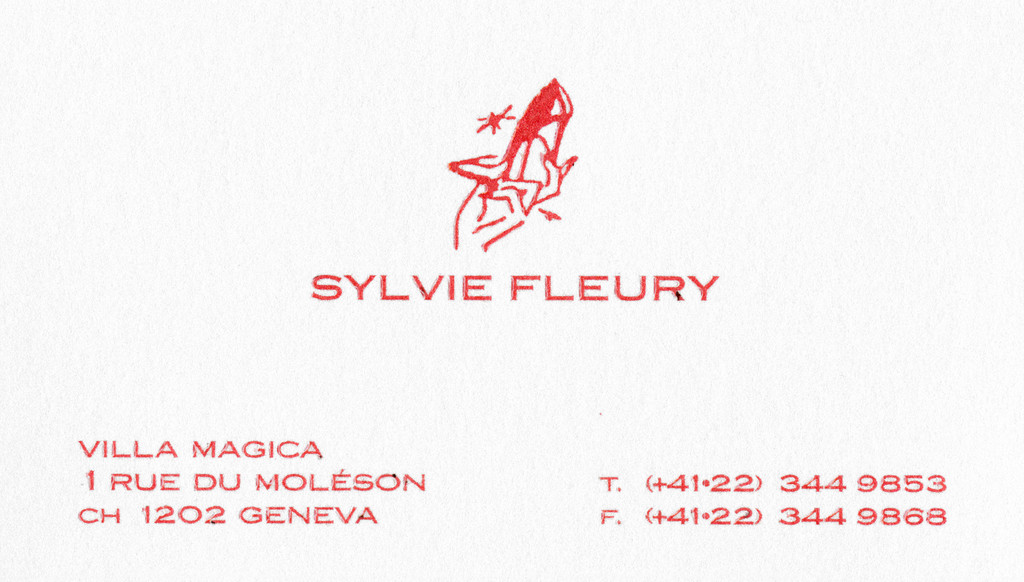
And this comparison with Easton Ellis brings us to the subject of business cards : in American Psycho (1991), Patrick Bateman coldly murders one of his coworkers because the latter’s business card is more stylish than his own. So what would the golden boy in the Calvin Klein suit have thought of Sylvie Fleury’s card ? He would surely have admired its slightly rough texture, the subtly spangled off-white background, the embossed letters printed all caps in an elegant dark red. Then he would have smiled, amused at the address : Villa Magica. Lastly, he’d have raised an eyebrow to decipher the little drawing above the artist’s name : a woman’s manicured hand holding a high-heeled shoe, above which flutters what might be an insect (dragonfly ?) or spider ( ?), unless it’s just a twinkling star – we don’t really know.
Samuel Gross (ed.)
Sylvie Fleury: Prix de la Société
des arts de Genève 2015, Zurich,
JRP/Ringier, 2015
David Zerbib — An exceptional event, an invitation, an advertising announcement, welcoming smiles, cocktails, business cards… How is art’s fate sealed by these by-products of the institutionalization of culture? The answer might lie in the various transformations of a certain idea of art set forth by General Idea, a group launched in Toronto in 1969 by artists AA Bronson, Felix Partz and Jorge Zontal (their real names being: Michael Tims, Ronald Gabe and Slobodan Saia-Levy) and whose fondness for irony emanates from its very name. First and foremost this implies accepting the late-1960s idea about the “dematerialization” of art ; and then, developing strategies that lend this general idea some specific forms ; and lastly to observe, paradoxically, that these forms constantly engender new located material procedures that displace rather than dissolve art’s common esthetic goals (going as far as announcing the “re-materialization of the art object” on the cover of File magazine, edited by General Idea from 1972 to 1989). (General Idea, “The Re-Materialization of the Art Object”, File, vol. 5 No. 2, Fall 1981).

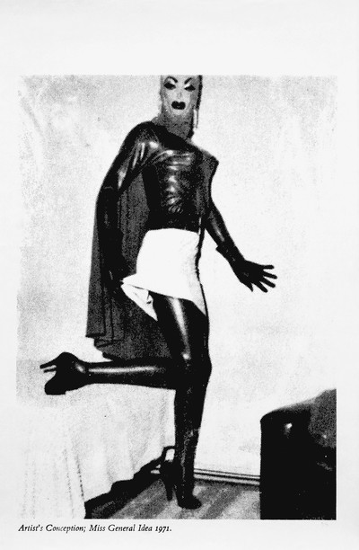
General Idea, Artist’s Conception: Miss General Idea 1971, screen print on salmon wove paper, 1971. Photograph by Andrea Rossetti. Courtesy of Esther Schipper, Berlin.
Indeed, General Idea playfully and critically reloaded the concept of art within the very same media context and environment that seemed to dissolve it. With no loss of intensity, the emphasis therefore shifted from the form of an object to the format of an experience. This explains the importance of the group’s “framing device” concept, which should be considered as expanded formats no longer limited to the physical or the technical (and might now include the notion of “found”, to quote the title of the 2006 exhibition, General Idea : Found Formats, Kunsthalle, Zurich), but that also segues into an operational template from a social, esthetic and critical point of view.
Let us examine how this displacement works in the case of Miss General Idea. At once a concept, an allegory, a muse, an emblem, a place, an event and a fiction, this figure and this parody of the beauty contest is in fact, as an idea, a “framing device”. As the group explains in one of its “showcards”: Miss General Idea contains, maintains and supports our interest, it sustains our attention, arresting it while letting us see the key that locks it. “Miss General Idea is basically this : an idea framing device for arresting attention without throwing away the key… We are surfacing on the surface of our desires defined by the intersection of differing points of view. Elevated she reigns ; idealized she contains ; artfully she maintains ; dominantly she sustains our interest.” (Showcard 3–001, Miss General Idea 1984, 1975).
An attentional and conceptual framing device, its goal was to interest us in art as a living idea, to retain and focus our desire, though never innocently, always with the theoretical consciousness of the frame : the key that it kept yet allowed us to see, that was nothing other than the format, in other words the key that locks the form and the idea together.
The 1971 Miss General Idea Beauty Pageant set in motion a process that would prove decisive in the trio’s work. General Idea revealed how art had entered a competitive era. Let us go back : as long as art objects exist, the media, the markets and the art world, as well as the institutional, social, technical and economic structures to which they are tied – but also all the by-products of these structures – operate only as instrumental props or more or less implicit backdrops, whereas the concept of art hinges mainly on the object. In other words, our definitions of art and judgment criteria are determined and validated by art objects. However, once art becomes esthetically indistinct, once it faces the challenge of “dematerialization” it appears rendered to the condition of constant contender. Ordinary objects, an attitude, an ephemeral situation or the form of the concept itself : What will now qualify as a work of art ? What content will we call “art” when filling out culture’s vast registration form ? And who will be elected to the position of artist ?
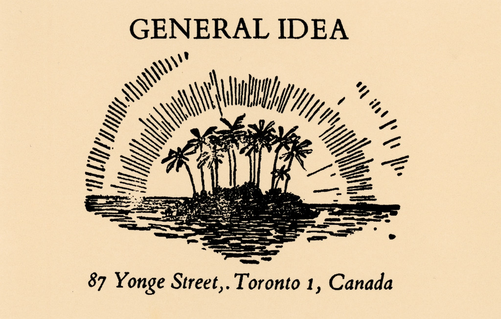
In truth, art has always been about competition, as Duchamp proved in 1917. However, before that, the rules of the game were not the aim of the game. In 1971 the rules were understood even beyond art’s identified game (in the gallery or art show), where art equals communication, information and advertising. The invitation to participate in this event was a parody promising the happy selected few “the opportunity of a lifetime” (as quoted in the 1971 Miss General Idea Beauty Pageant Entry Kit). Everything was about “luxury”, “glamour” and “celebrity”. The terms of Baudelaire’s “Invitation au voyage” had changed, because “peace and pleasure” were no longer the indicators of the contemplative beauty of modern times. The project logo, which headed the letter as well as the organizers’ business cards, heralded a new horizon : an islet with coconut trees emerging from a calm sea, that shimmers like the sun. In other words, an esthetic accomplishment worthy of a tour operator. Beyond the irony of such a misappropriation, General Idea announced the following : if art no longer aims for a specific heavenly and utopian destination, be it exclusive esthetic values or a protected islet of conceptual autonomy, it is nonetheless true that the very idea of its perspective resists dissolution and continues to tease our eyes and our expectations. Here is the business card, the format, the key : a framing device that reminds us of a potential point at the intersection of all vanishing lines and desires.
Frédéric Bonnet (ed.)
General Idea: Haute Culture.
A Retrospective 1969–1994, Paris, Paris-Musées Éditions, Zurich, JRP/Ringier, 2011
Samuel Adams — Keith Haring remains one of the most celebrated artists of the 1980s and an icon of that decade’s Day-Glo visual culture and social justice battles. His bold lines and cartoonish figures emerged from the unlikely confluence of graffiti, Pop Art, punk and hip-hop. He left his native Pennsylvania for New York City in 1978, enrolling at the School of Visual Arts for one year before dropping out to pursue his career. His labyrinthine compositions, brimming with exuberant gestures, sci-fi glyphs and coded eroticism, graced all available surfaces, from walls and vases to tarps and human bodies.


From the moment of his arrival in New York in the heyday of post-structuralist theory, Haring seized upon visual signifiers that were widely palatable and recognizable. By the thousands, he distributed tee shirts, pins, event flyers and protest posters branded with line drawings of a baby and/or dog. A fixture in the Lower East Side club scene and éminence grise among graffiti artists, Haring intervened in the urban environment by collaging and wheat-pasting controversial news headlines, altering advertisements and drawing on empty panels in subway stations. It is significant that the subway drawings, which established Haring’s reputation, occupied spaces intended for images of commercial goods. The ambiguous relationship between art, consumption and popular culture was one that Haring carefully managed throughout his career.
When collectors first showed an interest in his work, Haring contended, “I was going to be my own dealer, and sell to whomever I wanted so that I could maintain my integrity.” Even after accepting gallery representation in 1982 Haring aimed to keep balancing on the “tightrope” he was “walking between ‘high’ and ‘low’ art”. His mercantile ambitions can be traced to c. 1982, when he first saw imitations of his work on urban walls and tee shirts. He would soon collaborate with Vivienne Westwood on a runway collection and design ad campaigns for Absolut Vodka and Lucky Strike cigarettes. As the prices for his work climbed, however, he wondered if it would be possible to make Keith Haring-designed objects available on a massive scale while avoiding what he considered “crass commercialization”.
In 1986, encouraged by his mentor Andy Warhol and designer Bobby Breslau, Haring opened the Pop Shop on Lafayette Street in SoHo. Presaging the now ubiquitous museum gift shop, the Pop Shop sold such novelties as stickers, sweatshirts, radios and skateboards. Haring kept only a handful of items on view in the showroom to prevent shoplifting, ironically resulting in an aesthetic resembling that of a high-end boutique. The display also suggested that singularity was at issue, even with mass-produced objects for which there was an entire stock of duplicates in storage. Exterior awnings and nearby billboards indicated not the products available for purchase at the shop, but rather Haring’s aesthetic and persona, signified by his signature babies and dogs.
The Pop Shop’s black and white, image-laden surfaces subsumed the architectural elements in the space. Columns and corners faded into a dizzying total environment. Uniting disparate media into a synthetic whole and insisting on visitors’ participation, the Pop Shop was in a class with installations by such precursors as El Lissitzky, Kurt Schwitters, Richard Hamilton, Jean Dubuffet, Judy Chicago and Yayoi Kusama. The Pop Shop’s transactional component can likewise be seen within the alternative economic models for artistic consumption proposed by Robert Filliou and George Brecht, Gerhard Richter and Konrad Lueg, David Hammons, Kiki Smith, and Felix Gonzalez-Torres. Taken as a relational work of installation art, we can appreciate how Haring’s Pop Shop offered an alternative to the passive consumption of art while also challenging basic tenets of free market capitalism.
In 1988 Haring opened a Pop Shop satellite in Tokyo but supply and demand for counterfeit Keith Haring goods already existed in the city. It was thus impossible to cultivate a niche market for art objects that were neither original nor commercial and Haring closed the outpost after a year. Although Haring died in 1990, the Pop Shop in SoHo remained open until 2005 when it was finally priced out by new tenants in the neighborhood, such as the MoMA’s Design Store.
Claes Oldenburg’s The Store (1961–64) and Warhol’s Factory similarly presented new value systems for art and the quotidian, but we find a more direct precursor for the Pop Shop in the sprawling 1980 group exhibition, Times Square Show. The artist-run organizing institutions were Colab, a collaborative formed in 1977 that organized group exhibitions around themes such as real estate and wealth inequality, and Fashion Moda, an art space in the South Bronx established in 1978. Haring contributed a Xerox wall collage to the Times Square Show and, more importantly for this discussion, spent time in the exhibition’s souvenir shop, which was selling inexpensive multiples out of a former massage parlor. Colab also founded enterprises such as the multiple and edition seller, A. More Store, which opened in 1980 on Broome Street, where Haring lived for the first half of the 1980s.
While Pop artists such as Oldenburg and Warhol foregrounded similarities between art and commercial culture, artists of the late 1970s and 1980s who developed what Jeffrey Deitch referred to as “business art” were largely women, queer and/or artists of color. Without access to, or visibility on, the commercial art market where Oldenburg and Warhol thrived, their institutional critiques probed not only commerce and mass media, but also structures of gender, identity and race-based discrimination that underlay art markets and institutions. Although the Keith Haring Foundation refuses to attribute his collaborative works to the multiple hands that made and indeed signed them, Haring himself made efforts to promote colleagues such as LA2 (Angel Ortiz), a Puerto Rican graffiti artist who co-produced hundreds of paintings and objects with Haring between 1982 and 1984. (Ricardo Montez, “‘Trade’ Marks : LA2, Keith Haring, and a Queer Economy of Collaboration”, GLQ: A Journal of Lesbian and Gay Studies, vol. 12 No. 3, 2006).
Haring produced business cards for the Pop Shops and for his studio at 676 Broadway, which he moved to in 1986 while opening the nearby Pop Shop. The Broadway card, dated c. 1988, is hand-drawn with felt-tip marker and features his homunculus top and center. A business card must have been a useful accessory for an artist who maintained a vast social circle, met with collectors and exhibited internationally. At the same time, Haring bartered with friends, such as Warhol, and engaged in a specifically queer, at times homoerotic, politics of trading information, social contacts and valuables. With his insignia on billboards and walls across the city and around the world, Haring was an artist for whom a calling card seems superfluous. He achieved renown through graffiti tags, pins and word-of-mouth, making it difficult to imagine him pulling out this very entrepreneurial accoutrement for a graffiti crew or for new acquaintances made at the Palladium.
The exemplar attached is held in the Andy Warhol archive, yet it is roughly dated to the year after Warhol’s death. The telephone number on it is no longer in operation and in fact Haring’s foundation routes all inquiries through an online form instead of accepting direct calls. The card, like the Pop Shop itself, is a relic of a bygone age. As Haring’s subway drawings redirected the functionality and use value of expired advertising panels, this card today refuses to serve its most basic function of putting two people in contact. Instead, it transports us to a moment when human connection was based on intimacy, chance and desire, when anyone could be connected to an artist as acclaimed as Haring at the push of just seven buttons.
John Gruen
Keith Haring: The Authorized Biography, New York, Simon & Schuster, 1992
Keith Haring
Keith Haring Journals, New York, Penguin, 1996
Christianna Bonin — From stark white canvases that shimmer with painted gray circles ; to articles of furniture and clothing encrusted with protruding, lumpy phalli fashioned from stuffed cloth ; to mirrored “infinity rooms”, which dissolve or multiply bodies through the illusion of infinite space ; or a Louis Vuitton dog carrier in pointillisitic specks: Yayoi Kusama has explored the themes of illusion and self-obliteration by repeating, accumulating and splitting geometric forms ad infinitum. In doing so, she has blazed forth in artistic and commercial realms. What she dubbed her “accumulation” paintings in New York in 1957 encouraged a game-changing re-evaluation of the readymade and minimalist forms among modern artists in ensuing decades. Her current infinity rooms promulgate the “experience” installations that museums, their visitors and their social media so desire. Crowned the “world’s most popular artist” in 2014 by The Art Newspaper, Kusama has become “the poster girl for the globalization of contemporary art”. (Javier Pes, Emily Sharpe, “Visitor figures 2014: the world goes dotty over Yayoi Kusama”, The Art Newspaper, April 2, 2015). How could this migrant artist from rural Japan, who has resided in a psychiatric hospital in Tokyo since 1977, have gotten it so right ?
Little of Kusama’s eccentricity, celebrity or artistry is visible in her shockingly quiet business card from the 1980s. Yet, one could argue that the card discloses such issues as artistic identity, global networking and sociocultural difference – issues crucial to understanding Kusama, her art and her networks, then and now. Certainly, the artist and her commentators have retooled her self-described “hallucinations” of dots to define her current artistic originality and made her one of the global art world’s most resilient, recognizable brands. But Kusama also became the world’s most popular artist because she and her commentators have always found ways of asserting her separateness from it.
By most accounts, Kusama is a strategic networker. Before moving to New York from Japan, she sent her watercolors to Georgia O’Keeffe, who passed them on to dealers and collectors. Throughout the 1960s, Kusama organized nude polka-dot happenings in public spaces like Central Park or adjacent to MoMA and on Wall Street – a move that garnered her art much attention from the press and police alike. Even after she returned to Tokyo in 1973, Kusama continued to exhibit throughout Japan, Europe and the United States.
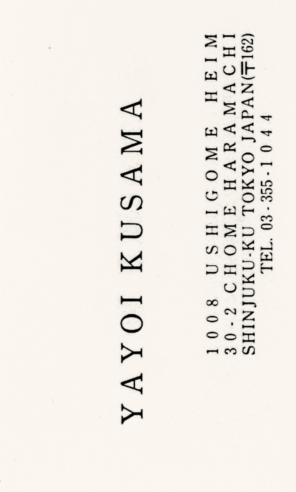
While Kusama’s artistic practice has always been international, this business card, which she gave to Dominique Bozo when he was the director of the Musée national d’Art moderne in Paris (1981–86), symbolizes a significant moment of contact and further internationalization in her career. When Kusama gave her card to Bozo, the Centre Georges Pompidou was preparing a massive exhibition titled Japon des avant-gardes 1910–1970, which included two of Kusama’s best-known works from her time in New York : Net Accumulation (1958), a canvas of dots first praised by Donald Judd, and Chair (1965), which epitomized Kusama’s ability to challenge male hierarchy by fragmenting, softening and repeating the phallus, its most potent symbol. The revisionary exhibition aimed to “reintegrate the Japanese avant-garde into the game of universal exchanges” rather than treating the “Japanese artist” as “isolated by their remoteness and language barriers”, and therefore unable to “actively participate in international movements”. The business card marks a moment when Kusama’s status as a globally networked, Japanese artist solidified : the Pompidou, one of the world’s foremost contemporary art centers, framed Kusama as a member of the Japanese avant-garde at the same time as exhibiting two works that she made while living and working in New York. That her address on the card actually locates her studio in the Shinjuku ward of Tokyo, which had become the center of post-World War II artistic counterculture production the decade before Kusama returned to Japan, also accentuates her later membership of this “distant” avant-garde with strong international appeal.

Yayoi Kusama red and white polka-dot heels by Louis Vuitton, 2012.
If the identification of Kusama as Japanese encouraged global interest in her work, the artist has also continually worked to hybridize that national and cultural association. Though Kusama states that “America is really the country that raised me” (David Pilling, “The World According to Yayoi Kusama”, Financial Times, January 20, 2012), her first exhibition in New York at the Brooklyn Museum in 1955 nonetheless came through an international watercolor exhibition that was first staged in Toyko. And it was The Asahi Shimbun, one of Japan’s national newspapers that supported her first solo exhibition in Paris at Galerie Christian Cheneau – an initiative made at that time by many Japanese media companies, who backed alternative, and often subversive art in order to legitimate Japan’s postwar sovereignty and promote a prosperous image of the country abroad. Kusama performs and mixes her identity in other ways, for example appearing in public in a dotted kimono, or having multiple wax figures of herself displayed in Selfridges in London. Her business card also embodies the split between east and west. With one side in Japanese and the other in English, it is a conventional Japanese meishi business card : bilingual, ready for international exchange as a clear extension of her identity. However, if the card cleaves east/west so neatly, it is malleable, if not outright collapsed, in Kusama’s oeuvre.
The tropes of avant-gardism – migrancy, individualistic creative vision and especially her marginality as someone with a history of neurotic disorders – loom larger in the scholarship on Kusama and the way she speaks of creative process. One of the earliest public references she makes to her hallucinatory episodes as the source of her art was in an interview with the art critic Gordon Brown for WABC radio in 1964 ; Christie’s website declares : “It is impossible to separate [her] art from her mental health.” Indeed, her status as an eccentric outsider – and the art world’s desire for it – has produced her artistic identity and commercialized it for the global art world and elite fashion industries, which still crave inaccessible bohemian artists with individualistic, creative visions.
Yet via the business card, Kusama participates in the business of art with no trace of her signature expressiveness. Her card bears the marks of her powerful international professionalism. Appropriately, it gives us her address and leaves unmentioned whether it is her studio or her residence, which she travels between each day. But the simple admission of her address, like a white business card seemingly bereft of its dots, means something only because we know of Kusama’s inaccessibility. The card mediates her status as an “outsider” with her global popularity. And for this, Kusama’s business card is seen, in hindsight, as eccentric.
Doryun Chong (ed.)
From Postwar To Postmodern, Art In Japan 1945–1989: Primary Documents, New York, MoMA, 2012
Yayoi Kusama, Louise Neri, Takaya Goto, Leslie Camhi (eds.)
Yayoi Kusama, New York, Rizzoli, 2012
Germain Viatte (ed.)
Japon des avant-gardes
1910–1970, Paris, Éditions du Centre Pompidou, 1986