Well, that’s the finest writing I ever saw.
Let us then create a new guild of craftsmen without the class distinctions that raise an arrogant barrier between craftsman and artist!
Well, that’s the finest writing I ever saw.
Let us then create a new guild of craftsmen without the class distinctions that raise an arrogant barrier between craftsman and artist!
Nastassja Haidinger — Stitch, loop, line… ink, mesh, thread. A few terms illustrative of a kind of work that involves time and effort, and the repetition of a gesture that lets itself be led by whatever comes along. One form follows after another in the works of Pierrette Bloch, a Swiss artist living in Paris, who studied with Henri Goetz and André Lhote, among others, though without pursuing any particular path or making any statement. She already had the horsehair in her studio, which she had bought because she liked it, though “without any specific intention”. Until she decided to make meshes out of it, then threads, which she ties in knots and rolls out, sometimes several meters long because, as she says, “the longer the thread, the more unpredictability it offers.” Regarding these horsehair threads, she adds in an interview, “The knot was a punctuation mark that interested [me].” This was not the first time she has borrowed writing terms to describe her artwork. Her meshes possess a graphic aspect she is fond of ; she likes to “write” them, for by following the cadence of a simple line she attains to a continuous, secret and tangled form of writing. It is the gesture that is primary in her work: the weight of hand on paper, the delicate repeated movement of thread unwinding, close to the body that guides it as a hand guides a pen. An affinity for writing that surely led her in her choice of materials: her medium of choice is ink – applied with a brush, however – on paper, whose materiality she appreciates. Black predominates in splashes of ink or in naturally dark or dyed threads, recalling the black of everyday writing, handwritten letters, note-taking. Bloch is particularly moved by the black of ink, its immediacy, its graphic qualities, the reading it presupposes. A color that is naturally found in her writing itself, an unusual handwriting that has remained unchanged since early childhood, as has her habit of ceaselessly taking notes – which are often reproduced in catalogs to her shows. While her tall, close, curved and looping letters possess a formal vocabulary and visual value on which she may have drawn for inspiration, the artist has never confirmed the analogy drawn by a number of critics between her artwork and her writing.


On closer scrutiny, Pierrette Bloch’s writing tends to cover the sheet with a tangle of words that are not always legible at first glance. In his book Les Éléments de l’écriture des canailles (The Elements of the Writing of Scoundrels), Jules Crépieux-Jamin (one of the first to lay a scientific foundation for graphology in the late 19th century) says of this “complicated” script that people of a “finical” and “meticulous” nature tend to have a hard time divesting themselves of a visibly complex style of handwriting. However, he adds, these people can draw strength from developing and systematizing that handwriting. If we find the “superfluous” traits of a complicated hand in Bloch’s repetitive loops applied to letters that do not need them, our artist has clearly systematized these loops in her meshes, in her horsehair threads, in her lines of paper. This handwriting also figures prominently on the New Year’s card (now preserved in the Julien Alvard Papers at the Bibliothèque Kandinsky, Centre Pompidou, Paris) she sent to Julien Alvard, a Parisian art critic and longstanding friend, who wrote the preface to the catalog for her show at the Galerie Georges Bongers in 1963. The name “Pierrette Bloch” printed on the card, while perfectly legible, seems caught in the vice of those big black letters. This may well be one of the artist’s attributes, an ability to hide behind her creations, which she prefers to keep secret and muddled.
In another take on graphology, Crépieux-Jamin apprises us that handwriting that is systematically “exaggerated”, too close or too large, may reflect a certain artificiality, a “disguising” that is apt to distance the written characters from the writer’s real character. In any case, it is true that Bloch’s writing combines opposites that are expressed in her artistic oeuvre as well: intelligible scrawl, looping versus angular strokes, heterogeneous shapes strung together into homogeneous content. If her letters are coiled and linked, it is surely in order to develop them more fully – like her horsehair threads. In its alignments of lines and signs and in the interplay between its upstrokes and downstrokes, between solids and spaces, Pierrette Bloch’s oeuvre develops a “graphological gesture” which may well be more about the image than the alphabet and is more readily felt than translated.
Pierrette Bloch, Jean Coural, Michel Thomas
Pierrette Bloch: Écritures 1972–1982, Beauvais, Galerie nationale de la Tapisserie et d’Art textile, 1982
Jules Crépieux-Jamin
Les Éléments de l’écriture des canailles, Paris, Flammarion, 1923
Julie Enckell Julliard (ed.)
Pierrette Bloch, Zurich, JRP/Ringier ; Musée Jenisch, Vevey, 2013
Pierre Encrevé (et al.)
Pierrette Bloch: Sculptures et dessins de crin, collages, 1968–1998, Cajarc, Maison des Arts Georges Pompidou, 1998
Michael J. Moore — “Well, that’s the finest writing I ever saw.” So said James Buchanan, the 15 th president of the United States, upon seeing an example of the artist Alvin Robbins Dunton’s penmanship.
A. R. Dunton (1812–1891) is largely unknown today, even to artists practicing his chosen form of expression – penmanship. But it was not always so. At his death in 1891 it was written, “There is not a penman in the country who is unfamiliar with the fame of A. R. Dunton. Indeed, his reputation was by no means confined to the profession, but his services to the whole people in the cause of penmanship are very generally known and appreciated. He may be truly called one of the pioneers of modern penmanship, occupying much the same relation to this art in the East as Mr. Platt R. Spencer did in the West and subsequently in the whole country.” (Penman’s Art Journal and Penman’s Gazette, November 1891). (The Spencer here mentioned was a contemporary of Dunton’s and the originator of a very similar form of writing now known as Spencerian Script, the most widely taught form of writing in the United States from the mid-19th-century to about 1930. In fact, this style of writing might well have been known as “Duntonian” were it not for the prodigious and effective marketing efforts of Spencer’s sons following P. R. Spencer’s death in 1865.)
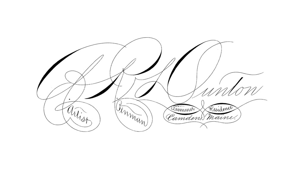

Calling cards were written at this time (1870s) when good penmanship was considered an essential part of a good education. Hundreds of schools devoted solely to teaching it taught thousands of students annually to write well – a skill much desired in many fields. And a fair hand was not only expected and appreciated, it was well remunerated : Dunton was paid $1,000 in 1867 for a single certificate commemorating the opening of the Union Pacific Railroad.
Calling cards had a greater importance and impact then than they do now. These cards were often the first form of contact between persons unknown to one another. There were no computers or websites, no social media or even telephones that could be used as an introduction – it had to be face-to-face or perhaps a letter, with a calling card, was used to form the critical first impression.
Then, as now, artists often attempt to represent what they are or what they do on this small rectangle of paper. The Dunton card not only shows what he could do, but also intimates what the recipient of the card might be able to do if his services were employed. This card could certainly begin a dialogue between the artist and a prospective student. Further, it also represents the method of art he taught as well as all the schools that adopted his teaching method.
This card also differs from most modern cards in that it was not just a representation of his art, a copy or a photo ; this was an original art piece created by his own hand. Is this an important difference in an age of photoengraving, of computer-assisted design, the availability of a myriad of computer fonts, the vectoring of scripts to achieve “perfection”, and inexpensive, high quality printing ? The answer may lie in the response to this question : Would you prefer to be given an original artwork or a print of it ?
This card is also simpler than modern cards, mirroring simpler times. It has no email address, no website, or telephone number – there were none. Only the town and state are mentioned, no street address or zip code, as the postman knew where everyone lived.
Cards such as this one, ubiquitous 150 years ago, are rarely seen today. The penmanship schools have all disappeared along with the masters of this art form who could teach it. Even now, modern grade schools are abandoning the teaching of cursive penmanship in favor of keyboard skills. The legion of jobs once available to the penman now go to machines as technology advances.
So, is the art form represented by this card now irrelevant to today’s high-tech society generally and artists in particular ? One who would disagree is artist and Master Penman Michael R. Sull. A fortuitous meeting in 1980 of Mr. Sull and Paul O’Hara, one of the last living penmen to graduate from the Zanerian College of Penmanship in 1910, led Sull to a lifelong fascination with Spencerian Script and ornamental penmanship, and the strong desire to bring back into public awareness the art form represented by this card and the penmen who created it. Thirty-five years of teaching, demonstrating, writing instructive and historical books, and promoting the value of good penmanship to schools have turned back the tide of obscurity of this almost lost art. A. R. Dunton, P. R. Spencer, and all the other penmen of the golden age of American penmanship, would be pleased their art is once again being appreciated and practiced.
Is there a thirst for this form of art today ? Were you to receive a card like this one, with a handwritten letter and envelope in the same style, amid the mountain of computer printed matter and electronic texts, emails and tweets, what would your reaction be ? Might it be one of awe and wonder, like James Buchanan ?
Mathias Pfund — Biglyphism (Zweischriftigkeit) was a German particularism that existed until the end of the Second World War. Indeed, until this relatively recent period, two typefaces coexisted in Germany: a Gothic script called Fraktur, and a Roman script called Antiqua developed in Europe, in the Romance language countries, during the Renaissance.
Curiously, it was Adolf Hitler who would seal the fate of their use with two successive reforms. In 1934, when the Nazis gained power, Hitler decreed Fraktur “the writing of the Germans”, by virtue of it being a specifically German tradition. At the same time, the use of the Roman alphabet was banned. From then on, Jewish publishing houses, which were prevented from using Gothic typefaces, worked with Antiqua.
A few years later, in 1941, in order to make learning German easier for populations under future occupation, and to strengthen the international Nazi propaganda machine (whose texts written in Gothic script were difficult to decipher and understand abroad), Hitler disavowed the use of Fraktur by falsely inventing a Jewish origin for it. Antiqua was, therefore, officially reintroduced and remained Germany’s main national script, even after the fall of Nazi regime.

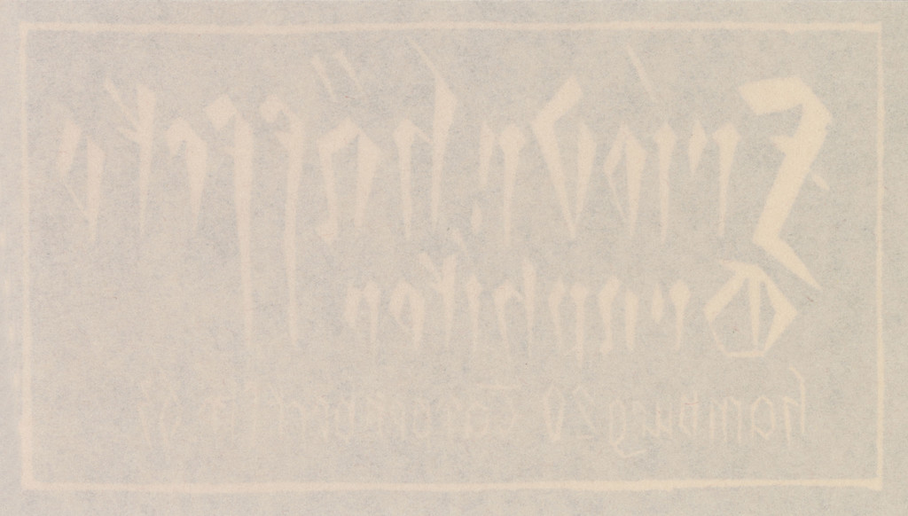
Well before the establishment of National Socialism, Friedrich Häffcke produced his calling card – probably around 1915 – using a relief print technique and handmade Gothic lettering. In choosing to present himself to others with this kind of script, he confirmed his desire to be seen as part of a certain rustic tradition in German engraving, whose outlook was opposed to that of the international avant-gardes. This statement is evidence of the resolutely conservative approach he took to his medium and profession.
In 1915, two hundred copies of Gottfried Keller’s Unter Sternen (Under Stars) were published, written using Häffcke’s Gothic lettering and illustrated with his nocturnal landscapes. This kind of book intentionally harks back to a time before developments in printing made the possibility of cheap books a reality. In the 1920s, he illustrated texts by Goethe, Novalis, and Heinrich Heine, among others.
The ex libris Häffcke created are also very classic in style, no doubt to satisfy his clients’ tastes. His own ex libris, engraved in 1909, shows a caravel plowing through the waves. Paradoxically, the dynamism and vigor of his calling card, with its letters scored into the inky surface, is more evocative of German Expressionism, which valorizes individual and subjective expression and turns against the increasing uniformity and anonymity of modern society.
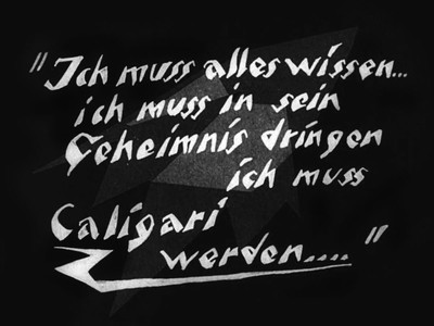
Intertitle from The Cabinet of Dr. Caligari, b/w film directed by Robert Wiene, written by Hans Janowitz and Carl Mayer, 1920.
With Häffcke’s card, one is reminded of the incisive woodcut lettering of Karl Opfermann (1891–1960) or the titles printed on film posters designed by artist and illustrator Josef Fenneker (1895–1956). In 1923, Christian Heinrich Kleukens (1880–1954) developed an “expressionist” lead font, known as the Judith Type. However, the benchmark font undoubtedly remains Neuland, also designed in 1923, by Rudolf Koch (1876–1934), who cut each lead letter by hand meaning there are slight variations between them all.
Today, fonts like the Judith Type have been adapted for the digital world (by Nick Curtis, Holofernes, 2007), and from an initial twenty letters we now have access to a hundred or so onscreen characters and glyphs. But this type of lettering, which gives the impression of having been ripped from the surface, had already been seen onscreen as early as the 1920s, since it appears in the titles of films by Friedrich Murnau and Fritz Lang, and specifically the intertitles (colorized in green) of the famous The Cabinet of Dr. Caligari (Robert Wiene, 1920).
Stephanie Barron, Wolf-Dieter Dube
German Expressionism: Art and Society, London, Thames & Hudson, 1997
Starr Figura (ed.)
German Expressionism: The Graphic Impulse*, New York, MoMA, 2011
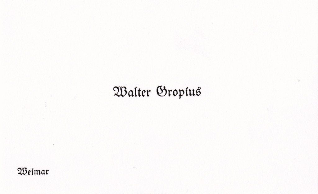
Arthur Fink — We would expect Walter Gropius to have had a differently designed visiting card: a card, that is, printed in sans-serif letters in the style of the Bauhaus’s own publications with its signature rejection of any distinction between upper and lower case. The layout looks modern, but Gropius used an outmoded typeface heavily symbolic of the past: a classic Gothic font, which might be interpreted as an ironic borrowing from the tradition of German printing. The architect, whose modernist Fagus Factory provided vital impetus towards breaking away from ornamentation in architecture, harks back here to runes and vegetal forms. Gropius’s fascination with the Gothic spirit might explain the card’s unusual design.
In the early 20 th century, Gothic architecture was a subject of lively discussion in various artists and architects’ circles, especially after the publication of Wilhelm Worringer’s seminal treatise Formprobleme der Gothik (Form Problems of the Gothic) in 1911. Worringer’s avowed aim is to reconstruct and explore the Gothic style, which he sees as opposed to classical and primitive art. He develops the notion of a secret Gothic that supposedly had a profound influence on the evolution of Northern European art. He believes in “Gothic man”, a “Gothic line”, a Nordic sensibility to form that can also be made out subliminally in works of Classicism (e.g. Hans Holbein). Worringer regards Gothic art as an art of anonymity. In contrast to the Renaissance, the age of the individual, Worringer ascribes to Gothic man the will to self-sacrifice. In the Gothic ethos, individuality is something negative, something to be combatted. Gothic form, as he defines it, is devoted to rapture and depends on monumentality for its effect. In contrast to the this-worldliness of classicism, the Gothic yearns for transcendence : although appealing to the senses, it nonetheless stands for spiritual, transcendent values, writes Worringer. Gothic art is driven by a “longing to be absorbed in an unnatural intensified activity of a non-sensuous, spiritual sort”. The Gothic dissolves the duality of spirit and reality. Worringer sees the constitutive phenomenon of Gothic form, its will to transcendental expression, in its cathedrals : “Gothic man builds his minstrels into infinity, not because of playful joy in construction, but that the sight of this vertical movement, far exceeding all human measure, may set free in him that frenzy of feeling in which alone he can drown his inner discord, in which alone he can find happiness.”

Walter Gropius delved deeply into Worringer’s book, and connections to the late Middle Ages loomed large in the founding of the Bauhaus in Weimar in 1919. From the outset, Gropius availed himself of medieval terminology in drawing up the program for his Bauhaus : changing the name of the Grossherzogliche Sächsische Kunstgewerbeschule (Grand-Ducal Saxon Art School) to Staatliches Bauhaus (State Bauhaus) was the first such reference to Gothic architecture. Bauhütte (literally “builder’s shed”, but more generally the [church] masons’ guild), from which the term Bauhaus (lit. “building house” or “house of building”) was derived, is a term in Gothic church building. The masons’ guild was a sort of architectural production center in which all the processes of building and design came together. Gropius describes the medieval masons’ guild in an open letter he addressed in 1916 to the Grand-Ducal Saxon state ministry in Weimar, in which he outlines the principles of the school he envisions : “A happy working collective could be re-created in their circle, similar to those exemplary collectives which the medieval guilds possessed, in which a great many kindred artists, architects, sculptors and craftsmen at every level came together and, in a like-minded spirit, would each humbly make their independent contributions towards carrying out their common tasks in reverence for the unity of a common idea with which they were imbued and whose meaning they understood.” (Walter Gropius, “Proposals for the Founding of an Academy as an Artistic Counseling Service for Industry, the Trades and Crafts”, trans. Walter Hackman.)
Likewise, instead of Lehrer and Schüler (“teacher” and “student”), Gropius employs the terms Meister, Jungmeister, Geselle and Lehrling (“master”, “young master”, “journeyman” and “apprentice”, respectively), also drawn from the medieval trades.
Lyonel Feininger’s famous woodcut of the Cathedral of Socialism for the cover of the 1919 Bauhaus manifesto made the Gothic connection explicit, presenting one of several avant-garde visions of the “cathedral of the future”. The cathedral is depicted here as a building that makes alternative states of consciousness possible and symbolizes spiritual states in general – not as a place of Christian worship, but as a locus for the practice of newly formulated world views.
References to the Gothic play an important part elsewhere as well : in the Bauhaus manifesto, Gropius calls for the arts to return to historical crafts and for all creative activities to be focused on architecture. “The ultimate goal of all art is building !” The opening line of the manifesto immediately enthrones architecture as the queen of the arts. Gropius reverts here to a historical utopia : the Gothic as an age in which architecture reigned supreme over the arts. The Gothic, and in particular the medieval masons’ guild, stands for collective, interlocking processes of production in which all craftsmen work together to beautify the building.
The Gothic is a place of nostalgic retreat. It is depicted as an age of social and cultural harmony, a world in which the production of physical things was in accord with psychic experience. Redefining the role of the artist/architect within the context of industrial production in the modern economy is a fil rouge running through Gropius’s conceptual work. From the 1914 Yearbook of the German Werkbund to his post-Bauhaus writings, Gropius repeatedly calls on the avant-garde to stop retreating from the sphere of production. In the closing lines of the founding manifesto he writes : “Let us then create a new guild of craftsmen without the class distinctions that raise an arrogant barrier between craftsman and artist ! Together let us desire, conceive, and create the new structure of the future, which will embrace architecture and sculpture and painting in one unity and which will one day rise toward heaven from the hands of a million workers like the crystal symbol of a new faith.” (Walter Gropius, Bauhaus Manifesto and Program, 1919, translation Maria Buszek.)
In the early years of the Bauhaus, Gothic stood for a collectively conceived approach to art : rather than being an outsider toiling alone far from the world, the artist is a socially embedded link in society, working collectively and anonymously on the style of the period for the good of the community as a whole. This call for the socially embedded artist and the eschewal of l’art pour l’art and fashionable “salon art” were key elements of Bauhaus. In contrast to the separation and division between the economy and politics on the one hand and the arts on the other, it was a core concern of Gropius’s to weld both of these parts back together – under the aegis of architects. As early as 1916, Gropius stressed the urgent need to make the arts productive for industry and trades in order to “breathe soul into the dead product of the machine”. And his business card reflects this allegiance to the historical Gothic paradigm with a view to rethinking the modern-day relationship between art, crafts and industry.
Walter Gropius
“Proposals for the Establishment of an Institute Offering Artistic Direction to Industry, Applied Art and Crafts”, Hans Maria Wingler, Das Bauhaus: 1919–1933: Weimar, Dessau, Berlin und die Nachfolge in Chicago seit 1937, Bramsche, Rasch, 1975
Wilhelm Worringer
Form Problems of the Gothic, New York, G. E. Stechert & Co., 1920
Mathias Pfund — A delightfully old-fashioned silhouette sporting a bowler hat and umbrella stood out among the various intriguing figures of fin-de-siècle Paris. With his goatee and that mischievous look in his eye, the man left behind an atypical oeuvre that was to undergo various critical fortunes. Even though he was derided during his lifetime by some of his peers, his resolutely modern approach to music, his eccentric character, his fanciful personality and disarming sense of humor had a lasting influence on musical composition in the 20 th century.
Erik Satie led a bohemian existence. After an undistinguished performance at school, from which he dropped out before graduation, he became a pianist at Le Chat Noir cabaret in Montmartre. On the September 1884 printed edition of his first composition, Allegro, he spelled his first name with a final “k” to stress his Viking origins. He went on to found the Église Métropolitaine d’Art de Jésus Conducteur (Metropolitan Church of Art of Jesus the Conductor), appointing himself Maître de Chapelle (i.e. Kapellmeister, conductor) and Parcier (i.e. parcener). The latter was a made-up title, etymologically derived from parsi, the perfect tense of the Latin verb parcere (to spare, save), meaning something like “preserver” or “guardian”. It should be noted that the word parcier exists in the Provençal dialect and means “co-owner”.
Following this mystical episode, a new period in his life was ushered in by the purchase of seven identical corduroy suits in 1895. This sartorial makeover earned him the nickname the “Velvet Gentleman”. The year after that, with his dwindling income, he had to move into a small, spartan room at Arcueil-Cachan on the outskirts of Paris, where he lived without running water or electricity for the last twenty-seven years of his life.


Satie’s education was also highly unusual in that he resumed his studies in 1905 at the age of forty-two. After three years at the Schola Cantorum he received his diploma in counterpoint. This belated academic credential was scoffed at by those of his contemporaries who deemed him an idler and eccentric.
Satie, who was a dear friend of Debussy’s, a collaborator of Picasso’s and close to Jean Cocteau, was introduced into the French avant-garde scene rather late in the day, in 1919, when he met Marcel Duchamp, Francis Picabia and composer Jean Wiéner, who played Satie’s music at the Théâtre des Champs-Élysées during one of his so-called Concerts Salade (1923).
Satie was nicknamed “Esoterik Satie” by the writer Alphonse Allais and “Satierik” by Picabia. He himself liked to say, “My name is Erik Satie like everyone else.” But he also gave himself extravagant nicknames like “le Vieux Hautbois Dormant” (lit. Old Sleeping Oboe, a pun on “La Belle au bois dormant”, i.e. Sleeping Beauty) or “Air Iksati”. Debussy depicted him as a “gentle medieval musician who strayed into this century”.
In the 19 th century, the Gothic style re-emerged from oblivion and permeated the collective imagination after the Romantics had restored the Middle Ages to favor, especially in architecture at the instigation of Gothic Revivalist Eugène Viollet-le-Duc. The Gothic influence can be found in various forms in Satie, e.g. in the titles of some of his pieces, such as Ogives (1886) and Danses Gothiques (1893), and, later in life, in the series of castles he drew in the intimacy of his room in Arcueil-Cachan. Most of the latter were Romantic extrapolations of fortified castles, but some were painstakingly drawn floor plans, one of which was executed on the back of one of his many different calling cards.
Satie’s peculiar lettering, borrowed from Gothic script, adorns all his handwritten productions, including his meticulously penned scores (replete with fanciful instructions for the performers), his manuscripts, all his correspondence, as well as over four thousand drawings and odd classified ads jotted on small pieces of paper and kept in cigar boxes that were discovered after his death.
The card that says Erik Satie – compositeur de musique (music composer) dates from 1922 and was addressed to Hélène Hoppenot. The wife of poet Henri Hoppenot, she was a writer herself and a photographer, who published a number of travel diaries. Satie first wrote to her in April 1917 and sent her four letters in all, three of them in 1922.
On November 27, 1922, he sent Hélène Hoppenot a photograph of himself taken by his friend Brancusi. The 30 × 24 cm print was too large to fit into a pneumatic cylinder, so Satie had to mail it at the post office, enclosing it with a letter thanking her for the box of caviar she’d brought him from Russia. It was probably then that he designed this calling card.
Satie’s script is a pastiche of Gothic letters. He capitalizes the final “r” in compositeur, but puts a line through it to indicate a lower case letter. There was originally a similar letter in Gothic script but it was used to abbreviate the Latin suffix “-rum” (for the neuter nominative and accusative, masculine accusative and the genitive plural of all three genders).
Taking liberties with the rules, his writing was essentially a graphic construct, which was not all that extravagant for Satie, “the only musician who had eyes”, as Man Ray put it.
Satie was very fond of red ink ; he used it to enhance his missives as well as his drawings, which were always executed with the most painstaking care. And although that ink was quite costly and his means quite modest, to the end of his life he never gave up using it.
Friedrich Tietjen — It was a highly conspicuous decision for the Austrian graphic designer Joseph Binder, an immigrant to America, to have his full name and address printed in all caps in a condensed black variant of Futura along the bottom edge of his visiting card, and above it, across the middle of the card, his last name repeated in significantly larger, bright-red lower-case letters, which are widely spaced and in a typeface that is not exactly Futura Black, but resembles it. In the mid-1930s – back when this card was printed – both of these fonts were very new, very modern and very successful, probably not least because they ventured to break away from traditional forms of typographical design.
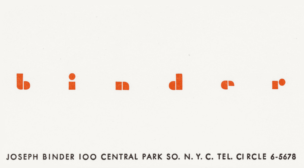

Designed by German typographer Paul Renner in the 1920s, both variants of Futura, unlike previous sans-serif typefaces, were derived not from older Antiqua styles, but from simple geometric shapes, from circles, lines, rectangles. The two fonts differ, however, in the references of their usage : while Futura rapidly caught on for use in printed texts, Futura Black is a stenciled lettering that could be carved into thin metal sheeting or cardboard or used to letter boxes with a paintbrush.
So for his own card Binder chose fonts which came from Europe, like himself, and which were presumably copied, adapted and varied in the United States in the font styles used for the card.
The typography of his card thus shows that he brought something with him to his new home : as one of Austria’s most prominent commercial artists, who had made his mark designing packaging and posters for big companies and for the tourist industry, Binder was familiar with modern functionalist designs used in advertising as well that had evolved within the orbit of Bauhaus and the Neue Sachlichkeit (New Objectivity), for which, among other things, Futura has been developed. But Binder’s card also shows he knows where he is now, in the United States and not in Europe anymore : the radical use of – albeit relatively large – lowercase letters for his name may well allude to experiments in design in which whole books were printed without a single capital letter in the German-speaking world as elsewhere.
At the same time, however, it suggests the proximity of American English as the omnipresent national language, in which nearly every word is written in small initial letters – one of the few exceptions being proper names. So putting his own name entirely in lowercase letters turns it into a common English noun, allegorically punning on design terminology : besides meaning a person or thing that binds books, a “binder” is also the detachable cover of a book or notebook, in other words one of the surfaces whose design was one of the main fields of endeavor for commercial artists in those early years of modernism.
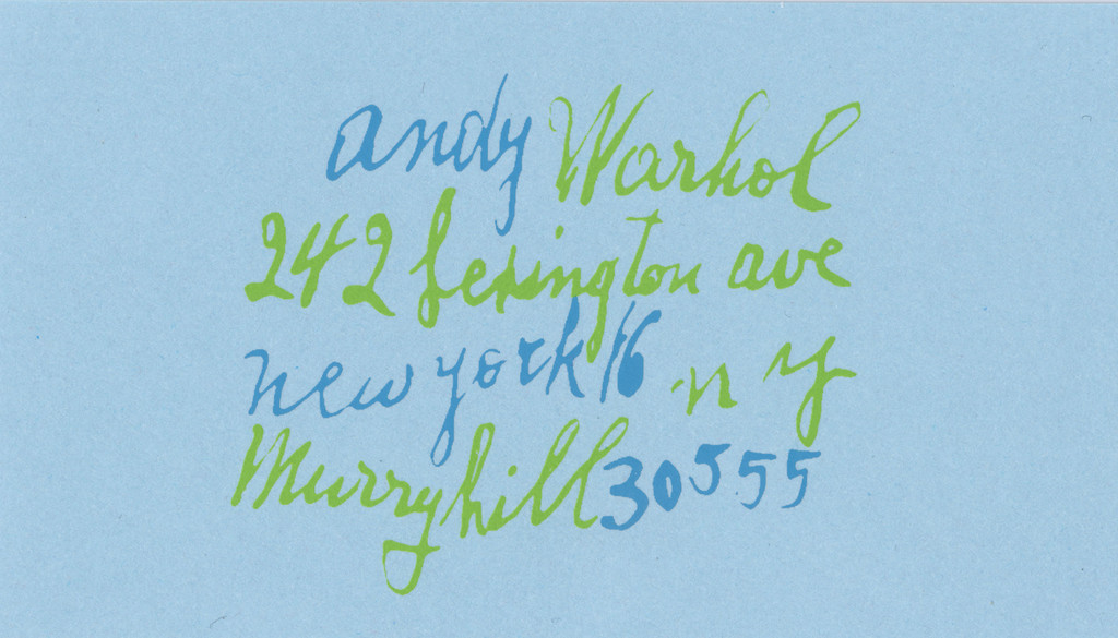
Nicolas Giraud — Before tackling ads, Campbell’s soup cans, dollar bills, car crashes and Coca-Cola bottles, Warhol worked for nearly ten years as a commercial illustrator. His drawings for Vogue, Glamour, Harper’s Bazaar and the New Yorker display a remarkable finesse and delicate lines, far from the Pop Art brutality of his first silk screens. And yet some Warholian principles were already in place. The pointillism of Warhol the illustrator was the result of the play of tracing and stamps, which enabled him to produce several copies of a single drawing. He was also in the habit of inviting friends to work on commissioned jobs. The handwriting on his business cards, for instance, is by the artist’s mother, Julia Warhola, who came to live with him at 242 Lexington Avenue, three blocks east of the Empire State Building on 34 th Street. Warhol habitually used her loopy, uneven handwriting for his commercial work, making it a sort of signature lettering. In 1958, Julia even received an award for a Moondog album cover designed by Warhol and executed by her. The artist’s assistants would reproduce this distinctive hand for other orders, sometimes using Letraset letters based on her script. In enlisting his immediate entourage, Warhol was already experimenting in a “preindustrial” form with the production methods of his future Factory, a “family” enterprise.

Conversely, the repetitive approach of Warhol the artist was not just a mechanical gesture, it was also an echo of everyday activities : going shopping and cooking dinner, going to the office and working, even praying. Repetition is a form of ritual, and it was this ritual that the artist turned into a business. The subject of his work was not only consumer society, but activities repeated so many times they lose any meaning. In the 1980s, Warhol’s diary entries retain traces of this daily repetition in a veritable litany of parties, orders, telephone calls and taxi receipts, to which was added a running list of those in his entourage who died each week of Aids. Warhol mentions attending a party for Bret Easton Ellis in 1986, when the 22-year-old writer had just published his debut novel, Less Than Zero.
There is no record of whether the two men exchanged business cards, but Ellis was taking notes at the time for American Psycho, a novel haunted by repetition and in a style eerily close to that of Warhol’s Diaries. Ellis wrote it in an apartment in the East Village. “The first time I set foot in my apartment,” the novelist says in a Vanity Fair interview, “the funeral service for Andy Warhol was taking place in St. Patrick’s Cathedral. It was April Fools’ Day, which is also the day American Psycho starts.”
A kind of writing was handed from one artist to the other, like a business card – and with it a smuggled legacy of business, death and work, work, work…
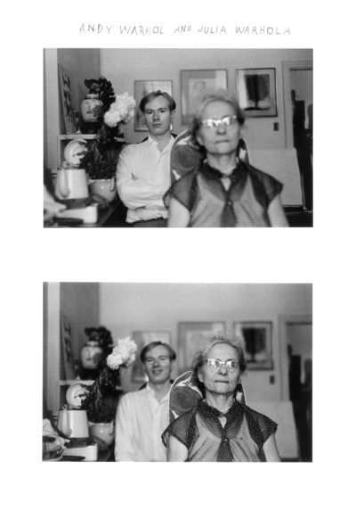
Duane Michals, Andy Warhol and his mother Julia Warhola, two b/w photographs, pen, 1958. Courtesy of the artist and DC Moore Gallery, New York.
Andy Warhol, Pat Hackett (ed.)
The Andy Warhol Diaries, New York, Warner Books, 1989