Rent for 10 mos. $600. Additional money to equip store $150. Money to make objects $250. ($24 per month). Total $1000.
Émilie Parendeau — On March 8, 1967, George Maciunas drafted a new FluxNewsletter for the network of Fluxus artists: 28 recipients, scattered all around the world, their names listed at the top of the page. Maciunas had been operating Fluxus since 1961, that organ he invented and never ceased shaping according to his mood, to circumstance and opportunity.
So what news did he have ? The newsletter opened with this information : “My wage-earning-time-killing job has made it difficult for me to devote more time to Flux projects and correspondence. To remedy this I have left my job a week ago.” This utterly radical decision was balanced a few lines later by the announcement of the creation of Implosions Inc., a business venture carried out in partnership with artist Robert Watts and businessman Herman Fine, that had a clear objective : to enter the “mass market” with “money producing products”, “this business will be operated in a commercial manner, with intent to make profits.”
Faced with the difficulty of financing and finding time for Fluxus, the solution seemed obvious : produce, sell and distribute as many low-cost items as possible, with the aim of bringing in funds for Flux projects, projects he now saw as a “more avant-garde offering” aimed at a “sophisticated art audience”. This new direction, which involved two activities, two product lines, two markets and two target audiences gave Maciunas a new role : as head of a company.


Until then, Maciunas had a day job working as a graphic designer for a small design firm called Jack Marshall ; the rest of his time was entirely given over to Fluxus – indeed, it was thanks to this salary that he was able to finance Fluxus projects.
This new situation shuffled the deck regarding both his schedule and his financial situation, and the business cards he created in 1967 reflect that change. He designed three different cards, one for each of the activities he was preparing to lead simultaneously. The first card was for the graphic design work he intended to continue doing on a freelance basis ; the second was a card for his new company, Implosions Inc. ; and the third card made more direct and specific reference to the various Fluxus projects that he was developing – concerts, performances, festivals and short films etc. :
G. Maciunas
FluxShops
FluxFests
FluxFilms
FluxGames
FluxShops
FluxFests
FluxFilms
FluxGames
Though each card was for a separate activity, the design was similar : black and white, text only, upper case, a single typeface and, last but not least, horizontal and vertical lines isolating each letter. These lines composed a grid that made deciphering the letters difficult and involved a kind of visual game forcing the eye to recompose the words in order to read the text.
Was Maciunas thinking of the grid system used by graphic designers to ensure the content is clearly presented ? Was he referring to the type case, the compartmentalized wooden box used by letterpress printers to store movable type ? Was he making a subtle and friendly reference to the Hermann grid, an optical illusion bearing the same name as his new associate ?
Regardless of the reason, by using a grid on each of the cards, Maciunas turned them into a set – a clever way of highlighting the fact that all three activities had one and the same goal : to support Fluxus and keep it alive.
Before this, George Maciunas had already created a set of cards, one for each Fluxus artist. Brought out in 1964, to coincide with the publication of Flux Year Box 1, this set contained fifteen cards for the artists participating in the project, including : Ay-O, George Brecht, Joe Jones, Yoko Ono, Ben Patterson, Ben Vautier, Robert Watts and La Monte Young.
Each card was in black and white with a square format, printed on one side, with only the artist’s name provided. These name cards combined typographical games and visual riddles. Thus Philip Corner’s name was relegated to a corner of the card while the first three letters of Eric Andersen’s name were replaced by an ampersand.
By the time he died, in 1978, George Maciunas had designed over fifty name cards, an activity that allowed him to use his expertise as graphic designer to support Fluxus, while also having fun. More than anything, thanks to these cards many people were included under the Fluxus banner : filmmakers, musicians and artists such as Alison Knowles, Mieko Shiomi, Name June Paik, Jonas Mekas, Willem de Ridder, as well as friends, sympathizers and temporary collaborators such as Christo, Walter De Maria, Claes Oldenburg and György Ligeti. And it was no doubt to emphasize his singular position within this organ that he always stamped the back of his own card with the word “Editor”.


George Maciunas
“FluxNewsletter, March 8, 1967”, Fluxus etc., addenda I: the Gilbert and Lila Silverman Collection,
New York, Ink, 1983
Leokadija Maciunas — At that time some people turned up who were sympathetic to Communism and they decided to create an avant-garde magazine for which Yurgis thought up the name, “Fluxus”. They decided
to acquaint the large American public with the new direction of the magazine. There were announcements in the papers, they sent out invitations, and the auditorium was lent by the Lithuanian Society.
But when the appointed day came the Board of Directors of the Lithuanian Society rescinded its agreement since they had found out the essence
of the meeting. To them, who had fled from the Communists, it seemed blasphemous to hold such a meeting if it even vaguely recalled Communism. Yurgis and his friends had to stand at the entrance of the auditorium and turn everyone back. Yurgis was very disappointed
and rejected the Lithuanian Society completely. He even changed his name from Yurgis to George.
Leokadija Maciunas
“My Son”, New York, George Maciunas Foundation Inc. website
(Passage quoted in extenso)
Xiaoda Wang — At first glance, this plain business card for the mythical Swiss curator Harald Szeemann seems out of place. While Szeemann has been celebrated for his pioneering exhibitions that shaped both contemporary art and curatorial practice (e.g. When Attitudes Become Form, Documenta 5, Der Hang zum Gesamtkunstwerk), this card simply does not have the visual flair to match the stylistically enticing or conceptually provocative cards created by and for artists. Printed in a standard sans-serif and all caps font, the curator’s name, his home address and telephone number lie modestly close to three of the card’s shy corners, leaving the center of the card noticeably empty. Yet, what makes this card so special is not what is printed on it, but what is not represented: the name of an established institution where the curator works. This omission points to Szeemann’s origin story as the first independent curator who resigned from the Kunsthalle Bern in 1969 and set up his Agency for Intellectual Guest Labor.


Eight years after his appointment as director of the Kunsthalle Bern, Szeemann curated his groundbreaking 1969 exhibition When Attitudes Become Form to explore the experimental forms and processes of Post-Minimalism, Conceptual Art, Land Art and Arte Povera. However, due to mounting pressure from the Kunsthalle’s board amid public anger over some controversial aspects of the show, Szeemann resigned on September 30, 1969. The very next day, Szeemann opened his Agency for Intellectual Guest Labor and granted himself total administrative and financial control over his curatorial projects, thus making him the first independent exhibition-maker. In the catalog of his self-funded exhibition The Bachelor Machines, Szeemann explains, “I have an idea. Under the guise of an Agency, I take on the job of making the idea a reality.
The Agency devises the keyword and the overall plan and assigns the development of the concept to me. In turn, I assign its execution to the Agency. The Agency informs me that I am the only one appointed.”
Without a museum to facilitate his business, Szeemann managed all his affairs from his apartment on Münstergasse, the Agency’s new headquarters. During this time, Szeemann printed the business card to notify his network that he was still functioning without the Kunsthalle.
Since the late 18 th century, curators mainly functioned to care for the museum’s collection in ways that aligned with the museum’s agenda. Reciprocally, the curator’s reputation was directly correlated with the status of the institution that employed them. To reflect the profession’s dependence on institutions, the curator’s business card included the museum’s name as its foundational component. For example, if we look at the business card of Dutch curator and typographer Willem Sandberg that is also reproduced in this book, one finds that the only way of contacting him was through the Stedelijk Museum where he worked. Without a museum, the curator would not have the necessary resources to acquire and preserve notable collections.
Separating himself from this subservient role of the curator, Szeemann focused instead on the independent role of the exhibition-maker, or Austellungsmacher, who exports their singular ideas to various institutions “without having to be concerned with all the exhibitions included in any museum’s annual programming plans.” A year after his departure from the Kunsthalle, Szeemann created three exhibitions – Agence, The Thing as Object and Happening & Fluxus – that demonstrated the authorial abilities of the exhibition-maker to create “temporary worlds” of provocative themes and experiences. With his business card in hand, Szeemann claimed his independence from the museum to build his own individual mythology*.
Claes Oldenburg — The Store, or My Store, or the Ray-Gun Mfg. Co., located at 107 E. 2nd St., N.Y.C., is eighty feet long and varies about 10 ft wide. In the front half, it is my intention to create the environment of a store, by painting and placing (hanging, projecting, lying) objects after the spirit and in the form of popular objects of merchandise, such as may be seen in stores and store-windows of the city, especially in the area where the store is (Clinton St., f.ex., Delancey St., 14 th St.).
This store will be constantly supplied with new objects which I will create out of plaster and other materials in the rear half of the place. The objects will be for sale in the store.
The store will be open every day at hours I will post. F.ex. am 10–2, pm 5–7, or the hours when I will be able to be in the store, which is also of course my studio.
The store may be thought of as a season-long exhibit, with changing & new material. It will be the center of my activities during the season.
The rent of the store is $60.00 per month, including steam heat and hot and cold water. Additional money will be needed to paint and plaster the front half and to make objects. Rent for 10 mos. $600. Additional money to equip store $150. Money to make objects $250. ($24 per month). Total $1000.


13 Incidents at the Store
A customer enters
Something is bought
Something is returned
It costs too much
A bargain!
Someone is hired. (someone is fired.)
The founders. How they struggled.
Inventory
Fire sale
Store closed on acct of death in family
The Night Before Christmas
Modeling clothes
A lecture to the Salesmen
A customer enters
Something is bought
Something is returned
It costs too much
A bargain!
Someone is hired. (someone is fired.)
The founders. How they struggled.
Inventory
Fire sale
Store closed on acct of death in family
The Night Before Christmas
Modeling clothes
A lecture to the Salesmen
Anaël Lejeune — Joseph Kosuth arrived in New York in 1965 and enrolled at the School of Visual Arts. He’d already had several years of training in art and design, mostly in Toledo and Cleveland, Ohio. As soon as he hit New York, Kosuth seems to have grasped the importance of pursuing multiple initiatives and functions in order to ensure his visibility in the art scene. So, while still a student, he organized a lecture series at the School of Visual Arts, inviting artists like Carl Andre, Dan Graham, Donald Judd, Sol LeWitt, Ad Reinhardt and Robert Smithson to come and present their work. He had met all these artists at parties, vernissages, or at Max’s Kansas City nightclub, a bastion of New York nightlife, where Kosuth spent most of his evenings discussing his projects. Kosuth also wrote reviews for Arts Magazine back in those days. As if that were not enough, in 1967 he and Christine Koslov (a fellow student at the School of Visual Arts) opened a little art gallery in an old shop at 315 East 12 th Street in the East Village. They called it Lennis Gallery after Kosuth’s cousin Lannis L. Spencer, whom they had convinced to invest in the project. Their first show, titled Non-Anthropomorphic Art by Four Young Artists, presented a series of hard-edge works, devoid, as they billed it, of any human image, quality or dimension, by Kosuth, Koslov and two other classmates, Michael Rinaldi and Ernest Rossi. That spring they held another exhibition of enduring fame: Fifteen People Present Their Favorite Book.


And that summer of 1967, the gallery was rechristened Lennis Museum of Normal Art. The “Museum’s” first eponymous exhibit, Normal Art, opened in November. The artists showcased, in addition to the founders, included Mel Bochner, Hanne Darboven, Dan Graham, Eva Hesse, Donald Judd, Sol LeWitt, Lee Lozano, Robert Morris, Robert Ryman and Robert Smithson. The works on display mostly comprised documents and books along the lines of Working Drawings and Other Visible Things on Paper Not Necessarily Meant to be Viewed as Art, a seminal exhibition put together by Mel Bochner in the winter of 1966 at the School of Visual Arts, where the latter had recently begun teaching.
The feisty assuredness with which Kosuth asserted the validity of the postulates underlying this nascent movement was manifest in the rhetoric he employed at the time and in the very name of the enterprise devoted to promoting conceptual art, a radical new art form of which he soon styled himself the most uncompromising exponent. The name Museum of Normal Art, indubitably referencing the New York art institution par excellence, viz. the MoMA, might also suggest the term “normal school”, i.e. an institution tasked with training teachers and, by that token, perpetuating standards and norms.
But there is yet another allusion here. At the Normal Art exhibition, Kosuth displayed, probably for the first time, a photostat enlargement of a dictionary definition : the Webster’s Dictionary definition of the word “water”. After having made use of colorless glass for several of his pieces, Kosuth had persevered in his efforts to downplay the visual dimension of art by working on the theme of water, a material both formless and colorless ; this was, he figured, a way of radically turning his back on the primary values of the whole tradition of Western art. Kosuth’s photostat was very much in the spirit of Ad Reinhardt’s black paintings. Kosuth was heavily influenced by Reinhardt and credited him with having insisted more than anyone else on the irreducibility of art as against other human activities, that “art-as-art is art”, according to Reinhardt’s famous dictum, and nothing else. This axiom laid the foundation for the new artistic norm, and “Art-as-Art” was actually writ large at the gallery entrance to greet visitors to the Normal Art show.
No less decisive in all of this was the work of Marcel Duchamp. Getting back to the business card, Kosuth paid an explicit tribute to the French master by revealing, for those still in the dark, the identity of the man behind the pseudonym Arthur R. Rose, the author of several late 1960s articles and interviews of lasting fame : namely none other than Kosuth himself. “Art’s Rroses” or “Art[hur] R. Rose” unabashedly refers to Rrose Sélavy, a pseudonym Marcel Duchamp had thought up in New York back in 1920.
So if Duchamp’s legacy does figure here, it could be traced as follows : that the reproduction of an entry from a standard dictionary could lay claim to the status of a work of art was of course thanks to the strategy of readymades : placing an everyday object in the context of institutional art ensures its possible reception as a work of art (under precise historical conditions which there is no point in reiterating here but which have been thoroughly thrashed out by art historians). For the rest, it may well be this whole chain of revelations that is indexed by the term “[SIC]”, which figures three times on the card like a beat at the end of each line. From bottom to top, “sic” seems to say : “Yes, so it is : Joseph Kosuth, that’s me. — Yes, Joseph Kosuth is indeed the man behind the figure of Arthur R. Rose. — Yes, his artistic work attests to the lesson he learned from Duchamp, for whom anything, even the vilest banalities, can acquire the status of a work of art once it is placed in an art context (here, a museum).” And Kosuth goes on to make explicit the new norm on the basis of which the most advanced artistic production would thenceforth proceed : any proposition if made in an artistic context immediately falls within the remit of art insofar as it is nothing but a presentation of its author’s artistic intention. (Joseph Kosuth, “Art after Philosophy”, Studio International, New York, 1969).
It may be noted that the logical thrust of this argument, although inspired by Duchamp, was borrowed literally from the analytic philosophy of language (A. J. Ayer or Wittgenstein) : language does not describe any state of things in the world, but determines, through the uses thereof, the meaning of words within a linguistic system. Kosuth’s analogy to art says precisely that : a work presented in an artistic context doesn’t convey any information about any fact whatsoever, except that it has been conceived as a work of art by the artist. Thus, each work serves to confirm the definition of art (i.e. the fruit of an artist’s intention) and to reaffirm art’s autonomy vis-à-vis everyday reality, about which it says nothing – herein lies its function. So if an exhibition is to convey any information, it is by no means information about the world transmitted through works of art, but about the concepts and theories underlying this conception of art. Hence the presence of books about aesthetics, philosophy of language, structural anthropology etc. at the Museum of Normal Art’s exhibitions.
But Duchamp’s legacy can also be parsed as follows : that the appreciation of a work of art can henceforth be reduced to a simple act of acknowledgment of its artistic value based on the logic of a theory rather than any appeal to its aesthetic quality (hence the thematic choice of water, shapeless and colorless, and its evocation by language, i.e. elements incapable, according to Kosuth – though he was doubtless mistaken –, of arousing any aesthetic pleasure in the viewer). This could only be understood in the wake of Duchamp’s readymades, which in the early 20 th century contradicted the principle, previously deemed unshakeable, that the artistic status of an artefact depends on its visual qualities. The question of whether a given work is any good came to be superseded by the question of whether the reasoning behind it has any relevance.
[sic], thus : here’s the proof…
Fabien Pinaroli — To my knowledge, this is one of Iain Baxter&’s first business cards (he officially added the ampersand to his surname – now pronounced “Baxterand” – in 2002). This card, which dates from late 1966, has the name N. E. Baxter Thing Co. printed on it. The name “Baxter” would later disappear and the venture would definitively become N. E. Thing Co. (or NETCO for short).
In setting up this business, Iain Baxter& was addressing issues of collectivity and anonymity. At the time, the young Iain Baxter was already critical of the art world’s attachment to artists’ names and signatures – an art world he never really belonged to anyway : in 1964 he’d already completed two years of art school, but had previously studied zoology and science education.
1966 was the year that Iain created an off-the-wall artists’ collective called IT together with his wife, Ingrid, and student, John Friel. IT’s artists would systematically appear anonymously, in masks. Their productions comprised “extensions” – “corrections” even – of existing works, geometric or lyrical abstractions, Pop Art and Minimal Art etc. The collective put on two gallery exhibitions, one in Toronto and the other in Los Angeles, where they made quite a splash, displaying irreverent plagiarisms of works by Mark Rothko, Andy Warhol, Claes Oldenburg, Frank Stella, Lawrence Weiner and Donald Judd etc. The show included an extension of one of Josef Albers’s paintings (which actually involved the removal of a tile to reveal the wall behind it) ; a straightened out sculpture by Abstract Expressionist Jose Rivera ; Claes Oldenburg’s soft Shoestring Potatoes Spilling from a Bag that had been separated, hardened and piled up on the floor (the wooden beams were covered with cheap cotton canvas suggesting a bag) ; one of Donald Judd’s Stacks wrapped in a polka dot slipcover ; Franz Kline’s brush strokes, detached from the canvas and laid out on a rack (three works from this series were shown at the Iain Baxter&/Adam Chodzko exhibition at Raven Row in London in 2013, works shown in the IT series were Pneumatic Judd [1965], Blown Out Flavin [1965] and Stripped and Racked Franz Kline, Mahoning, 1956* [1966]).
When NETCO was set up, Iain and Ingrid Baxter created a COP (Copying or Plagiarism) department as well as other departments for Research, Accounting, Services, Photography, Consultation, Projects, Thing and the notorious ACT (Aesthetically Claimed Things) and ART (Aesthetically Rejected Things) departments.


Carl Andre, one of several artists Iain was in touch with after setting up the corporation, felt the whole thing was a bad idea – yet another symbol of corporate capitalism. He ironically suggested Iain seek donations from his artist friends, not to fund NETCO, but to abandon this crazy undertaking. He even sent him a letter with a $1 bill enclosed to show he was launching the fundraising initiative (Iain told me the letter was lost).
On a more serious note, NETCO’s presidents responded to the mistrust of their corporate concept by issuing a very brief statement, as seen in the company’s archives held at the AGO Gallery in Toronto, that said : “Artists generally make left-wing remarks and act with right-wing attitudes.” In setting up a business, at least there was no pretense of any left-wing discourse, which took care of that issue… But Iain and Ingrid did not take playing corporate CEOs seriously, which was one thing among many that made NETCO a “critical enterprise”.
@richardprince4 — The Offices of Holzer Fend Fitzgibbon Nadin Winters and Prince have been closed since 1980. Where has it gotten us? 16:07, 28 March 2016
Dean Inkster — Having opened sometime in 1979, the correctly named (i.e. alphabetically ordered) Offices of Fend, Fitzgibbon, Holzer, Nadin, Prince & Winters proved short-lived. As Jenny Holzer recalls, “We had business cards and did one show in LA […] but I’m not sure what else we achieved.” Indeed, apart from the Offices… being associated with the individual careers of its eponyms, for the most part by dint of a line in their respective CVs, a summary search of the Internet reveals little more than a group portrait (presumably taken during their West Coast excursion), their business card and an advertisement reiterating the latter in the equally short-lived magazine Spanner. In 2014, the rare bookseller Harper’s Books lauded the group’s Xerox publication, which – top-stapled with the requisite business card – accompanied the 1980 exhibition in Los Angeles, Pleasure/Function, as “one of the greatest pieces of art ephemera of the era”. Such laudation, however, owes more to rarity – “Scarcer than Prince’s Spiritual America invitation” – than content.


Holzer puts the paucity of their activities and their lack of business acumen down to the fact that they were “heavier on concept and absurdity than action” – something which evidently contradicts the business card’s claim to offer “suggestions for realistic action”. Absurdity aside, that concept consisted, first and foremost, in an attempt to renew art’s social agency and, in so doing, proffer the artist as “consultant” or “expert” – the provider, that is, of knowledge and skills, albeit of a variable and ultimately unspecialized kind. In so doing, it anticipates the shift, in the late-1980s and early 1990s, in which artistic labor increasingly entails forms of institutional service provision. The artist as “consultant” or “service provider” thus departs from the egalitarian image, a decade earlier, of the “art worker”, as promoted by the militant New York-based Art Workers’ Coalition of the late 1960s and early 1970s. In shifting identification from blue- to white-collar work, the Offices… did not, in fact, part with a concern for labor. Robin Winters had been active in a number of trade unions before completing his art training, while immediately prior to cofounding the Offices… Peter Nadin had engaged in a collaborative endeavor with Christopher D’Arcangelo, in which they questioned, as emerging artists, the status of their day labor (for the most part, renovating gallery spaces and artists’ studios), “as a means of surviving in a capitalist economy”. Moreover, the Offices’ first endeavor consisted, at Holzer’s behest, in offering, albeit unsuccessfully, their services to none other than the United Nations’ International Labor Organization.
It is significant, therefore, that the Offices… emerged from another, larger collective, which, as Holzer has suggested, drew on the egalitarian principles of the previous decade. Formed in Lower Manhattan in 1977 by a loose-knit group of around fifty artists (both Coleen Fitzgibbon and Robin Winters were co-founders), Collaborative Projects Incorporated – immediately abbreviated to Colab – succeeded in their initial intent to channel public funding directly to artists – thus bypassing institutional channels, from arts administrators to the alternative art galleries that emerged in the early 1970s following the rise of federal and state funding of the arts in the mid- to late 1960s. Funds were hence distributed by way of democratic vote to projects involving two or more Colab members, while membership was open to anybody who attended three consecutive meetings. Colab’s staunch egalitarianism manifests itself in Holzer’s reminiscence of The Manifesto Show, which she co-curated under the auspices of Colab with Coleen Fitzgibbon in Fitzgibbon’s storefront at 5 Bleecker Street in April 1979 : “I was trying to decide how to write what to whom, not to mention why and where, so I thought a study of manifestos would be helpful. Thats what we did in the storefront with maybe a hundred artists and non-artists – anyone with something to say was welcome. There were manifestos in the window ; printed tirades on the right-hand side of the room ; visual manifestos – things that looked more like art – on the left ; a platform for shouting in the middle ; and we blasted speeches from a loud-speaker outside.” Tipped off by an acquaintance, Fend had been enamored by the inclusiveness and camaraderie of 5 Bleecker Street during a visit to an earlier Colab exhibition that same year. At the end of 1980, Fend, Fitzgibbon, Holzer and Winters all participated in Colab’s notorious foray into insurrectionary art, The Real Estate Show, in which an abandoned city-owned building on Delancey Street in the Lower East Side became the illicit site of artistic protest against a burgeoning gentrification of Lower Manhattan.
At the same time, the Offices also drew on yet another, earlier collaboration, this time between Fitzgibbon and Winters. An additional unsung piece of art ephemera, signed X&Y and dated 1976, sees the two future co-founders of Colab and the Offices… listing in dutifully typewritten form a near encyclopedic array of artistic services (from “film showings” to “performances”, “production line techniques” to “time and motion studies”) and preceding with an equally dizzying muster of potential clients from the generic (“institutions” and “offices”) to the specific (“flowers shops” and “garden parties”):
INTERNATIONAL SERVICES
ADAPTABLE TO YOUR SITUATION.
WE TRAVEL ANYWHERE ANY TIME.
LARGE ENOUGH TO HANDLE YOUR NEEDS.
SMALL ENOUGH TO SERVE YOU.
ADAPTABLE TO YOUR SITUATION.
WE TRAVEL ANYWHERE ANY TIME.
LARGE ENOUGH TO HANDLE YOUR NEEDS.
SMALL ENOUGH TO SERVE YOU.
Paul Bernard — Everything hinges on a principle that Philippe Thomas explains thus: “Fiction is generally locked inside a book, as inside
a frame or on a movie screen. Once you understand that, you know that you are dealing with fiction. But what happens if the book, movie
screen or painting are also caught inside a piece of fiction? This brings us to Pessoa: he produced fiction that, instead of remaining within the sentence, spilled over. Pessoa used Alvaro de Campos and other heteronyms to produce texts whose covers bear the name of a character that pursues, weaves, creates and produces fiction. And so, the object itself, the book-object, and reality itself one might say, becomes fictional” (1995 unpublished Philippe Thomas interview with Stéphane Wargnier).
Between 1985 and 1995, using this principle as a starting point, Philippe Thomas developed a kind of “society art” to use his own term, with which he attempted to transgress the framework of representation, to destroy the sacred borders that separate the world one tells stories about from the world in which one tells stories. In other words, fiction itself.
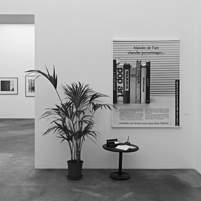
La Pétition de principe (The petition principle) is the title of a 1988 work attributed to Jacques Salomon in which one finds the business cards made for the “readymades belong to everyone®” agency. Presented in an elegant cardholder, itself placed upon a low table designed in a style very typical of the era, the cards are accompanied by a guestbook and a pen. Next to the table, an eye-catching green plant, and, most importantly, an advertising poster that reads : “Art History in search of characters”, and further down at the bottom : “Don’t wait another day to make History.”
It is a strange work, a readymade bit of conceptual art that looks as if it has been plucked out of a waiting room, and which invites the man on the street to actively participate : they can write in the guestbook, and acknowledge their initial participation in this vast fictional project produced by Philippe Thomas. They can also, of course, take a business card put it in their billfold alongside cards for their hairdresser, the Chinese restaurant down the road and members of their own professional network. By doing this they help lend reality to the “agency” whose history we should now briefly discuss.


The agency, initially called “readymades belong to everyone®”, first opened in New York’s Cable Gallery in December 1987. For the duration of the show, this rather trendy gallery was briefly turned into a reception area for potential clients. There was a sofa, a low table, two desks and a few chairs designed by Martin Szekely. There were yucca plants, of course, and posters recalling Philippe Thomas’s earlier work, as well as red velvet ropes – the kind so often seen in museums and banks – symbolically separating the gallery in two parts. And then there was Philippe Thomas himself, the artist-turned-agency director who, seated behind a desk, welcomed visitors and offered anyone who so wished the chance to become a notable figure in the history of art. It was child’s play : all that needed to be done was to buy a work of art from the agency, mostly reproductions of barcodes, and through this transaction, immediately become its author. For a few dollars one could become somebody, a very real heteronym – whatever that means.
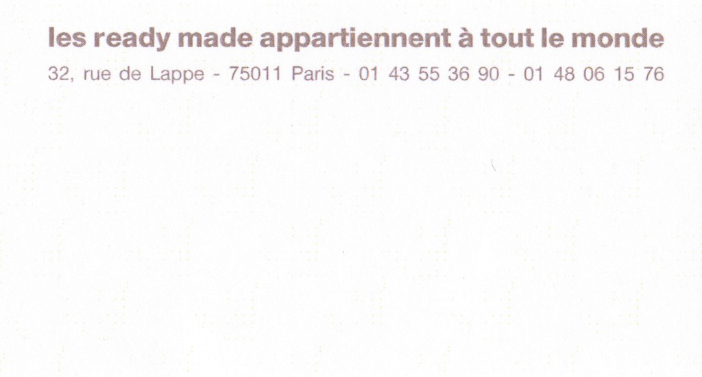
One year later the agency set up shop in Paris, in Claire Burrus’s gallery at 32 rue de Lappe, around the corner from place de la Bastille. The 1980s were shaped by an entrepreneurial spirit : to win you have to act, to paraphrase a slogan of the time by French entrepreneur Bernard Tapie ; don’t wait till tomorrow to make history. The project grew, publicity campaigns were entrusted to well-known agencies, a logo and a sign were designed, activities were assigned and schedules drawn up. The entire entrepreneurial ritual was worshipfully reified in order to appear as a potential work of art that could be acquired – the petition principle bought by Jacques Salomon comes to mind. By the time the agency closed in 1993, over thirty characters and projects had been brought into being “in cooperation with the readymade belongs to everyone® agency”, the most impressive of which no doubt remains the magnificent 1990 show, Feux pâles, at the CAPC Musée d’Art contemporain in Bordeaux. The museum as an institution, usually the guarantor of “neutral assessment”, thus found itself contaminated by fiction.
Jacques Salomon, La Pétition de principe (The petition principle), 1988. MJS Collection, Paris. Photograph copyright Ilmari Kalkkinen, Mamco, Geneva. Courtesy of the Philippe Thomas Estate, Jan Mot, Brussels and Claire Burrus, Paris.
In 2014, almost twenty years after its demise, Geneva’s Mamco organized a major retrospective of Philippe Thomas’s work, which I curated. I therefore came into contact with many of his “characters” and, in some cases, with their heirs who were unaware of the “heteronymical” aspect of their dearly departed. I also had to patiently explain to the ever-scrupulous representatives of the André Chenue packing and transportation company, and niggling customs officials, why the names of certain well-known collectors should in this case replace the names of the artists on the invoice. But I would have to get used to this kind of complication because, like Philippe Thomas, my last name is also a first name, and this often caused suspicion in official circles. Fiction interferes with everything, and to take part in any way, shape or form in the work of Philippe Thomas involves being ready to become a character yourself, to step through the looking glass and take part in a game of musical chairs between author, buyer and commentator.

Which leads me, naturally, to mirrors. From Alberti’s new myth of Narcissus, to Gerhard Richter and Velasquez’s Las Meninas, art history has taught us to view the mirror as a powerful symbol of painting. A potential surface for all images, all illusions, and more than anything it allows us to imagine what’s going on outside the picture, and to look lovingly upon that which the image cannot contain – including us as spectators. It is significant that Philippe Thomas used a mirror as his agency’s sign. His work as a whole is somewhat similar to a hall of mirrors, a kind of mise en abyme of the places assigned to each that offers a singular reflection of this 1980s entrepreneurial spirit. A trace of this specular theme can be found in the gray/silver ink used for the business card. Stating simply in Univers typeface that “les ready made appartiennent à tout le monde” it mimics the shape and dimensions of a pocket mirror used to check one’s makeup, or to check that the fiction is indeed holding up.