Upon receipt of a “meishi”, you say the giver’s name like this: “You are Mr/ Ms X.” If you can not read it or are not sure how to pronounce it, this is the time to ask.
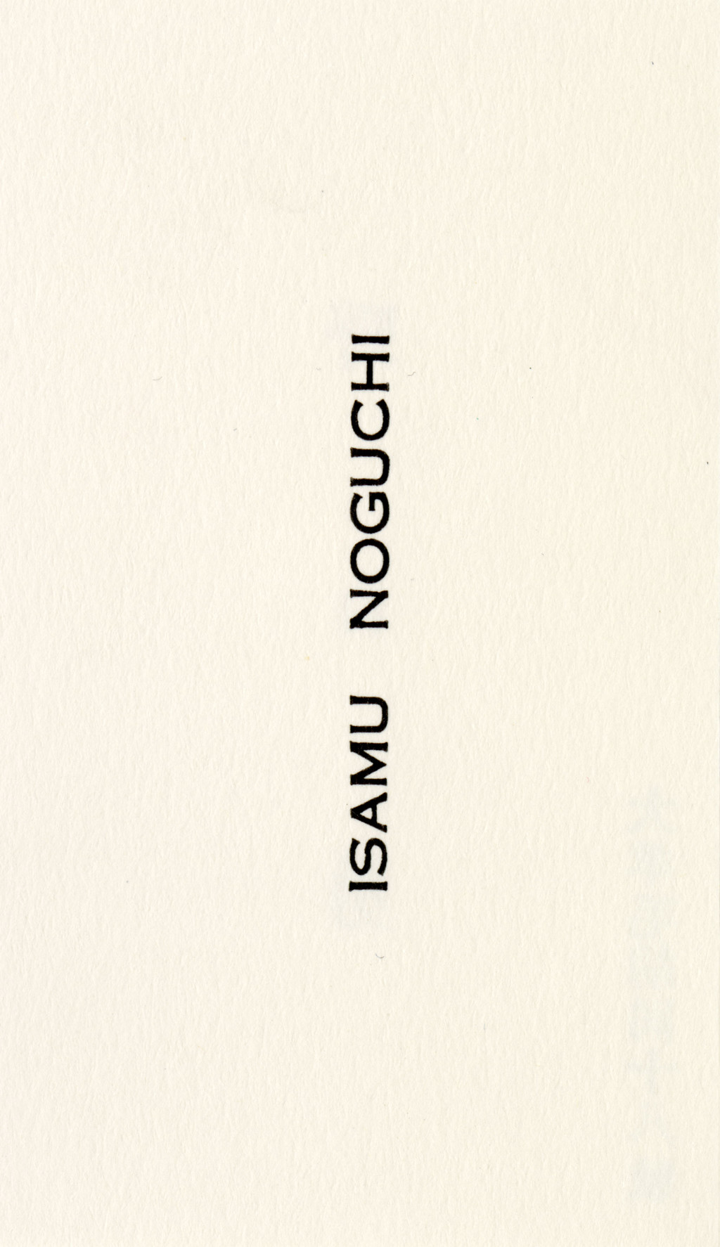
Sophie Gayerie — 1930: Young Isamu Noguchi, who was beginning to make a name for himself as a portraitist for New York art scene celebrities, had saved up enough money to set off for Asia, on a voyage he had been preparing for a long time.
Four years before that, on the recommendation of Alfred Stieglitz, Noguchi had applied for the newly-created Guggenheim Fellowship. In the description of his project he proposed to hone his sculpting skills in Paris, the epicenter of the avant-garde, then in India, China and Japan, where he hoped to find his way back to his roots : “My father, Yone Noguchi, is Japanese and has long been known as an interpreter of the East to the West, through poetry,” he wrote. “I wish to do the same with sculpture.”
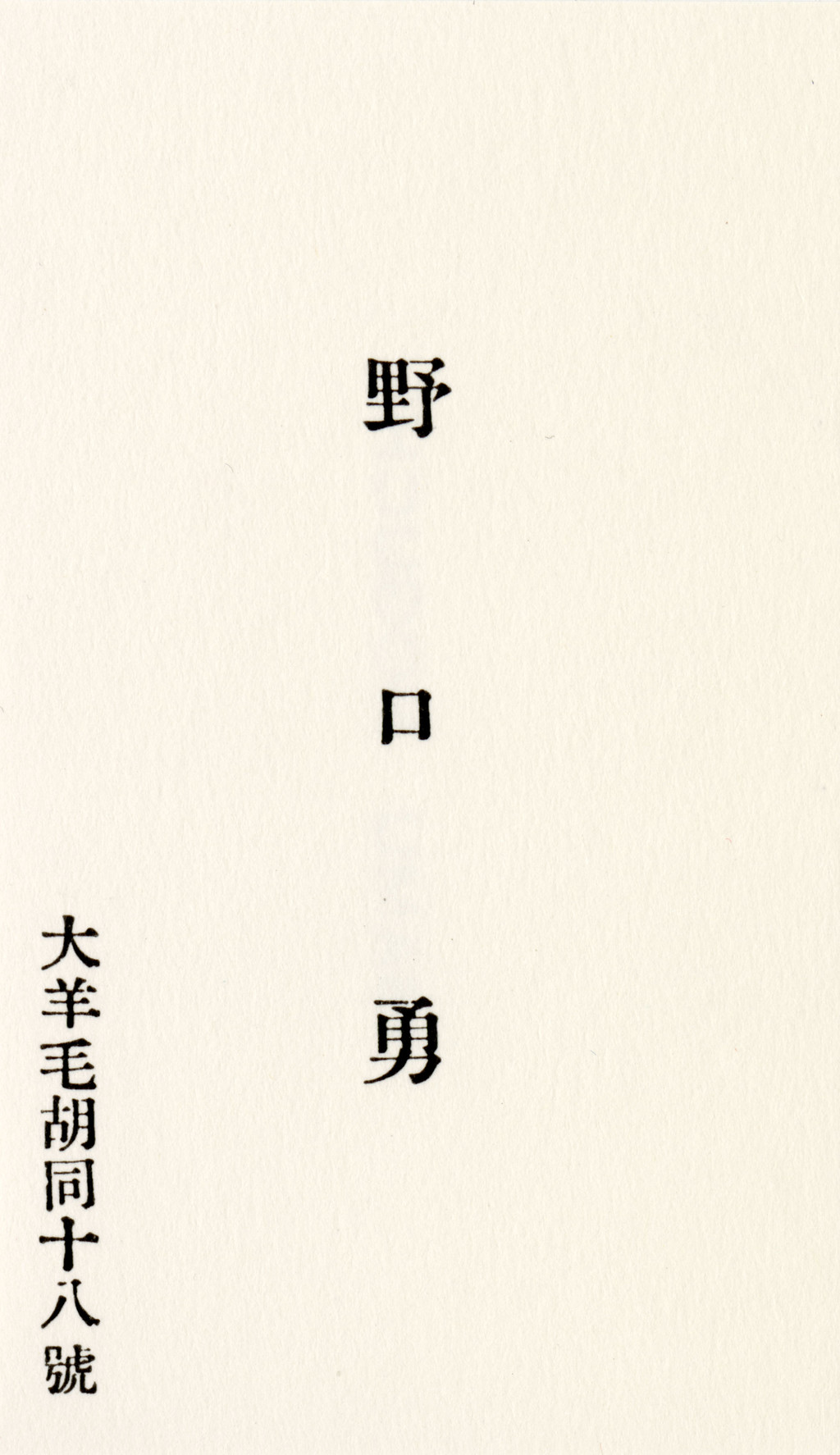
Too strongly attached to Paris, where he served as Constantin Brancusi’s assistant for several months, Noguchi postponed his departure for the East. When his travel scholarship expired in 1929, he was obliged to return to New York. In July 1930, after a year back home, he finally set forth on his voyage. Just as he was about to board the Trans-Siberian train, he received a letter from his father forbidding him from using his (the father’s) name in Japan – after dropping out of Columbia to sculpt full-time, the artist had changed his last name from Gilmour (his mother’s name) to Noguchi. Isamu then temporarily changed course : his new destination was Beijing. What remains of the artist’s eight-month sojourn in the Chinese capital is his business card and plenty of memories.
Isamu Noguchi — Without doubt there is no greater city than Peking. If my father did not want me, Peking had heart and warmth to spare. There must be a habit of welcome to the stranger. Friends appeared : Nadine Hwang, a beautiful lieutenant in the army of the young marshal Chang Hsüeh-Liang (who wanted me to become a general), Carl Schuster, Jean-Pierre Du Bosc at the French Legation and Wu Taitai. A house appeared (Ta Yang Mao Hutung 18), a cook appeared, speaking and cooking French as well as Chinese ; a rickshaw boy, a houseboy, and their families. All was run with incredible ease, and soon I was a householder studying Chinese in the mornings, and receiving merchants.
I began work by making a figure of a Chinese girl in dental plaster (the only kind to be had). Then, shifting to materials more natural to the place, I made enormous drawings with fantastic brushes and expressionist flourishes upon their incredibly beautiful paper. I did figure drawings, because that was what I knew how to do. How ashamed I was of my limitations when I visited the painter Chi Pai Shi, whom I had adopted as teacher. That autumn he painted grapes for me and some pale narcissus with the inscription : “Who says that flowers have no passion.” A painting, he said, is incomplete without a poem and without a seal. He first became famous for his seals, this carpenter who became a great painter. He gave me mine.
I was eight months in Peking, by which time my splendid living had reduced my resources precariously, and I decided to leave. I wanted to see something of Japan before my money ran out completely and I did not see why I should have the hesitancy I did, or why my arrival should ever be known. I resolved that it would be only a temporary absence from Peking, after which I would return to learn the art of the brush, learn how to be with nature, how to live.
Isamu Noguchi
A Sculptor’s World, New York, Harper & Row, 1968
(Passage quoted in extenso)
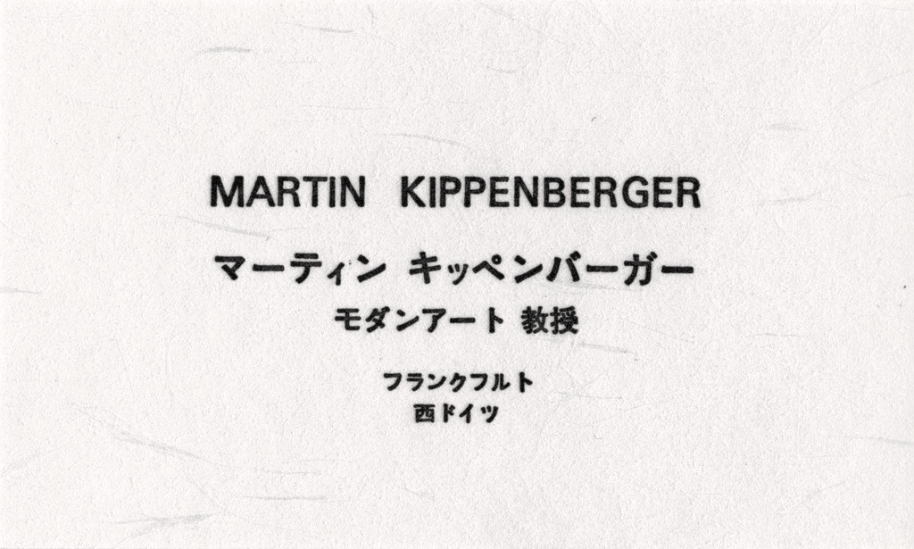
Daniel Baumann — In 1991, Martin Kippenberger traveled to Japan together with the artist Ulrich Strothjohann. Like Sandro Chia or Donald Baechler, he had been invited by the AC&T Corporation to realize a series of editions. In Kippenberger’s case this became, as often, a prolific output: one portfolio of 5 etchings (ed. of 35), one color drypoint with unique framing (ed. of 20), five large drypoints (ed. of 20), a card box multiple (ed. of 12), and 11 unique rubber reliefs. Remunerated with 100,000 DM it was good money in a time of crisis, as the effects of the 1987 stock market crash had reached the art market. Kippenberger asked to receive the sum in cash. Two clerks came to count one thousand 100 DM banknotes in front of Kippenberger, who was greatly enjoying his gangster movie moment (and the prospect of an anecdote). Later, the piles were sewn into a coat to bring the DMs back to Germany. Having a Japanese business card was part of the game, as playing a role was another thing he loved doing. The card reads:
Martin Kippenberger
[His name in Japanese]
Professor of Modern Art
Frankfurt
West Germany
[His name in Japanese]
Professor of Modern Art
Frankfurt
West Germany

Jutta Koether — Urgency remains, hard questions must be asked about life and art and all the rest while looking at Kippenberger’s new editions. […]
Hard questions must be asked, now. What are you doing with that rubber, Martin Kippenberger? Giving us some crooked peace signs? What are you doing with that drypoint needle? Scratching that crucified frog? He surely continues to create those significant dark-sweet aftertastes, an extract from his uncomfortable visual events. Pushing you to the edge where there is nothing but the settled non-depth of everyday reality.
Information is my business. There is absolutely no need to think in terms of some secret of art here. Or a key formula. Kippenderber’s work is facts and diversity. Makes factual diversity. Like serving bread only – no jam.
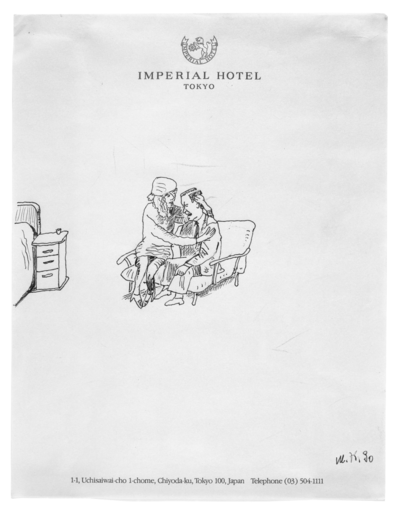
Martin Kippenberger, untitled (Imperial Hotel, Tokyo), felt-tip pen on paper, 1990. Copyright Estate of Martin Kippenberger, Galerie Gisela Capitain, Cologne.
Giving us the facts about irregularities included in the life which, in his case, happens to be of an artist too. Giving us some surfaces containing some apocalyptical sadness, but with funny undertones, giving us a cardboard box with eye-holes to look through. Inside a hand-shaped mirror in which you can see yourself. After working through the rubber and needle non-depth facts of life, you reach the sculpture, and get some depth. You’re ready now to see yourself…
This is what Martin Kippenberger likes to set up. That is how in-depth his art can go. He is helping you find a place to start. Kippenberger is behind the box, the rubber, the etchings. The artist is left behind, but still restless, saying “I had a vision”. After all !
With all that art, you might come close to a vision too. What is it all about, Martin Kippenberger ? It’s getting ready for some big visional/visual aid.
Pierre Leguillon — The second edition of the monograph containing an overview of Irma Boom’s graphic work, published in 2013 by Lecturis in Eindhoven, the Netherlands, counts 800 pages. However, at 4.3 × 5.5 cm it is even smaller in size than her visiting card.
On the cover, the same simple “BOOM” as on her card, in capital letters – no doubt cut out of paper –, a logo that was designed for her by the architect Rem Koolhaas. It is difficult not to see it as a homage to the lettering created by the great Dutch maker of art books : Willem Sandberg. Indeed, these letters are reminiscent of the gigantic blue and red torn-paper letters, reproduced on tiles, that run along the platform of the Waterlooplein Metro station in Amsterdam, that have been part of the city’s collective imagination since 1977.
It is, then, a “book-as-object”, and a “book-as-boundary”, like most of Irma Boom’s work, which includes some 265 publications, and places her work well beyond graphic design.


On page 234 of this tiny monograph one finds Project Japan: Metabolism Talks…, by Rem Koolhaas and the curator Hans Ulrich Obrist, which was published by Taschen in 2011. It was for this project that Boom had a Japanese version of her card printed – an indispensible accessory given the highly ritualized nature of greetings and introductions in Japan.
Project Japan is proof that, despite the great sophistication and occasional difficulty in producing these works, Boom is able to meet the challenge of large-scale print projects. As with many of her other books, special attention is paid to the edges that appear in various shades of pink, green and gray. Indeed, pages edged with different colors allow one to navigate with ease each section or sub-section of this study, carried out in Japan by the two authors over more than six years.
The recycled paper on the cover and inside pages echoes the manifesto book Metabolism: Proposals for a New Urbanism, that was published in 1960 and laid out by Kiyoshi Awazu. But the overprinting of text in fluorescent ink gives the book a very contemporary feel and helps differentiate the various topic sections : orange for history, pink for interviews etc. Thus, despite the density of information, finding one’s way around the book is very easy.
It seems Irma Boom is never more comfortable than when dealing with enormous – and very varied – amounts of information : maps, photographs, posters, books, diagrams, summary tables etc.
“Lots of books nowadays and printed material could go digital, because they already look like a pdf. I want to make a difference by experimenting with materials, sizes and weight. The cover material we’ve been using for a while now, enhances this idea. Escaping the pdf and finding a legitimization to print is something I’m investigating all the time. For the Project Japan book we used a gray board for the cover, and used recycled paper as a reference to the original Metabolist manifesto. But to find a reason that a book has to be printed, that’s for me a really important issue. I am happy about the new developments with iPads and tablets and the effect it has had on book design. It gives me space to work on the redefinition of the printed book and use the non-linear structures that new media have introduced.” (Interview with Irma Boom by Arjen Oosterman, March 9, 2012, Amsterdam, Archis, Volume magazine blog).
The book is made up of interviews with the movement’s surviving architects : Arata Isozaki, Kiyonori Kitukabe, Noboru Kawazoe, Fumihiko Maki, Kisho Kurokawa, Kenji Ekuan and Atsushi Shimokobe. The intention of the two editors, Koolhaas and Obrist, was to embody, in book form, a kind of oral transmission of the history of architecture, and for Irma Boom, it was to find a format capable of visually translating a living dialogue.
Irma Boom worked continuously with her assistant for a year and a half on this book : “It is a very dense, layered book, almost a classic book, there is so much information. That’s something you hardly see nowadays, normally it is always spreads with images. It is of course a challenge to get a homogeneous book with so much different information. The book was designed during the process of developing the content. I don’t know how many prototypes we did, maybe 100 or 150, no idea, but many ! All the time the book became more and more clear design-wise. […] We had to make so many design decisions, find a form for so many details. It’s the most exciting, intense and complex book I have designed for years. Every page is different and designed : 704 pages long.”
The book was also published in Japanese the following year. When one considers that the Japanese contributed greatly to new representations of international modernist architecture – in particular Yukio Futagawa through GA (Global Architecture) magazine published in Tokyo since 1979 – one could see Project Japan as the desire to give back to the Japanese their history and their place in history, in the face of, for example, greater media coverage of the English movement Archigram.
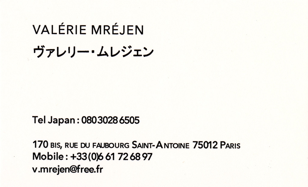
Fabienne Radi — French artist Valérie Mréjen had a business card printed in 2010 while she was in Japan making two films with Bertrand Schefer (ABCDEFGHIJKLMNOP(Q)RSTUVWXYZ and Exercice de fascination au milieu de la foule [Exercise in fascination in the middle of a crowd], 2011). The telephone number is that of her Japanese cell phone, which she only used for a month while shooting in Tokyo. In these two films we see long static shots of the faces of shibuyettes, those shy gaudy-looking girls who walk up and down the sidewalks of the Shibuya district in central Tokyo. “The Japanese all have business cards, which they hold out in both hands,” explains Mréjen. “To approach these girls, we had to be able to give them a card of our own. We had to be able to reach them or be reachable during the shoot.” Mréjen has no card in Paris. She writes her phone number on whatever she can find in her bag, a Metro ticket for example.

In the first chapter of Empire of Signs, Roland Barthes calls the sensation he felt upon arriving in Japan a secousse du sens, a “jolt of meaning”. This is what one might experience in any of Valérie Mréjen’s works, whether videos, objects, installations, films, artists’ books, novels. While her references are manifold, including every possible genre (the Manufrance mail order catalog, the films of Jacques Tati, Jean-Luc Godard and Jean Eustache, soap and candy wrappers, the design of useful everyday items of the 1960s and 1970s, stationery…), the effects of her works are as subtle as they are sustained. There is no frontality, but an extreme precision in everything she does, which may be regarded as her Japanese side. She also has affinities with a certain Belgian spirit, though, that explores the realms of the absurd and burlesque. Reading her Liste rose (2007) aloud is an interesting experience that always has a certain small effect. She cut names out of a telephone directory (another everyday object that has disappeared), then rearranged them in such a way as to construct bizarre phrases inspired by want ads in the newspaper. Her strategies are drawn as much from Georges Perec’s Think/Classify (1985) as from Roland Barthes’ Mythologies (1957).
What is special about Valérie Mréjen is her ability to keep things at arm’s length even while observing them very close up.
Roland Barthes
Empire of Signs, New York, Hill and Wang, 1983