When we’d go out to social events, like art openings and museum parties, I’d dress up in one of my thrift store suits, put on a false mustache and weird glasses, fix my hair so it stood out all over the place, and become Biluxo Benoni.
Xiaoda Wang — On March 18, 1968, Ray Johnson mailed a Johnson City Holiday Inn envelope to the Surrealist practitioner Charles Henri Ford. Written on it was an invitation to the first meeting of Johnson’s New York Correspondence School, a network of friends and acquaintances participating in his “mail art” project. (Other correspondents included in this book are his former Black Mountain College teachers Anni and Josef Albers, artist Joseph Beuys, George Maciunas, Claes Oldenburg, Ed Ruscha, curator Harald Szeemann etc.) Inside this envelope was an unassuming business card for the Peter Jarema Funeral Home in New York. Like many of the objets trouvés and moticos that Johnson sent his correspondents, the verso of this funeral home card was emblazoned with his characteristically simple bunny motif. Under this bunny, the artist had stamped “Ray Johnsong” (the “song” being “Return to Sender” by Elvis Presley), one of his alter-signatures that he had invented in the 1960s. Rather than identifying the artist, this business card points to the cracks of identity itself.


The first known appearance of a drawn bunny in Johnson’s correspondence dates back to 1964, and it had since become a common signifier of the artist himself. “Why a bunny ?” asked Lucy Lippard once rhetorically about its iconography, knowing that whatever lay behind it was never meant to be exhumed. Rather than simply serving as a commercial logo for the artist, the bunny becomes a Dada-inspired symbol of nonsense – emptied of meaning – that can be mobilized to deconstruct and devaluate signification, such as those of identity and history. In his 1973 exhibit Ray Johnson’s History of the Betty Parsons Gallery, Johnson listed the names of all the artists represented by the Betty Parsons Gallery under indistinguishable drawings of the bunny. Reminiscent of Max Ernst’s Une Semaine de Bonté,this series of therianthropic portraits mobilized Surrealist humor and absurdity to reveal the subjective construction of history and trivialize its “objectiveness”. According to Johnson, history is “a very loose subject in which anybody can declare that anything happened at any time at all”, and his bunny list is as much a “history” of the gallery as that written by art critic Lawrence Alloway. Likewise, the bunny on the business card affirms subjectivity as a similarly loose construction embedded in language.
![Ray Johnson, untitled Xerox mailing (April 5, 19…, The New York Corraspondence [*sic*] School died), probably 1973. Copyright Ray Johnson Estate, courtesy of Richard L. Feigen & Co., New York. - © Oracles: Artists’ Calling Cards](https://oracles.editionpatrickfrey.com/media/pages/chapters/deal-two/xiaoda-wang/0448e87df9-1565432868/ray-johnson-400x.png)
Ray Johnson, untitled Xerox mailing (April 5, 19…, The New York Corraspondence [sic] School died), probably 1973. Copyright Ray Johnson Estate, courtesy of Richard L. Feigen & Co., New York.
A self-proclaimed fan of Kurt Schwitters, Johnson adapted his idol’s collage techniques – by combining the funeral business card, the rabbit and his alter-signature – to pronounce the death of the unified subject. Aptly, the same Johnson City Holiday Inn envelope also contained page 5 of his Book about Death, a collection of prints that were mailed separately to recipients, thus preventing anyone from receiving all the pages. Death becomes the final moment of the book’s unification, when all the pages are bound and deciphered as a whole. For Johnson, subjectivity has more to do with the structure of language than with the Enlightenment tradition of transcendental free will. In 1990, five years before Johnson’s final “performance” when he drowned himself in Sag Harbor, Long Island, he announced, “European artists are receiving information about the death of Ray Johnson. But they are not fooled. They know what conceptualism is all about.” Through the constant self-remaking of his art practice, such as with his business card, Johnson rejected subjectivity’s illusive unity and embraced its chaos and multiplicity.
Earlier in 1968, Johnson wrote to Leslie Sue Evans : “I would suggest you with haste jot a line to Richard C., my alter ego at 34 Montrose Court, Johnson City, Tennessee 37601, ask for a fake Ray Johnson or anything and you’ll hear from him.” Another way to reach him, as the business card had suggested to Charles Henri Ford, was to ring the funeral home and ask for a bunny or Ray Johnsong.
Ray Johnson
Ray Johnson Catalogue Raisonné, New York, Karma, 2014
Ellen Levy
What’s in a Name? Ray Johnson’s Free Associations, edited by Frances F.L. Beatty ; New York, Richard L. Feigen & Co., 2011
Lucy R. Lippard (ed.)
Six Years: The Dematerialization of the Art Object from 1966–1972, New York, Frederick A. Praeger, 1973
Chus Martínez
Ray Johnson: Please Add to & Return, Barcelona, MACBA, 2009
Elizabeth Zuba (ed.)
Not Nothing: Selected Writings
by Ray Johnson, 1954–1994,
New York, Siglio, 2014
Moritz Küng — Early in his career, in 1981, a year after leaving the Academy of Fine Arts in Vienna, Heimo Zobernig (b. in Mauthen, Austria, 1958) had some business cards printed bearing only the name “Dr. Sommer” in a joined-up font called English Palace. He used them to proffer his services as a lifestyle counsellor to foster positive thinking and change people’s lives for the better. After handing out his business cards for years, Zobernig began numbering the last remaining forty-odd cards to suggest that a business card can do more than merely transmit information, it can be valued as an artwork.


Zobernig’s enigmatic pseudonym calls to mind “Dr. Jochen Sommer”, the pseudonym used by German physician, psychoanalyst and catechist Martin Goldstein for an advice column in the German teen magazine Bravo. First launched in 1969, Goldstein’s column soon proved so popular that extra editorial staff had to be hired to process up to five thousand readers’ letters a week. At its peak in the 1980s, Bravo employed a whole team of advisors under the pseudonyms “Dr. Alexander Korff”, “Dr. Kirsten Lindstroem” and “Dr. Christoph Vollmer”, each specializing in a different field (relationships, puberty, sexual practices and psychoanalysis). According to Zobernig, he was not aware of this high-profile use of the Dr. Sommer pseudonym at the time.
In an early catalog published in 1987 by the Ralf Wernicke Gallery in Stuttgart containing 12 tipped-in color plates of his paintings, Zobernig re-used the English Palace font on the frontispiece as well as his pseudonymous Dr. Sommer persona. In this light, his abstract paintings based on simple geometric forms in a limited range of colors (black, gray, red, orange, yellow, brown, blue) and shapes (dots, bars, lines, circles, segments) could be interpreted as psychograms.
In his many years of artistic practice, Zobernig has tailored for himself a chameleonic spectrum of roles, shifting freely between producer of artists’ books, self-taught graphic designer, amateur branding expert and (para)scientific art theorist. This versatility is particularly conspicuous on the front and back cover of his first major retrospective catalog. While the blurb on the back lists all the artistic domains in which Zobernig has been active so far (painting, color theory, sculpture, spatial design, architecture, graphic design, interior design, performance art, video, exhibition and set design), the front cover bears the deliberately misspelt title Austelung. Katerlog (instead of Ausstellungskatalog – i.e. “Exhibition Catalogue”). These orthographical high jinx are accentuated by the outlandish cover photo of Zobernig as a flamboyant bohemian sporting an open-necked white shirt, cool sunglasses and a horseshoe mustache. Along with the misspelt title, this 1989 portrait is jarring and, like most of his other catalog covers and titles, raises questions about the very possibility of communicating so-called neutral information. Some years later, two other photographs of the artist shot at the same session in 1989 were used for a limited C-print edition and the inside cover of the catalog Stellproblemen (literally “Placement Problems”), on which he once again intentionally misspelt the title (spelt correctly, Stellproben, the title means something completely different : “Blocking Rehearsals”), thereby referencing his own previous intentionally misspelt titles as well as his multiple identities.
Eva Badura-Triska (ed.)
Heimo Zobernig, Vienna, mumok ; Cologne, Verlag der Buchhandlung Walther König, 2003
Moritz Küng (ed.)
Heimo Zobernig: Stellproblemen, Cologne, Verlag der Buchhandlung Walther König, 2009
Marie de Brugerolle — On the front of Larry Bell’s visiting card, that probably dates from 1978, is a photograph of two men sitting on a sofa, in which we see part of one of his Vapor Drawings, from the artist’s Ellipses series, hanging behind them.
The man on the left seems stuck at the edge of the card, an arm folded on his knees, his head pressed into his hand, eyes glancing over to the opposite corner of the card, wearing what could be an expression of weariness, boredom or despair. Maybe he is looking at the other person ? This individual, more open and expressive looking, is seated at the other end of the sofa, an arm and hand are opened wide, his palm facing upwards, as he calls out to his taciturn speaking partner.


The man on the right wears a brown Panama-style hat with a large black and white striped band. Besides this headwear and a jacket that completes his outfit, he wears the same as his neighbor : brown shirt, black leather waistcoat and beige trousers. They are the same person in two radically different poses, like the two faces of a split personality.
The card reads “Dr. LUX”: a pseudonym that invokes light and reinforces the dual nature of the owner of this card, between night and day. Could we be dealing with a Doctor of Light, a kind of spiritual guide ? Might he be here to choose between “the white and the black”, to use his light to heal, which could be interpreted as a “spirit” or “spirituality” ?
What we see here could be an illustration of the dichotomous position of the artist, who is always between two things ; or even a nod to Marcel Duchamp’s Soigneur de gravité (Juggler of Gravity), that instructs us to “guérir par le rire” (heal through laughter) – a homophonic word game on “Gai-Ris-Donc” (after the French word guéridon, or “occasional table” in English). We know the extent to which Duchamp’s Large Glass can be seen in Larry Bell’s glass panels – Duchamp who visited the young artist in his studio in Venice, California, and later invited him for tea in New York. This mirroring is symbolic, in as much as The Large Glass or The Bride Stripped Bare by Her Batchelors, Even (1915–1923) are breaches of reality, breaches that Larry Bell would redeploy for his first “box” in 1958.
And if light is the artist’s medium, one could see Dr. Lux as the artist’s heteronym : going from being listed as Ben Lux in the Los Angeles phone directory to the more mature Dr. of Light ; it is also a parody of the usual misunderstandings in the reading of Larry Bell’s work, and the constant connection made to the Light and Space movement (Eric Orr and Doug Wheeler are friends who he has collaborated with) or even to Minimalism.
The explanation, the real story, the anecdote, is much more literal but says a lot about the artist. Passionate about music and a great player and collector of folk guitars, Larry Bell was listening to a DJ from Los Angeles mix folk bands and pop songs. Particularly liking the band The Weavers, he decided to buy one of their records for “The Benoni Song”. From this, came a new nickname : making fun of Bell’s new obsession, one of his friends decided to call him Benoni.
At that time, Larry Bell wore second-hand clothes and shoes and would often disguise himself. He would wear false mustaches, like in Ed Ruscha’s film Premium (1971), or wear suits like the ones seen in the photographic portraits taken by his friend Dennis Hopper. He explained the appeal of disguises by his taste for the absurd and a kind of schizophrenia inherent to youth, the experience of being someone else for a day. This sartorial extravagance earned him the nickname Luxury. One of his artist friends, Billy Al Bengston, shortened the alias to Lux. Gradually, these two pseudonyms merged to make Ben Lux.
Larry Bell — In my other life, I was hanging around artists like Kenny Price and Billy Al Bengston – that whole group of people. Bengston and I would go on these thrift store sojourns to buy duds. If he bought one suit for ten cents, I would buy twenty. Whatever money I got I just spent. If we all went out to dinner I’d pick up the tab – even if I had no money at all. Those guys started calling me Luxury because of that extravagance. I introduced Judy to them and she put the two nicknames together as Biluxo Benoni. I began playing that character called Biluxo Benoni. I think I did it because I felt I had to be a special kind of person to satisfy myself in the presence of these great people like Bengston and Price and Irwin. When we’d go out to social events, like art openings and museum parties, I’d dress up in one of my thrift store suits, put on a false mustache and weird glasses, fix my hair so it stood out all over the place, and become Biluxo Benoni.
Sometime later, Billy Al shortened Luxury to Lux. Somehow in the process I ended up Ben Lux. From then on, I became that character. I hid out in a lot of places as Dr. Lux, sometimes as this kid from the San Fernando Valley. Then, at a certain point I decided to stop dressing up and just be me ; for one reason or another, the name Ben Lux, or Dr. Lux, just stuck.
Douglas Kent Hall
“Strange Days: Conversation with the Doctor”, Zones of Experience: The Art of Larry Bell, Albuquerque, Albuquerque Museum, 1997 (Passage quoted in extenso)
Max Nordau — Whistler’s lifework reveals more than that of any other artist in our times the deep, organic primitiveness of his genius as a painter. We can observe in him, as in a school text, the psychology of the born painter. His signature is at one a fine example of the association of ideas on the part of a visionary. It consists, as everybody knows who has seen Whistler’s works, of a butterfly with evenly outstretched wings. People have insisted on seeing heaven knows what symbol in this, and have consequently sought the wildest and remotest explanations of it. If any one asked the master for an explanation, he laughed, and made a mysterious gesture of refusal. It gave him vast entertainment to see his admirers tormenting themselves with profound attempts at interpreting it. They just had no eyes ; they could not see. The butterfly is nothing but the first letter of Whistler’s name – a big W. A Gothic, ornamental W with the two side lines bellied out and a bar in the middle reminds one strikingly of a soaring butterfly with its cylindrical body between its outstretched wings. The definite association of ideas from similarity of form made Whistler, as he painted the W of his signature, think of a butterfly, and he henceforward formed this picture that was fuller in expression, disregarding the original letter, which seemed to him balder and more meaningless. The butterfly came to the front more and more as the W went further and further back, and it is possible that at last Whistler himself forgot the point from which he started.


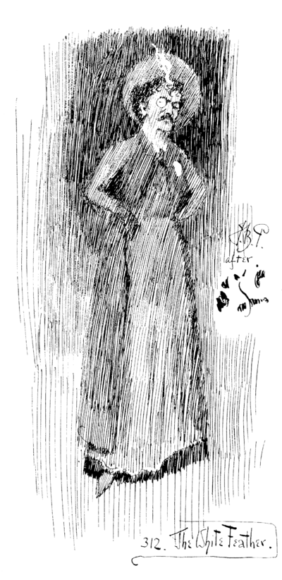
The White Feather, caricature of Neill Whistler by Sir John Bernard Partridge, from an album containing press cuttings compiled by J. M. Whistler, 1878–1885. Courtesy of the University of Glasgow Library, Special Collections.
Max Nordau
On Art and Artists, London, T. Fisher Unwin, 1907
(Passage quoted in extenso)
Nicole Marchand-Zañartu — I knew him as Cassandre, a name the young poster painter had picked to make his mark in memory of King Priam’s incorruptible daughter and which sounded like a thunder clap even on this little calling card, on which the initials A. M., placed before the name, clouded the issue. Cassandre was no longer hiding out in the temple of Athena. He even lived in a house built by August Perret at 11 rue Albert-Joly, in Versailles. And he had a first name, which prophets and prophetesses, Greek or otherwise, seldom possess. Well, not really a first name, but an acronym. Which made for two characters in one: A. M. for Adolphe Mouron alias Cassandre. One, no doubt, to converse with the other. When in 1929 Cassandre proclaimed in radically Corbusian terms, “The poster is not a painting, it’s a machine for making announcements,” Adolphe Mouron tempered the assertion: “The point is to elicit in the viewer much more than a fleeting visual sensation: an emotion, conscious or unconscious, in any case obsessive. The point is to take them unawares, by surprise.”


Blaise Cendrars had detected the presence of emotion in Cassandre’s work. The novelist was probably thinking of his friend’s work when he came up with the equation Publicité = Poésie (Advertising = Poetry) in a lyrical prose piece in 1927. This newcomer, extolled as a veritable “strategy of desire” after the war, bore well the name Cendrars had given it : “flower of contemporary life” (Marcin Skibicki, “‘Publicité = poésie’, l’équation de Blaise Cendrars dans l’œuvre d’A. M. Cassandre”, Université Nicolas Copernic de Torun´ , Synergies Pologne, No. 12, 2015). Its success burst forth on all the walls. We were a far cry from Nadar’s worries in 1900 about whether the word réclame (ad) would strike gold.
It was a subtle alchemy of rigor and invention that Cassandre brilliantly distilled in his pictures, which remain engraved under our eyelids to this day. Take Dubo, Dubon, Dubonnet in the Metro tunnels, for instance. Nothing was more thrilling as a child on the Metro than to wait with bated breath, eyes glued to the window in frozen anticipation, to catch sight of this little cubo-futurist fellow pouring himself a glass of vermouth. And that great big steamer, the Normandie, built in 1935 (and propelled by 160,000 horsepower). Cassandre opted to show only its immense prow. It was enough just to look at the mighty vessel to feel you were out on the open sea crossing the Atlantic. And then there was that little Nicolas chap with his big blue apron slipping down his legs, which are a bit crooked from lugging all those bottles, five in each hand.
So much for Cassandre’s first life. Then Adolphe Mouron literally returned center-stage. He cast off rule and compass, that sublime asceticism, which, however, had silenced his painterly gift : “The poster requires of the painter complete renunciation.” And he embarked on a new adventure. This was 1933. Louis Jouvet had just revolutionized the theater with his Cartel des Quatre (an informal alliance begun in 1927 between four influential Parisian theaters and their directors), commissioning Cassandre to design sets and costumes for his staging of Jean Giraudoux’s Amphitryon. This foray was followed by a wide range of productions in which he displayed his talent and incredible elegance : comedies, operas, ballets. And those hybrids, the stuff dreams are made of, such as Magie-Divertissement (Entertainment-Magic), Féerie chorégraphique (Choreographic wonder). This man, who had watched the birth of so many artistic movements and styles, which had in turn beguiled and influenced him – Bauhaus, Dada, Surrealism –, had found his spiritual master in Mozart. Don Juan, for which he designed the costumes and set, was performed thirty-five times at the festival in Aix-en-Provence : “I wept”, he said on the subject of Mozart. “But what for ? I had to console myself afterwards. Do it the way I did : weep, weep your heart out, but then take comfort. Consider that it was willed by the Almighty, and what are we to do against him.” (A. M. Cassandre, “Memento Feuilles Mortes I”, Journal (1958–1966), 1959 ; A. M. Cassandre official website).
Paulo Pires do Vale — Little is known about this writer born in Lisbon on June 13, 1888 – the same day as Fernando Pessoa – and who died, before his time, at twenty-odd years of age.
For family reasons, he expressed himself first and foremost in English.
The oldest texts we know he wrote date from 1906.
Besides many poems, he is the author of short story “A Very Original Dinner”, and some of his correspondence has surfaced. He was responsible for the translation to English of El estudiante de Salamanca (The Student of Salamanca) by José de Espronceda, but which he never finished.
He was interested in philosophy (having written an essay entitled “The Philosophy of Rationalism”) as well as in the Portuguese politics of the time (as is reflected in an essay project going by the name of “The Portuguese regicide and the political situation in Portugal”). He was critical of social conventions and the Catholic Church in particular (as the text “The Mental Disorder(s) of Jesus” shows). He also went under the pseudonym (or alter ego) of Caesar Seek, who announced the imminent publication of “The Memoirs of Caesar Seek” or “The Black Book of Caesar Seek”, but which never saw the light of day.


In his personal library he left in his name some twenty works – incorporated by Pessoa into his own library – and which serve as ample proof of his aforementioned interests. It is not known how they fell into Pessoa’s hands, but as far as can be ascertained they were friends or at least knew each other. Fernando Pessoa, who one can imagine admired his free spirit and courage, compiled Search’s oeuvre into a number of different volumes : “Death of God”, “Delirium”, “Documents of Mental Decadence” ; and wrote an impressive poem about him called Epitaph, in which he highlights Search’s solitude and rebellious temperament :
Here lies Alexander Search
Abandoned by God and man
Who suffered and wept at
Nature’s scorn.
He bowed not to state or church,
Not to God, woman, man or love,
He bowed not to the earth below or heaven above.
His knowledge did to this amount:
[…] for love there is not
And in this world nothing is sincere
Save sorrow, hatred, lust and fear
And even these are outdone
by the ill they cause.
He died at twenty-odd
And these were his last words
Accurst be Nature, Man and God!
There are those who claim Search never existed – but we have no reason to doubt Pessoa’s word! Further proof of his existence is a card in his name with an address at rua de Bela Vista (Lapa), 17, 1st floor, in Lisbon. Nonetheless, certain witness statements have said they heard Pessoa confess, before he died, “Monsieur Search, c’est MOI!” – and what’s more, the address given was the same as that of his grandmother Dionísia on his mother’s side, with whom Pessoa lived in 1907 at the time of founding his publishing and type-setting business “Empresa Ibis – Tipográfica e Editora”: is it possible that this card was nothing but a print run for some heteronym of his?


Fernando Pessoa
Poems, translated and edited by Edwin Honig and Susan M. Brown ; San Francisco, City Lights Books, 1986
Alexander Search
Poesia, Lisbon, Assírio & Alvim, 1999
Oskar Schlemmer — Doctrine: what suits me is the richly flowing, sonorous, pastoral “organ sound”. A pitfall: the expressive ; theatrical posturing. And now, with my new pictures, the danger of falling into mannerism. How does Schinkel put it ? “One is really original only when one is searching.”
Oskar Schlemmer
“Diary March 21, 1931”, The Letters and Diaries of Oskar Schlemmer, Middletown, CT, Wesleyan University Press, 1972
(Passage quoted in extenso)
Carrie Pilto — In the space provided by this small carte blanche, Henri Matisse placed a reproduction of his signature: an allusion to his profession, and an affirmation of the position he had attained in Paris, capital of the arts. Below it, he included the two addresses at which he could most likely be found living and working between 1914 and 1920, depending on the time of year: one in the suburbs and one in the city. In these three lines of black ink, and in the negative white space around them, we can visualize much of his life and work.


The card is simply printed, like the business card of a craftsman or merchant, rather than engraved, a costlier statement reserved for the upper classes. The quality lies in the signature, gently leaning to the right, connected through the middle, and ending in a controlled flourish or arabesque. If handwriting is related to drawing, then signing is something closer still – a calligraphic representation of oneself, and Matisse would arguably become the greatest draftsman of his time. And if giving one’s card is a performative act, meant to engage a relationship, this virtual signature is seductive, a tease ; one longs to see Matisse’s hand continue the arabesque, to follow, as he says, the “desire of the line” onto a sheet of papier Ingres. He confided that “My line drawing is the purest and most direct translation of my emotion” (Henri Matisse, “Notes of a Painter on his Drawing”, 1939, Trivium Art History website), and for those who know how to look, it “generates light and value differences on the paper that correspond to color”. The signature tells us something then of his search to reconcile line, feeling and color that would never cease to preoccupy him, until he happily discovered their synthesis towards the end of his life, in his cut-outs.
But what of the hyphen in the signature, between his first and last names ? It is strange, even in French. Hyphens are used to indicate a compound first name (e.g. Marie-Pierre) or to regroup multiple last names (Marie Pierre-Dupont). To link first and last names as Matisse does runs counter to logic, as the whole purpose is to distinguish one from the other. Matisse’s “–” belongs to a time we can barely imagine, a time before there was only one Matisse. It recalls the grueling quasi-anonymity in which he tried to live from his painting in the early years of his career, a time before he could afford calling cards. It was the period in which he first lived at the second address on this card : 19 quai Saint-Michel, Paris. This was Matisse’s home base from around 1895 to 1907. From his high window opening onto the Seine, he could paint the view of the busy pont Saint-Michel to the left, or the timeless facade of Notre-Dame Cathedral to the right, testing out various Impressionist and Post-Impressionist styles, searching for his language.
It was a highly competitive environment for painters in those years, and the annual Salons were the testing grounds. In 1904, the list of exhibitors at the Salon d’Automne includes, under the letter M : Auguste Matisse (no relation). Who today can call to mind the work of Auguste Matisse ? Back then, his future looked promising, and the two artists were often confused. Auguste was three years older than Henri, and the two had been exhibiting contemporaneously at the various Salons since 1896. The more established Auguste grew tired of the mix-ups, and of receiving the other Matisse’s mail. Sometime near the end of 1904, they agreed that Henri would use the hyphenated Henri-Matisse to distinguish himself, and appear in the catalogs under the letter H. (The hyphenated signature can also be found on many works made before 1904 ; Wanda de Guébriant of the Matisse Archives confirms that these early efforts were signed only later, after that date.)
Henri made a name for himself the following year, at the Salon d’Automne of 1905, when he and his group of friends unleashed their wild brush strokes and pure colors in the scandal-making cage aux fauves. The painting that most fascinated the public, and attracted the most scorn, was a hallucinatory portrait of Henri’s wife Amélie in an extravagant blue hat, with a slash of red for an upper lip and a long stroke of green to contour her nose. Woman with a Hat (1905, San Francisco Museum of Modern Art) was painted at 19 quai Saint-Michel just before the opening of the Salon, and signed green on green, “Henri-Matisse”.
Auguste would surely have wanted to distance himself from the indignities heaped on his homonym. “To not look like his namesake Henri Matisse, who loves color, Mr. Auguste Matisse makes his paintings ever blacker”, wrote one commentator on a later edition of the Salon des Artistes Français. “The two Matisses know each other”, he added, “and when Auguste met Henri, who was then very much under attack : ‘Let us always use our first names,’ he would say, ‘It’s better. That way they will not confuse us’.”
In the years that followed the agreement, Henri Matisse’s identity seems to have floated back and forth. In the Salon d’Automne catalog of 1906, for example, Auguste is absent, and Henri Matisse (no hyphen) is back on the list of exhibitors under the letter M. The paintings he exhibits, however, faithfully display his nom d’artiste, including the vibrant Still Life with Red Carpet (1906, Musée de Grenoble), signed red on red “Henri-Matisse”.
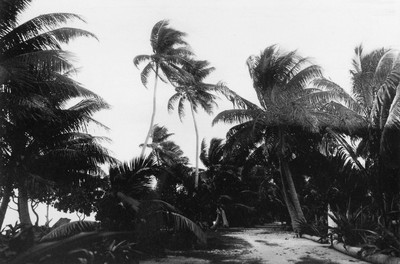
Henri Matisse, Tahiti, b/w photograph, 1930. Inscribed on the reverse: “J’ai fait plusieurs fois la même vue. Je n’étais pas certain de la pose.” (I took the same shot several times. I wasn’t
sure of the pose.) Photo: Archives Henri Matisse.
© Succession Matisse / 2023, ProLitteris, Zurich
Alas the nuisance continued, with Auguste writing to Henri, whose fame was growing, especially abroad : “You can’t get it into the head of these blessed Berliners, Münchners and other Teutons that there are two Matisses, or rather that there is only one – who is called Henri-Matisse. […] As always, but especially since last May, when I won a first-place medal, not a week passes that the Germans (who absolutely ignore me otherwise) don’t ask me for reproductions of my paintings in the Salon by sending me your photograph to initial !” The situation takes on further comic proportions in a follow-up letter where Auguste laments : “I was invited in your stead to exhibit in shows in other countries. […] I even sold some paintings to some amateurs (I only realized later) who thought they had acquired paintings by the renowned Matisse. I frequently send away clients lost in my studio. They are often foreign and it is sometimes difficult to make them understand that they are mistaken.” (Letters from Auguste Matisse to Henri Matisse dated Paris, December 1904 and Île de Bréhat, c. 1911 ; Issy-les-Moulineaux, Archives Matisse, author’s translation).
Matisse at least once took advantage of the confusion. In 1909, the Salon des Indépendants changed its rules to limit submissions to two per artist. Noting the absence of Auguste, Henri placed four works on display : two under Henri-Matisse and two under his real name.
It was in that year 1909, after a couple of years living and working in a converted convent, and starting his own non-profit art school, that Matisse’s career was financially afloat for the first time. He was able to rent a comfortable house in the southwestern suburbs of Paris, at 92 route de Clamart, Issy-les-Moulineaux, and build a studio in its garden. There he battled it out with the largest and most powerfully “primitive” of his paintings to date : a pair of “decorative” canvases representing Dance and Music commissioned by his daring Russian patron, Sergei Shchukin, for his Moscow mansion (Dance II and Music, 1910, State Hermitage Museum, St. Petersburg). This new home base and studio were like a circus tent with safety net where Matisse could perform his visual high-wire acts, while achieving a certain level of bourgeois respectability.
Some of the most well-known paintings made in Issy give glimpses into his new surroundings. There are sumptuous views of the studio interior replicating his canvases, drawings, sculpture and ceramics, arranged around patterned fabric backdrops (The Pink Studio, 1911, Pushkin Museum, Moscow ; The Red Studio, fall 1911, MoMA, New York) ; a family scene of his wife, daughter and two sons relaxing in the living room (The Painter’s Family, 1911, State Hermitage Museum, St. Petersburg) ; and a large painting of a leafy corner of the garden in summer (Tea, 1919, Los Angeles County Museum of Art) with his now grown-up daughter Marguerite and a model enjoying a cup of tea from a Russian samovar, and the family dog scratching its fleas. Matisse later bought the property and today it houses his archive.
However well it served his work, Issy was “beyond the limits of the known world” for Parisians and, according to Matisse’s biographer Hilary Spurling, the Matisses had to beg friends to visit. Marcel Sembat, a Socialist deputy and one of the artist’s rare French collectors, even suggested ordering calling cards incorporating a map to the house, but these do not seem to have materialized. The pendulum of daily existence swung between suffering for his art and ennui for his family. On a visit to fellow Fauve exhibitor, Albert Marquet, who had taken over the old bohemian quarters at 19 quai Saint-Michel, Matisse learned that the apartment just below was free, with the same view of the Seine and Notre-Dame.
In January 1914, Matisse was back living and working on the quai Saint-Michel, reserving Issy for the summer months. He returned to painting the quay and Notre-Dame in the spring, but this time they are reduced to a scaffolding of black lines, with a cool wash of blue unifying the Seine, the stone and the sky, reflecting his exchanges with the Cubists : constructed, synthetic and austere, it is one of the most spiritual of his works, with the white of the canvas shining though, and one green tree (View of Notre-Dame, spring 1914, MoMA, New York).
Rejected for military service, Matisse spent much of World War I working at quai Saint-Michel and in Issy, solemnly taking his painting to new levels, creating something entirely original from a fusion of Western art and the non-Western arts he had encountered on his travels, simplified through Cézannian geometry, amplified through the monumental color planes of Italian primitive frescos, filtered and condensed through his own sensations, combining the visual and the invisible. It was during this time spent in Issy that he completed two schematic figure scenes of imposing scale, The Morrocans, 1916 (MoMA, New York) and Bathers by a River, 1917 (Art Institute of Chicago).
Looking back at the calling card, which according to the two addresses must have been printed during this time of war, renown and “radical invention”, it seems as though his hyphenated signature, Henri-Matisse, created out of the necessity of disambiguation, was perpetuated by choice once his place in the avant-garde had been won : Henri-Matisse as his brand name, as a lexicalization of the French language. As he later told Louis Aragon, “The importance of an artist is measured by the number of new signs he has introduced into the plastic language.” But incredible as it might seem, its continued use may have been necessary. Auguste, now specializing in seascapes, had failed to disappear. By 1930, when Henri’s name was world-famous and his face soon to appear on the cover of Time magazine, “In Tahiti… [he] landed on an islet inhabited only by a single guard”, MoMA curator Alfred Barr recounted, and “when Matisse gave his name the guard greeted him enthusiastically under the illusion that he was Auguste Matisse, the academic marine painter”. And later, as Matisse’s son Pierre relayed to Barr, “A final tragicomic confusion occurred upon Auguste Matisse’s death, when in September 1931, headlines in several of the more philistine newspapers announced it was Henri who had died.”
There is, in fact, one more use for the hyphen in French names : immortalization. When a prize, a place or an institution is named after a noteworthy person (often after their death), when a proper name comes to embody collective values, a hyphen is used as a bond to seal the various parts of the name into something unique, solid and indivisible. Think of city squares dubbed place Victor-Hugo, or the Prix Roland-Garros. The hyphen makes the monument. And while it is true that incomprehension, criticism and debilitating anxiety often plagued Matisse, he was also supremely conscious of his worth, even in the face of ridicule. Late in life, he confided to his friend, poet André Verdet, speaking of his cut-outs : “I know it’s only much later that people will realize how much of what I’ve done today is in harmony with the future.” Henri-Matisse is a name readymade for a monument, predestined to immortality, game for fame and waiting for the world to catch up.
Alfred H. Barr
Matisse, his Art and his Public, New York, MoMA, 1951
Jack Flam (ed.)
“Conversations with Aragon: On Signs”, Matisse on Art, Oakland, CA, University of California Press, 1995
(Author’s translation may differ)
Hilary Spurling
Matisse: The Master, London, Penguin Books, 2006
Oskar Schlemmer — We have discovered a real marvel: not far from here, near Bunzlau (famous for its pots) is a place with the name of Schlemmer! What d’ye say to that ? True, it turned out to have neither a railroad station nor a post office, but it does have a Kraftpostation (bus station). So you see the grandparental name lives on! For their name was “Kraft”, a much handsomer, prouder name than the ominous Schlemmer. Actually we wanted to surprise you with a postcard or a photo of the Schlemmer station, but it is easier to get Wölfelsgrund than to Schlemmer. We also wondered if we should move there ; the address would be so simple: 2 × Schlemmer.
Oskar Schlemmer
“Diary March 21, 1931”, The Letters and Diaries of Oskar Schlemmer, Middletown, CT, Wesleyan University Press, 1972
(Passage quoted in extenso)
Aurélien Mole — Pierre Durat’s Photobiographie des contemporains (1863) presents a photograph of Gaspard-Félix Tournachon under a row of pennants on each of which one of Nadar’s several occupations is writ large: medical student, journalist, photographer, caricaturist, novelist and aeronaut. (Owing to perspectival curvature, the pennants on the far right and left are illegible.) While it is chiefly his portraiture, begun rather late in life to help out his older brother Adrien, that has survived to this day, Nadar’s energies were always dispersed – probably an enduring legacy of his bohemian years. The common denominator of this panoply of pursuits was the public persona he cultivated his whole life long – and commended to posterity through two highly fictionalized autobiographies: Quand j’étais étudiant (When I Was a Student), published in 1856 at the age of 36, about his bohemian period, and Quand j’étais photographe (When I Was a Photographer), published in 1900.


The student argot fashionable in early 19 th century Paris turned Tournachon into Tournadar, which was then diminutivized to Nadar. He used this pseudonym for his first newspaper articles (1838), then his first novels (1842) and his first caricatures (1846). Again, single-minded purpose was not Nadar’s foremost attribute. In his twenties he worked as a journalist, secretary and writer, among other things, as well as founding various short-lived periodicals, most famously his one-off Panthéon in 1854 (featuring caricatures of a host of prominent Parisians), which may not have been highly remunerative, but they were richly revealing about Paris society in his day. His omnipresence in the press made Nadar a household name.
This fame also ensured the success of his photography, beginning in 1854. With a penchant for pantomime and a gift for observation honed through the practice of caricature, Nadar became a portraitist of great finesse, capable of unshackling his subjects from traditional poses to elicit a looser, subtler personal expressiveness. Looking at his portraits today, we must try to imagine the conversations that accompanied each modeling session. For celebrities of his day and age, sitting for Nadar also meant a private confab with this highly sociable and personable personage. His portraits of ordinary people, on the other hand, while a vital source of revenue for his studio, tend to lack this air of intellectual intercourse. There is also a conspicuous difference between the stiffness of a commissioned portrait of, say, Eugène Delacroix and the apparent intimacy of his rendering of Charles Baudelaire, for example. Personal exchange, as in the use of calling cards, is the very life-blood of Nadar’s best portraits.

Félix Nadar, Nadar par Nadar, woodcut by Diolot after a self-portrait by the artist, c. 1853. Collection Museum of Mistakes, Brussels.
Nadar ! In 1857 Gaspard-Félix won sole use of the famous pseudonym in a lawsuit against his brother Adrien.
Nadar ! A sign in the form of a huge gas-lit signature designed by Auguste Lumière and slung across the facade of Nadar’s Paris studio at 35 boulevard des Capucines.
Nadar ! The name at the bottom of a license to photograph using artificial lighting, which he used to take unprecedented pictures of the catacombs and sewers of Paris.
Nadar ! The name writ large on the front page of so many newspapers when he left his studio behind to fly through the ether in the Giant, his huge hot-air balloon, which crashed on his second flight on October 18, 1863.
Nadar ! So famous that no one was surprised to see a picture of him interviewing centenarian chemist Eugène Chevreul in L’Illustration ; the article combined text with snapshots for the very first time.
And Nadar at the center of this visiting card, first printed in 1896 when he moved to Marseille and opened what was to be his last photography studio, at 21 rue de Noailles. He added “(father)” under his signature on this card because his son Paul had already begun using the name Nadar (son) for his own photographic work, thereby ensuring the Nadar brand would live on after his father’s death in 1910.
Nadar
Quand j’étais étudiant, Paris, Michel Lévy Frères, 1856
Nadar
Quand j’étais photographe, Paris, Ernest Flammarion, 1900