2, Le grand art vit de moyens pauvres. The lines that follow this Le Corbusier quote were to prove highly prophetic: “Les rutilances vont à l’eau. Le moment de la proposition est venu. L’esprit d’architecture s’affirme. Que s’est-il passé? Une époque machiniste est née.” (Glitter is for water. The time has come for a proposition. The spirit of architecture is asserting itself. What has happened? A machine age is born.) In another commentary culled by Sandberg for his typographical meditations, Le Corbusier writes: “Il arrive un moment où les acquisitions techniques sont suffisantes pour qu’une esthétique architecturale puisse en naître […].” (There comes a time when technological attainments are sufficient to give rise to an architectural aesthetic.) What could be more worlds apart, however, than the scant means and artisanal methods of a Willem Sandberg reduced, in his underground hideout, to a shadow of his former self, on the one hand, and the stentorian proclamations of Le Corbusier, on the other, an author boldly heralding the dawn of a new age and advocating frugality, to be sure, but in a world of plenty – palaces for all! – and technological progress, thanks to the unfailing predictability of mechanized production? We intuitively sense, however, that these divergent approaches share a basic tension that constitutes the modernist enigma: to reject aesthetic and social conventions in order to ground a new art form in what is purportedly a more neutral principle of reality: an economy of materials that maximizes exploitation of the tools available in any given environment. Le Corbusier’s grand art no longer adheres to the canons of art, but to the constraints of a given production context.
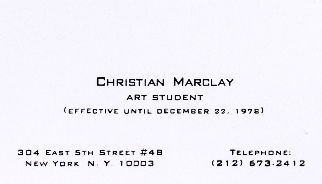
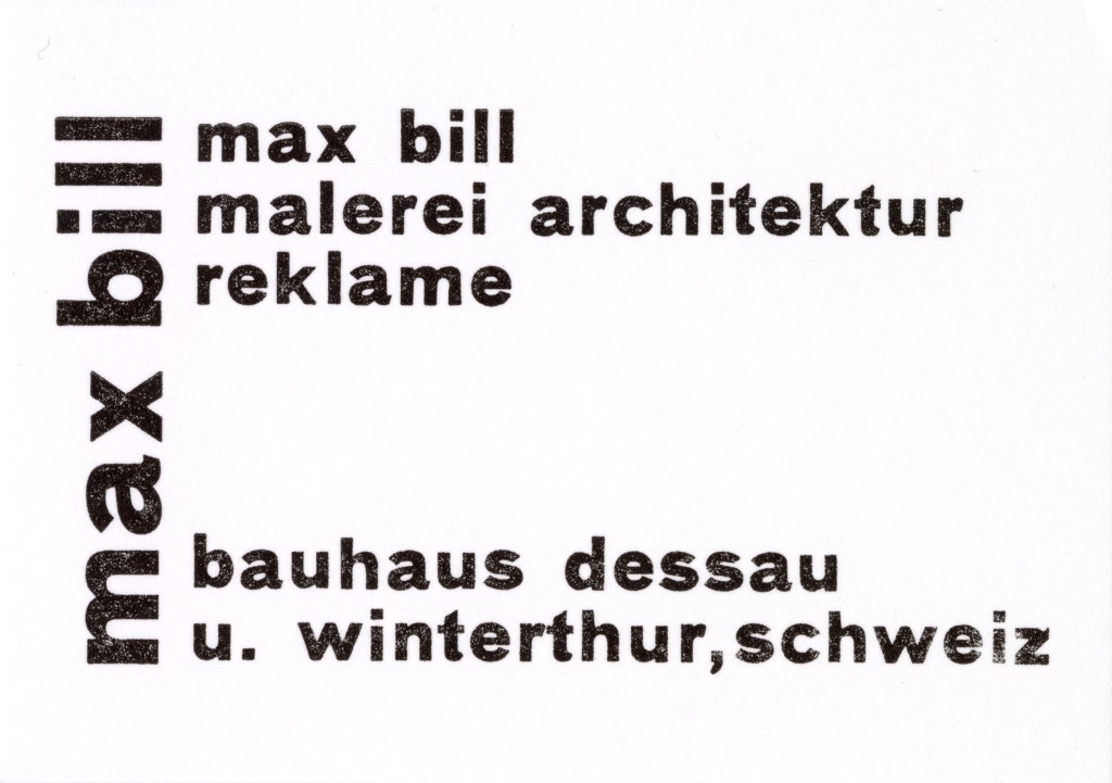
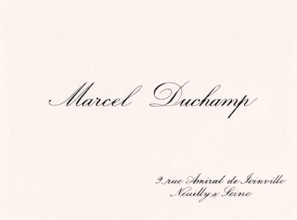
3, What better way to test this hypothesis than to observe the treatment of one of our most standardized documents in terms of both social etiquette and graphic aesthetics: the common calling card. One such card, belonging to a Swiss icon of Modernism, Max Bill (1908–1994), has a bearing on our questions and merits some explanation. He designed the card around 1927–28 while studying at the Bauhaus in Dessau, or shortly thereafter. A lecture by Le Corbusier convinced the young student that the school was indeed worth his while, although he actually spent precious little time there. It is more of a business card than a calling card, on which Bill emphasizes his proficiency in painting, architecture and advertising as well as his presence in two different places: the Bauhaus in Dessau and his Swiss hometown of Winterthur.
There is nothing particularly unusual about this card for a professional typographer of his age. But a stuffed-shirt stickler for conventions, one of those German burghers George Grosz caricatured with such delectable and nightmarish ferocity, might well have deemed it far too casual for purposes of professional self-presentation. Besides the card’s fashionable sobriety, devoid of allegory and ornament, and its nonconformity to the symmetrical, aligned and centered layout of the traditional business card, there is an apparent offhandedness about the design or printing of the characters. I expected to find already here what would later become Bill’s favorite two typefaces in the 1930s, Akzidenz Grotesk and Monotype Grotesk. But the round letters – especially the “a” – are different in shape, closer to the typeface used in “a dripping French Grotesk”, as typographer Alex Chavot puts it, which is one way of saying the counters of these letters are abnormally “clogged” with ink. So it is chiefly a certain carelessness that suggests this card was hastily turned out by a printer more intent on maximizing the profitability of his machinery than upholding the grand and noble art of typography.
Should this casualness be called “style”, a little like the faded blue jeans with holes in them we wore as teenagers back in the 1980s and 1990s, much to our parents’ chagrin ? It is hard to answer this question anachronistically. On the other hand, although thoroughly conversant with the rules and various procedures of letterpress printing, Max Bill never identified with professional typeface designers and even picked fights with them – which would explain the mention of advertising and not typography on his card. When he did talk “about typography” it was not as a professional insider but, as he put it, “as an outsider, from the perspective of someone who focuses on the stylistic characteristics of an age” or who “conceives of typography chiefly as a means […] of turning present-day products into cultural documents”. In this 1946 article in The Swiss Printing Review, however, which is chiefly addressed to Swiss typographers, the designer even shows a certain disdain for specialized designers in this field : “Few guilds are as receptive as typographers to simple, schematic rules to work by with a great measure of assurance. Those who draft these ‘formulae’ and have a knack for assuming an aura of accuracy will drive typography in what will be the prevailing direction for a certain period of time.”
This attack was probably triggered by a major phenomenon that emerged in 1920s Germany, particularly in the teaching at the Bauhaus school in Dessau : the incursion of avant-garde artists into the domain of printing. A number of creative artists turned away from easel painting to colonize the processes of technical reproduction, both photographic and typographical. They sought to bring the figure of the brilliant artist down from his ivory tower and integrate him into standardized, mechanized industrial processes. In the composition of this card, moreover, we find the main characteristics of the avant-garde style championed by the Bauhaus and theorized under the name of the “New Typography”, involving the rejection of all ornament and using “geometric grotesque” letters instead, designed to render the cold mechanical aesthetic of the machine by eliminating every trace of handwriting, especially serifs, yielding an architecture of the printed document based on elementary contrasts in size, shape and color. The centered, “symmetrical” layout, condemned for being corseted by aesthetic conventions of a bygone age, gave way to an asymmetrical design touted as vibrant and organic in the sense that it sought to catch and guide the reader’s eye. Certain proponents of the modernist aesthetic (Herbert Bayer, Joost Schmidt, Karel Teige, Josef Albers, Otl Aicher et al.) were also intent on putting together what was to be a new, universal alphabet, which would do away with the distinction between upper and lower case : 1 sound = 1 letter.
Thus, the carelessness a professional printer might object to in Bill’s business card is actually only in appearance. To grasp how actually careful, how quasi-scientific, the card’s composition is we must hark back to Le Corbusier’s oracular proclamation quoted by Sandberg : “The spirit of architecture is asserting itself. […] A machine age is born.” What is remarkable here is not the poverty of the materials, but the respect for the new standards defined by DIN, the German Institute for Standardization. DIN A, which to this day governs paper sizes (A5, A4, A3 etc.) in Europe, is based on a constant ratio of height to width : the square root of 2. The dimensions of Bill’s card, 74 × 52 mm, are size A8. Its architecture deviates from conventional standards for this printed epitome of social etiquette, conforming instead to a new machine etiquette based on economic values and the standardization of industrialized production. Bill’s grand art here consists in using the humble materials of printing (ink and paper) to combine the new constructive aesthetic taught at the Bauhaus with the sizing specifications of the German Institute for Standardization.
A fussy typographer might find the card’s composition not quite accomplished or functional enough to bear out Bill’s professional claims. Indeed, according to Richard Kiencke and Otto Frank’s 1926 digest of DIN standards for printing professionals, a business card ought to be size A7, measuring 74 × 105 mm, not size A8. This recommendation follows from another DIN proposal to adapt filing cards and boxes to this standard ; “This size [A7] makes it possible to place business cards in a filing card box arranged in alphabetical or geographical order.” Bill, doubtless aware of the non-conformity to this rule of thumb, used a trick : since A8 width equals A7 height (74 mm), he repeated his name in a larger font and, more importantly, placed it perpendicular to the rest of the text. So when tipped over, the card is exactly the same height as the other cards and the name “Max Bill” can be read in the same direction as the names on the others. Thus, Bill’s layout and format do conform after all to the conventions of the standard filing box. This, then, might be deemed a kind of “civility”, a new etiquette for an efficient modern enterprise whose watchword is “Time is money !” For the rest, while Bill does take the liberty of derogating from the formulae of professional typographers, the card still satisfies the DIN prerequisites, including a “headpiece” stating the main information at the top of the card. Lastly, the choice of A8 for his card size, which is half as wide (less 1 mm for the printer’s guillotine) as A7, also saved the impecunious student some expense, printing two cards for the price of one. Yet another illustration of Le Corbusier’s dictum : art lives on scanty means.