She was a marvel ! An exception to her sex, she lived in a “state of exception”, a world of exploits, from childhood on.

So, not a business card. That would actually be the height of incongruity for a bunch of feminist artists whose members are intent on remaining anonymous lest their individual personalities get in the way of the mission they have set themselves.

Patricia Falguières — This is a woman who never stopped presenting herself or being presented: a few months old, painted by her father, she became his favorite model; at twelve she posed in a musketeer’s costume for family friend Jean-Baptiste Corot, at fifteen in a Templar’s costume for a photographer (her father having changed cults from the Saint-Simonians to the Templars); at sixteen, she was photographed copying works in the Musée du Louvre; at twenty-four, portrayed by her brother Auguste as a painter contemplating her own unfinished canvas; at thirty-four, engraved on a medallion by celebrity portraitist David d’Angers; at thirty-five, she was painted by Dubufe with short hair, one hand holding a sketchbook, the other hand lying gently on the back of a bull beside her. Her first biography came out a year later, in 1856. After that she was front-page news. Her studio/menagerie became famous. Her fame even outstripped that of George Sand, who was her role model in so many ways, spreading all the way to the Americas, where railroad tycoons and bankers snapped up her paintings while the less wealthy made do with engraved reproductions. Buffalo Bill and his Wild West show touring Europe for the Universal Exposition of 1889 paid tribute by granting her private visits, and she painted everything: Colonel Cody himself, the Indians, mustangs, rodeo buffalos and all the rest. One poster shows her at the easel under the gaze of Buffalo Bill and Napoleon.

She was a marvel! An exception to her sex, she lived in a “state of exception”, a world of exploits, from childhood on. Everything was decided very early on: from the age of thirteen, she would be a painter, she would “surpass” Madame Lebrun! She would not go to school: since the Napoleonic Code, academe was off-limits to women, as was the study of human anatomy. Girls were to be kept in a state of innocence. And yet she had an exemplary academic career of sorts: an early education in painting in a family in which everyone was an artist. She trained by copying the masters – at the Musée du Louvre.The “minor genre” in which she specialized was highly regarded by the spirit of the times: animal painting. Her diligent study of natural history was nurtured by her friendship with the eminent naturalist Étienne Geoffroy Saint-Hilaire. In 1840 her paintings began a steady ascent through the ranks at each successive Salon. Then, in 1848, she was unanimously awarded the gold medal for Ploughing in the Nivernais, followed five years later (at age thirty- one) with the triumph of Horse Fair and international fame.

Rosa Bonheur smoking a cigarette photographed by Anna Klumpke in Château de By, Thomery, France, July 1898. - © Oracles: Artists’ Calling Cards

Rosa Bonheur smoking a cigarette photographed by Anna Klumpke in Château de By, Thomery, France, July 1898.

Wherein lies the marvel, the exceptional, the extraordinary side of it all? In those mighty oxen toiling in the fields and those powerful Percheron draft horses reminiscent of Michelangelo and Géricault? In the spectacle of all that heroic virility immersed in everyday labor: plowmen, coachmen, horsemen, farmhands? Or in the astonishing fact they were all painted by a woman? “Strength”, “power”, “energy”: this is the vocabulary employed by art critics discussing the “case” of Rosa Bonheur. Flaubert painted the scene at the Yonville agricultural show in a particular “shade of gray”, that “color of mold and of the life of wood lice” that characterizes Madame Bovary. Bonheur’s Horse Fair is poles apart: it is an unprecedented take on a battle scene, a kind of “history painting” (witness its sheer magnitude: 4 m wide and 2.5 m high), whose dramatic vigor transcends the banality of suburban horse-trading.This is anti-Flaubert.
But isn’t the real marvel that a woman should be the author thereof? In 1845, when she took third prize at the Salon, critic Théophile Thoré wrote: “Mademoiselle Rosa Bonheur paints almost like a man.” It was herself, her person, her short hair, trousers, her habits of smoking cigarettes and riding astride the horse like a boy that aroused public notice every bit as much as her paintings.The “tomboy” had reaped the benefits of family indulgence. Her father, a fervent Saint-Simonian who would later leave hearth and home to join the socialist community at Ménilmontant, like someone leaving their family in our day to join a cult, had designed the ideal outfit for the “brothers and sisters” of social reformer Prosper Enfantin, that of the Golden Age to come. Taking up the model, Rosa tweaked and tailored it to serve as her workwear in the studio.To wear it out of doors for plein air painting purposes, she had to apply for an official “cross- dressing permit”, renewable every six months at police headquarters: she had earned the right to wear trousers by working in the male preserve of slaughterhouses, horse fairs and cattle markets.
Like precursors of Gertrude Stein and Alice B.Toklas, Rosa Bonheur and Nathalie Micas enjoyed their married life in full view of the world. Rosa painted, and Nathalie, a keen technology buff, worked on her inventions when she wasn’t busy helping Rosa in the studio.They entertained the empress and other crowned heads and celebrities. They read Don Quixote passionately: had they not had their share of fantastic adventures when, in 1849, just after the death of Rosa’s father, the two girls set out for Spain “as real knights errant” to see the world, its landscapes, its brigands and its smugglers?

Rosa Bonheur — I take women to task who abandon their usual attire in a desire to pass themselves off as men. Had I felt that trousers suit my sex, I would have given up skirts entirely. But I don’t feel that way, so I never advised my sisters of the palette to wear men’s clothes under ordinary circumstances. If, then, you see me dressed as I am, it is by no means with a view to making myself interesting, as all too many women have done, but quite simply to facilitate my work. Bear in mind I spent whole days in slaughterhouses at a certain time in my life. Forsooth, one must be utterly devoted to one’s art to live in pools of blood, amongst animal slaughterers. – I was also passionate about horses, and where can one study these animals better than at fairs and amongst horse traders? There was no denying that the clothes of my sex were a constant hindrance. This is why
I decided to apply to the police commissioner for authorization to wear men’s clothes.
But the outfit I wear is my workwear and nothing but that. The jeers and gibes of imbeciles have never bothered me ; nor did Nathalie care any more than I did. She didn’t mind at all seeing me dressed like a man, but if it in the least offends you, I’m quite prepared to don a skirt, especially as I need only open a closet to find a whole wardrobe of women’s wear. Why wouldn’t I be proud to be a woman ? My father, that enthusiastic apostle of humanity, repeatedly told me that woman’s mission is to uplift the human race, that she is the Messiah of future centuries. I owe to his doctrines the great and proud ambition I have conceived for the sex I pride myself on belonging to and whose independence I shall uphold to my dying day. Besides, I am convinced the future belongs to us. I wish to cite just two illustrations in proof thereof : If the Americans lead the march of modern civilization, it is owing to the admirably intelligent way in which they raise their girls and the respect they have for their women. On the other hand, if the Orientals are languishing in a barbarity from which they are unable to extricate themselves, it is because the husbands insufficiently esteem their wives and, in consequence, the children are not inclined to feel affection for their mothers. Our timid beauties of old Europe let themselves be led too easily to the altar, like lambs to be sacrificed on the altar of pagan temples. I have long since come to understand that by placing the crown of orange blossoms on her head, a girl subjugates herself, becoming but a pale reflection of what she was before. She becomes forever the companion of the head of the community, not to be his equal, but to assist in his works ; as great as her value may be, she will remain in his shadow. The memory of my mother’s silent devotion reminds me that it is in man’s nature to express his opinions without worrying about the impression they produce on his companion’s mind.

Anna Klumpke
Rosa Bonheur: sa vie, son œuvre, Paris, Ernest Flammarion, 1908

Charlotte Magnin — The following opening lines of Victor Hugo’s poem Le goût de la lutte (from the 1853 collection Les châtiments [Castigations]) are inscribed on a vase Émile Gallé dedicated in 1896 to his collaborator and friend, the artist Victor Prouvé:

Ceux qui vivent, ce sont ceux qui luttent ; ce sont
Ceux dont un dessein ferme emplit l’âme et le front.
Those who live are those who fight,
Those whose soul and mind are filled with a firm design.

The power of poetry in the service of glass: this is how Gallé used literature to make his works resonate and to augment their powers of suggestion. Belles-lettres formed a profound and plentiful source of inspiration for this artist from Nancy, who went as far as to describe his quotation-bearing productions as “talking glassware”. Victor Hugo is the author most cited in Gallé’s work, for two reasons: for his power of poetic evocation and for his championing of justice. Justice is indeed a core issue in the oeuvre of Gallé, whose moral and social engagement was recently related in an article by François Parmantier.
Hugo’s lines echo Gallé’s combative devotion to the causes he supported. The vase on which they are inscribed is dated 1896, when word of the Dreyfus Affair first began to spread, before eventually stirring up the masses and dividing France. The artist’s passionate refusal to tolerate injustice impelled him to take a stand for the plight of the oppressed. In this he saw eye to eye with Mathias Morhardt, one of the founders of the Human Rights League, and helped set up a chapter of the organization in Nancy. Gallé wrote how much he enjoyed reading Morhardt’s book À la gloire d’aimer during a convalescence, and Morhardt’s name can be made out on Gallé’s business card. The two men were also avowed Dreyfusards. Gallé and his wife Henriette followed the case closely ; her brother-in-law was a close friend of Dreyfus’s brother and kept them well informed about the affair, supplementing the information they gleaned from their connections and wide reading. The Gallés emphatically sided with the accused, and the artist brought himself and his art into play in the interest of upholding the truth.
From 1898 to 1900, he produced a number of Dreyfusard works, most of which were presented at the World Fair in 1900 and constitute his most accomplished engagé artworks. At the fair he unveiled a stand designed in the form of a glass furnace. The general tone of his exhibit was summed up in an inscription on the lintel :

Descends divine Sagesse! Bénis nos fourneaux. Donne aux coupes la belle nuance
Mais si les hommes sont méchants, faussaires et prévaricateurs
À moi les mauvais démons du Feu! Éclatent les vases! Croule le four!
Afin que tous apprennent à pratiquer la Justice!

Descend, divine Wisdom! Bless our kilns. Give the vases a beautiful hue.
But if men are wicked and corrupt liars
Bring me the evil demons of fire! Smash the vases! Topple the kiln!
So that all learn to practice Justice!

These lines after Hesiod invoke the wisdom that is fused here with the art of glassmaking. Men will suffer the wrath of “divine Wisdom” for a miscarriage of justice. Several works of sociopolitical import were ranged beside the furnace, two of which were executed with the help of Victor Prouvé: the vase Les Hommes noirs (Black Men) and the ink bottle La Calomnie (Calumny). The vase, made of dark, opaque glass covered with tormented human figures, alludes to the obscurantism and conspiratorial atmosphere surrounding the Dreyfus Affair. The ink vial, in purplish-blue hues, denounces the mendacity of the press. The elderberries adorning it represent those used to make the ink that was poisoning Dreyfus’s reputation, and calumny is personified by an old crone. Also conspicuous on the stand was a chalice-shaped vase called Le Figuier (The Fig Tree), whose sculpted motifs of tears, Chi-Rho symbols (☧ ) and fig tree evoke religious symbols of brotherhood between Jews and Christians, an idea underscored by an inscription from Victor Hugo’s call for equality in Contemplations (1856): “Car tous les hommes sont les fils d’un même Père. Ils sont la même larme et sortent du même œil” (For all men are sons of the same Father. They are the same tear shed by the same eye).

Émile Gallé,* Cocotte Porte Saint-Georges*, ceramic origami fortune-teller to hold visiting cards, with a monochrome design (inscription:* Démolissons-la* [let’s demolish it]), 1883–1884. Photograph by Michel Bourguet. Collection and courtesy of Musée de l’École de Nancy. - © Oracles: Artists’ Calling Cards

Émile Gallé, Cocotte Porte Saint-Georges, ceramic origami fortune-teller to hold visiting cards, with a monochrome design (inscription: Démolissons-la [let’s demolish it]), 1883–1884. Photograph by Michel Bourguet. Collection and courtesy of Musée de l’École de Nancy.

Under cover of a certain symbolism, Gallé produced militant works capable of conveying a powerful message, graphic but subtle, for they make no explicit reference to Dreyfus. His stance was nevertheless clear. He signed the petition for the captain’s honor that appeared in L’Aurore in 1899 and wrote protests in the press ; he even helped set up the newspaper L’Etoile de l’Est in 1901 to make the Dreyfusards’ voices heard against the predominantly anti-Dreyfus local press in Nancy. He took part in public debates and joined the ranks of the “intellectuals” (Maurice Tournier “Les intellectuels, déjà, encore, toujours”, Mots, vol. 37, No. 1, 1993) – a word that reactionaries coined at the time to deride the liberal Dreyfusards – and he was hauled over the coals, in turn, for venturing outside his artistic remit.
Thus, Émile Gallé endowed the decorative arts with a new function : that of promoting moral values. Art has a duty to be useful (Bertrand Tillier, “Émile Gallé et l’affaire Dreyfus : vers une mutation des arts décoratifs”, Annales de l’Est, Numéro Spécial, 2005) “for grace is a weapon in the fight for the idea”, as he inscribed on his table Sagittaire d’eau (Arrowhead, 1900). This new thrust opened up a different avenue for the decorative arts in which the work came to be viewed as a declaration, and quotation as a statement.
This politico-poetic dimension, in which the visual arts and literature are fused, was the reflection of Gallé’s struggle against “a national calamity, a trouncing of intelligence, a dimming of the French soul”, as he wrote to Roger Marx in 1899. In his form of political activism, the artist was able to inscribe himself, as it were, in the opening lines of Hugo’s Ceux qui vivent, ce sont ceux qui luttent on the vase gifted to Victor Prouvé in 1896. The next two lines of the poem also apply to Gallé’s career, for he was among

Ceux qui d’un haut destin gravissent l’âpre cime.
Ceux qui marchent pensifs, épris d’un but sublime.
… those whose mind
Envisioning a great destiny and a demanding climb,
Walk pensive, engrossed by a goal sublime.

Françoise-Thérèse Charpentier (ed.)
Émile Gallé, Roger Marx: Lettres pour l’Art: Correspondance 1882–1904, Strasbourg, La Nuée Bleue, 2006

Mathias Morhardt
À la gloire d’aimer, Paris, Librairie Molière, 1903

François Parmantier, Valérie Thomas (eds.)
L’École de Nancy face aux questions politiques et sociales de son temps, Nancy, Musée de l’École de Nancy; Paris, Somogy, 2015

Aurélie Jacquet — A unique feature that Émile Gallé’s visiting card shares with no other card in this book, is that a large black border surrounds it. This border is a window onto a distinctive practice that existed at that time, one related to mourning. In Savoir-vivre et usages mondains, the Comtesse de Gencé explains that the prescribed period of mourning depended
on the degree of relatedness to the deceased. The period of mourning for a widow or widower was two years, although men were less likely to fully comply with this rule because of the responsibilities they had. For parents and parents-in-law, mourning lasted 18 months; for grandparents it lasted 1 year, 6 months of which were a period of “great mourning”. “One is permitted not to mourn, even for a close relative, if one is not mentioned on the funeral notice.” There were also rules about what to wear during mourning: women wore a cap and men a crepe band, of varying widths, in their hats. Black cuff links were allowed provided they were plain and undecorated. In addition, one was exempted from making visits during the period of intense mourning. “In order to maintain relations, they would send cards and letters.” However, “those in mourning only use writing paper edged with a black border whose width varies according to the extent of their grief. Visiting cards are also edged with a black border.” Looking at Gallé’s card, it was clearly for someone he was very close to. The card was found in the Bibliothèque de Genève, in letters addressed to a certain Mathias Morhardt and written at the time his book À la gloire d’aimer was published, in 1903. In fact, Émile Gallé’s father died in Nancy in 1902 at the age of eighty-four. Charles Gallé, the painter, knew the art of enameling and set up a family ceramics and glassworks business following his marriage to Fanny Reinemer.
“É. Gallé returned home during a period of convalescence, that in all likelihood would be long, and was pleased to find this friendly [present] [...] from [...] Mathias Morhardt: To the glory of love. He was delighted to read his letter as soon as he was able to do so.Very sincerely, thank you. E. G.” Émile Gallé died on the September 23, 1904, only a few months after this moment, and less than two years after his father.
In “Hypothèses sur les causes du décès d’Émile Gallé”, Aline Wagner outlines a number of theories that were put forward claiming to explain Émile Gallé’s early demise: overwork, the unlikely suggestion that he was poisoned by arsenic used when working with glass, neurasthenia – there
was strong interest in the psyche at that time –, a leukemia-related illness, various digestive disorders including cancer... However, none offer
any real clues as to the actual cause of the artist’s death (Aline Wagner, “Hypothèses sur les causes du décès d’Émile Gallé”, Annales de l’Est, Numéro spécial, 2005).
“Today, I feel weak. I have no strength [...] Our ordeals are designed to lead us to a higher state. Personally, I feel detached from all the miseries that have so painfully afflicted me when I was exhibiting, exhibited, and working in the industry... I hope we can meet again in a beautiful and luminous realm, where we will effortlessly enjoy the laws of light that shall apply to us.They will permeate us. Everything will be paternally explained to us” (Letter dated the August 31 to Jules Henrivaux).

Klaus-Peter Speidel — Adrian Piper’s early work focuses on the question of identity as a black person. Piper is a light-skinned African American who went to school in a white neighborhood and was regularly defined as either not white or not black enough. Piper’s work, therefore, often addresses  the theme of racism, with many of her pieces being inscribed in public space. This includes a series of calling cards she developed in the 1980s, cards that Piper would use, exhibit and give away for others to make use of too. As such, they are not business cards in the traditional sense, but cards tailored to specific, but recurring situations.

Two of these cards are reproduced in this book: one white and one brown. The brown card is linked to Piper’s experience of being a lightskinned African American, whose blackness is not immediately apparent. It was created as a reaction to people making racist jokes in her presence, mistakenly assuming that no black person is present. Like the white card, it deploys what we might call a passive-aggressive approach. Simply handing someone a card with words printed on it, comes across as less aggressive than verbally confronting that person and demanding an immediate verbal response. The discretion of this act also offers a way not to engage in a situation one wishes to avoid.

Another significant feature of these cards is that they are available for other people to use. In certain contexts, this can completely change the card’s meaning. If I, as a white male, were to use the brown card, the sentence “I am black” would become metaphorical, and a declaration of solidarity with black people who are victims of racism. If I were clearly black, the card’s latent aggressivity would be considerably transformed: the statement “I am black. I am sure you did not realize this…” would become ironic. This relates to the “indexicality” of the words “I” and “present”. What these refer to changes depending on who speaks and where. As a philosopher, Piper was no doubt aware of how the indexicals may transform the meaning of the words printed on these cards.

Anaël Lejeune — A business card? No, not really. It is more of a tract or membership form. A membership brought about, as it were, in performative mode: the mere fact of the verbal utterance performs an act on the plane of reality. In this case, a change in an individual’s status through the utterance of a female name in someone else’s ear. All this is of course not the result of some magical operation which spoken language by itself is capable of performing. It is a matter of context. Just as the utterance “I call this meeting to order” is only effective before a formally convoked assembly, so, too, “Pass it on to a curator or collector” only works in a specific social context: that of the institutionalized art world. Seeing as not everyone rubs shoulders with curators and collectors on terms of sufficient familiarity to suggest or recommend which works of art to acquire, it is probably safe to say that Guerrilla Girls are primarily recruited from amongst the ranks of well-connected artists, gallerists, critics and – you never know – members of some board of trustees.

So, not a business card. That would actually be the height of incongruity for a bunch of feminist artists whose members are intent on remaining anonymous lest their individual personalities get in the way of the mission they have set themselves. Hence the gorilla masks (a visual pun on guerilla) their members wear in public appearances, and the pseudonyms they adopt in public statements, which are all drawn from a list of deceased artists : Eva Hesse, Frida Kahlo, Georgia O’Keeffe, Käthe Kollwitz et al.
The group formed in 1985 for a major art event : the exhibit entitled An Internal Survey of Painting and Sculpture at MoMA, a survey of the best contemporary art being produced at the time. Of the 169 artists showcased, only 13 were women. That sparked outrage in part of the art community. A group of female artists, who soon called themselves “Guerrilla Girls”, thereupon banded together to stage various forms of protest in front of the museum. Hence this art collective’s raison d’être – and the issue their works were meant to address (on the mechanism of artworks as cognitive operation, see Adrian Piper) – was to expose and denounce the politics of major museums and commercial galleries with regard to the representation of women artists and members of the Afro-American community. The posters and documents produced by the collective present all sorts of well-known facts and telltale statistics in gaudy layouts and loud colors that deliberately borrow from agitprop and advertising strategies.
While the contents of the Guerrilla Girls’ productions recall the institutional critique of Hans Haacke, whose documentary polls denounced the socio-economic mechanisms underlying the workings of the institutional art world in its relations to the public and its collusion with corporate and private interests, their methods smack of the activism of the Art Workers’ Coalition and the Guerrilla Art Action Group (to which the Guerrilla Girls pay obvious tribute in their name). Started up in the mid-1960s amid the mounting turmoil of the student protests and civil rights movements, these associations, modeled on trade unions, crusaded for artists’ rights and working conditions and decried the institutional art world’s failure to take a critical stand on the Vietnam War (when they weren’t accusing it of economically profiting from the war) and its politics of gender and race representation.

Guerrilla Girls,* When Racism And Sexism Are No Longer Fashionable, How Much Will Your Art Collection Be Worth?*, poster, 1989. Courtesy of the artists. - © Oracles: Artists’ Calling Cards

Guerrilla Girls, When Racism And Sexism Are No Longer Fashionable, How Much Will Your Art Collection Be Worth?, poster, 1989. Courtesy of the artists.

That the return of conservative and puritanical values in the Reagan era twenty years later should usher in a new period of probing the issues of morality, sexuality, identity politics and the like seems only a matter of course. And yet it is surprising that so much importance should still be attached to the institutional art world (whether museums or other stakeholders), the primary target of the Guerrilla Girls’ attacks, in the 1980s. For that was an age in which it no longer seemed possible to regard museums as guarantors of the public good which, two decades before, could still be expected to do justice to culture in all its diversity. It was an age in which, given the emergence of postcolonial and gender studies that make the case for multiple identities, the institution of the museum, which had already become a link in the chain of the culture industry, began to be largely overwhelmed by a whole host of alternative venues, privileged spaces for the efflorescence of various forms of resistance.
And yet this card/tract may well attest to these lingering tensions. Despite the symbolic power it still confers on museum curators and the pun on “gorilla”, for which the group’s founders (all Caucasian) were rebuked by some Afro-American artists uneasy about the use of gorilla masks to condemn the latent racism in the art world, one is nonetheless inclined to read into this card/tract the hypothesis of the identity of the subject as a socio-cultural construct, gender affiliation as a matter of prescriptive social usages which, consequently, could be thwarted. You don’t become a Guerilla Girl by signing some document, paying dues or being so dubbed by some higher authority, but by taking action and uttering words freely in a context that is, in every case, unique : in short, that of performance. Moreover, judging solely by what it says on the card, you don’t even have to be a girl.

Vincent de Roguin — The similarities are strikingly obvious between these two pieces of construction paper bearing the names of the Dadaists John Heartfield and Raoul Hausmann. One not very reliable source suggests that Richard Huelsenbeck designed them both ; on close scrutiny of the objects in question, however, one could easily imagine the whole Berlin Club Dada ordering their business cards jointly based on catalog samples at a local shop. In that case, besides those of “Dadasoph Dadaraoul” Hausmann and “Monteurdada” Heartfield, there would have been matching cards bearing the monikers of “Weltdada” (i.e. “Worlddada”) Huelsenbeck, “Oberdada” Johannes Baader, “Propagandada” Georg Grosz, “Pipidada” Walter Mehring et al. Admittedly, with their respectable layout and uniform typeface – based on a late 19th-century foundry type called Engravers popularized in the United States by Barnhart Brothers & Spindler foundry and ATF typeface designer Morris Fuller Benton – these two cards, which date from 1920, hardly evoke the memory of the formal exuberance that characterized the movement’s productions, of which parangonnage, i.e. mixing different typefaces, happened to be one of the most conspicuous forms.

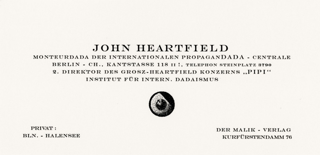
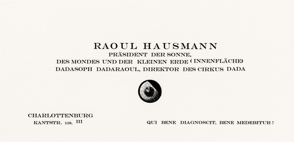
This surprising impression of functionalism fades away upon perusing the few lines of outrageous sobriquets and contemplating the sort of stylized eye floating underneath. The top right segment of that “eye” sports a diagonal hatching that recalls an infamous strand of hair whose possessor was, that year, none other than the charismatic propagandist of the newly-formed Nationalsozialistische Deutsche Arbeiterpartei, not yet the hysterical tyrant against whom Heartfield would soon produce dozens of scathing photomontages. The real origin and properties of this pictogram remained a riddle for the time being. Leaving aside the enigmatic eye and the epithets, the sheer contrast between the object itself, that is the business card, with its load of social conventions, and the radical Dadaist undertaking was already doubtless a strategic choice.
In 1917, rallying around the aforesaid Huelsenbeck, a renegade from the original core of the Dada movement in Zurich, the members of the Berlin Club delighted in subverting conspicuous signs of respectability. Their monocles, solemn incantations and extravagant titles were part and parcel of this crusade against all things grandiose, against the pride of the artistic elite, against the bourgeoisie, against civilization, against the “cacacosmos organisé”, as Hausmann called it retrospectively. Their aim was to disrupt. Disturb. Disconcert. Disorient. Discompose. Debunk. And then finally perhaps, as Tzara put it, “balayer, nettoyer” (sweeping, cleaning) (Tristan, Tzara, “Manifeste Dada 1918”, Dada3, Zurich, 1918) – to make a clean sweep. But this Club Dada, as fervently Dada as it may have been, was still a club, whose doors remained closed to the likes of Kurt Schwitters, who once tried to gain admission through the good offices of Raoul Hausmann. Behind all the virulence and the scandals, their sophisticated posturing and business cards, as caustic as they may have been, reflected a penchant for a certain dandyism, a refinement that could not be reduced to pure satire.
This was not one of the least paradoxes of a movement celebrating “the contradictory nature of man” (Hausmann) and based on the injunction that to be a Dadaist means first of all to flout the fundamental principles of Dadaism : the cream of the bohemian avant-garde espousing the Spartacist cause ; anti-establishment artists attacking art, its independence and grandeur, who were to spend much of their lives assailing one another’s claims to discoveries and inventions (choosing names, the invention of photomontage, the authorship of the manifestos etc.). These conflicts would continue to afflict John Heartfield when he decided to devote his most creative energies to the great proletarian cultural revolution : the German Communist party likened his militant photomontages to “bohemian bourgeois decadence” that would only sow confusion among the masses in search of a political orientation. The Berlin Dadaists, a motley crew pursuing a mixed bag of objectives, wanted above all to be the mirror of a German society traumatized by the war and grappling with the symptoms of a nervous breakdown. John Heartfield, along with his brother, Wieland Herzfeld, and the painter George Grosz, embodied the group’s most radical fringe. Georg Gross and Helmut Herzfeld had already changed their names to Grosz and Heartfield in 1916 in reaction to the unbridled nationalism sweeping across Germany. On December 31, 1918, Heartfield, Herzfeld, Grosz and stage director Erwin Piscator joined the Kommunistische Partei Deutschlands, which had been founded only the day before by Rosa Luxembourg and Karl Liebknecht. The Austrian Raoul Hausmann, for his part, too individualistic for Bolshevism and perhaps ultimately more attached to his liberties than to the class struggle, refused to resolve Berlin Dadaism’s essential tension between political and artistic idealism. He felt that politicizing Dada was a mistake, that Dada should, on the contrary, enable art to divest itself of any trace of utility. Together, Heartfield, Hausmann and Grosz organized the First International Dada Fair in the summer of 1920, bringing together 174 works by 27 artists, an exhibition that would mark their last collaboration and the dissolution of the Club Dada, undermined, as it was, by internecine strife and the public’s widespread fatigue.

Raoul Hausmann nude self-portrait, standing in the sand, c. 1918. Collection Centre Pompidou, Musée national d’Art moderne, Paris. Copyright Centre Pompidou, MNAM–CCI. <br>© 2023, ProLitteris, Zurich - © Oracles: Artists’ Calling Cards

Raoul Hausmann nude self-portrait, standing in the sand, c. 1918. Collection Centre Pompidou, Musée national d’Art moderne, Paris. Copyright Centre Pompidou, MNAM–CCI.
© 2023, ProLitteris, Zurich

Small drawing by Kurt Schwitters on a letter to Raoul Hausmann, 1947. - © Oracles: Artists’ Calling Cards

Small drawing by Kurt Schwitters on a letter to Raoul Hausmann, 1947.

If anyone could have handled the designing of these business cards, it was Heartfield, a high-profile graphic designer and typographer at the time who was producing, among other things, remarkable book jackets for Malik-Verlag publications. Founded in 1916 by Wieland Herzfelde and domiciled in his house at Kurfürstendamm 76 till the early 1920s, Malik-Verlag published most Dadaist journals and manifestos as well as a selection of leftist prints. The Club Dada, for its part, was headquartered chez Huelsenbeck at Kantstrasse (misspelled on Heartfield’s card) 118 in Charlottenburg, Berlin. In his classic 1928 treatise Die Neue Typographie (The New Typography : A Handbook for Modern Designers), eminent German typographer and theoretician Jan Tschichold went on to cite Heartfield’s June 1917 cover for Neue Jugend as “one of the earliest and most significant documents of the New Typography”. A trained painter, Hausmann could also pride himself on a mastery of typographical art. In 1918 he pioneered the use of lettering as a pictorial element in his signature poster poems. Beginning in June 1919, he was also the creator and the ingenious artisan of Der Dada, the movement’s flagship journal.
After the Berlin club disbanded and in parallel to his work for Malik-Verlag, Heartfield devoted his energies to political photomontage on behalf of the labor movement and, soon thereafter, exclusively against Nazi propaganda. He fought the evil regime indefatigably till 1938, first from Berlin and then from exile in Czechoslovakia and England. Hausmann, for his part, continued the post-Dada adventure for a while, in the company of Kurt Schwitters et al., before turning to photography, producing chiefly landscapes, portraits and nudes, specifically of his female companions Hedwig Mankiewitz and Vera Broido. Precious little common ground remained at this point between the two men. For the dyed-in-the-wool Communist Heartfield, “New political problems demand new means of propaganda. For this, photography possesses the greatest power of persuasion.” Hausmann’s preoccupations, on the other hand, appear to have been beset with ambivalence, inexorably complex and invariably a form of ongoing research, as his motto – attributable to the physician Giorgio Baglivi’s De Praxi Medica of 1696 – would seem to suggest : Qui bene diagnoscit, bene medebitur, “The better the diagnosis, the better the cure.”

Raoul Hausmann
Courrier Dada, Paris, Le Terrain vague, 1958

John Heartfield, Roland März
Der Schnitt entlang der Zeit: Selbstzeugnisse: Erinnerungen: Interpretationen: Eine Dokumentation, Dresden, Fundus-Bücher, 1981

Jan Tschichold
Die neue Typographie:
Ein Handbuch für zeitgemäss Schaffende, Berlin, Verlag des Bildungsverbandes der Deutschen Buchdrucker, 1928

Aurélie Jacquet — In 1904, when his grandmother gave him a microscope for his seventh birthday, Roman Vishniac, already a budding biology and photography buff, promptly hooked it up to a camera to take pictures of the leg muscles of a cockroach, magnified 150 times. He was fascinated by every little thing he could scrutinize under his microscope.
In 1918, fleeing an anti-Semitic outbreak in the wake of uprisings against the Bolsheviks, Vishniac’s family left Moscow, where he had grown up, for Berlin. He devoted himself to scientific research there. But when his family, although wealthy, was soon confronted with mounting anti-Semitism in Germany as well, he made up his mind to become a professional reporter and document the rise of Nazism. Aside from making a living out of his passion for photography, his aim was to alert the world to the trouble brewing in Central Europe. He went to Paris in the late 1920s, as a young Russian émigré living in Berlin, to convince several organizations of the looming threat to the Jewish people. Nobody seemed to believe him at first, but in 1935 the American Jewish Joint Distribution Committee (JDC) commissioned him to photograph the Jewish communities of Eastern Europe as part of a fundraising campaign to help the neediest among the Jewish population. Due to the absence of electricity in the poorest homes, he frequently had to shoot under extremely dim lighting conditions. So he would bring a kerosene lamp along to illuminate the darkest interiors and often took long exposures, leaning back against a wall for support while holding his breath. Posing as a traveling cloth merchant, he was accused of being a spy on more than one occasion, but he knew how to get around those in his way.

Vishniac even infiltrated concentration camps like the one in Zba˛szyn´ , Poland, in 1938, and used the material he shot inside the camps to prove their existence to the League of Nations in Geneva. Back in France, he was arrested by Marshal Pétain’s Milice Française and spent three months himself in a deportation camp in Ruchard (Indre-et-Loire department, west-central France). Thanks to the efforts of his wife and the American Jewish Joint Distribution Committee, he was released and managed to obtain a visa to escape from Europe for good. With his wife and two children he fled via Lisbon to the United States, reaching New York on New Year’s Eve, 1940.
In the New World, Vishniac was soon re-assigned to document Jewish refugees in the United States and various Jewish-American communities, and even returned to Europe in 1947 to cover the aftermath of the war and the plight of displaced persons.
Some critics deplore technical weaknesses and compositional flaws in Vishniac’s work, but probably the main criticism concerns his use of sometimes dubious captions to enhance the dramatic impact of his photographs and to kindle compassion for the subjects’ sufferings. While putting together a retrospective in 2006 at the Musée d’Art et d’Histoire du Judaïsme in Paris, Maya Benton, curator of the sizeable Vishniac Archive at New York’s International Center of Photography, noticed one picture, for example, bearing a caption about a little girl who had to stay inside all the time, lying barefoot in an unheated room, because her parents could not afford to buy her a pair of shoes. But the same girl is shown wearing shoes out of doors in another picture. (Yasmine Youssi, “Roman Vishniac, un artiste révélé”, Télérama, No.  3376, Sept. 24, 2014).
Edward Steichen, on the other hand, director of MoMa’s photography department in postwar New York, ranked these pre-Holocaust pictures “among photography’s finest documents of a time and place”. It should be borne in mind that only about one eighth of these negatives actually made it to the United States.
In 1937, the US Farm Security Administration launched a project to alleviate rural poverty during the Great Depression. Roy Stryker, head of its Information Division, handpicked a score of photographers to document the living conditions of poor farming communities in order to raise public awareness of their plight. The resulting photographs were sent to the mainstream press – and used to build up an archive. This purely documentary use of photography for social purposes was by no means unprecedented : Lewis Hine had been hired by the National Child Labor Committee at the beginning of the century to expose the inhumane working conditions of child laborers. Hines occasionally staged his photographs, by the way, to bolster their impact on the viewing public. Some critics disparaged the FSA photographs as socialist propaganda. Others viewed the project as a truly artistic endeavor. At any rate, these documentary images prepared a whole nation of viewers for the photodocumentary coverage of World War II.
Vishniac’s business card, preserved in the archives of the Cooper Hewitt, Smithsonian Design Museum in New York, is covered with a whole array of scientific photography and microscopy devices. An eminent microbiologist in his own right, Vishniac made significant contributions to the field of photomicrography through groundbreaking shots from inside a firefly’s eye, for example, or of blood flowing in a hamster’s cheek pouch.
Monique Sicard wrote in 1998 : “The sudden advent of photography brought about a revolution in ways of observing the world. The photograph made it possible for people to share what they’d seen. […] Paradoxically, the ‘automatic’, ‘objective’ photographic image, interposed between the observer’s eye and the world, fueled the assertion of scientific realism. Offering an undeniable impression of reality, functioning like an autonomous mechanism, a perfect copy of its subject, the photograph seemed to furnish proof of the existence of a neutral, unique, objective, universal world that hardly required its observers to exist.”
Out in the suburbs of New York, Vishniac would roll around in the grass to mask his human scent and lie low for as long as it took to capture his prey. He could hold his breath for over two minutes to take a picture of a bug !
“Nature, God or whatever you want to call the creator of the universe comes through the microscope clearly and strongly,” writes Roman Vishniac in “Kaddish pour un monde disparu” (Paris, Esprits Nomades, 2014).

Naomi Rosenblum
A World History of Photography, New York, Abbeville Press, 1984

Jean-Baptiste Delorme — “w. j. h. b. sandberg”, it says modestly on the business card, printed in the late 1930s, of a man who was Jonkheer (“Esquire”) Willem Jacob Henri Berend Sandberg by birth, Willem Sandberg to the public at large, Will to intimates, Henri Willem van den Bosch to the German occupiers. As many appellations as activities pursued over the course of his long life (1897–1984). Although predestined by his noble lineage to a career in the Dutch peerage, Sandberg studied fine arts in Amsterdam, but dropped out after only six months in 1919, weary of an academicism that left no room for experimentation. The young aristocrat then traveled around Europe and joined an esoteric movement called Mazdaznan. This syncretic cult, mixing Christianity with Zoroastrianism, advocated self-fulfillment through asceticism and vegetarianism, both of which Sandberg practiced his whole life long. During a stay at the Lebensschule, the European bastion of Mazdaznan in Herrliberg near Zurich in 1921, he learned the rudiments of typesetting. After founding and running the Dutch center of Mazdaznan from 1923 to 1926, Sandberg turned to “pictorial statistics”, a system designed by Otto Neurath for the “transmission of clear-cut information to promote social and political awareness”, which eventually led Sandberg to graphic design. In 1932 he became a member of the V.A.N.K., an applied arts association that regularly held exhibitions at Amsterdam’s Stedelijk Museum. He designed posters for and helped organize various events there, whereupon the new museum director, David Cornelis Roëll, invited him to join the team of curators in 1938. Sandberg accepted on one condition: that he be allowed to continue his graphic design work on the side – outside and above all inside the museum.

Sandberg’s business card condenses two polarities that set the pattern for the second part of his life : graphic design and the museum. Commissioning himself to design all manner of material for the Stedelijk, Sandberg had an “opportunity to build up a coherent typographical oeuvre unequalled in the museum scene”, as Ad Petersen puts it. In addition to the museum’s now legendary catalogs, he was to design “all the other printed matter for the museum, from its stationery, envelopes and invitations to its flyers and posters, annual passes, stamps and printed forms, even the figurines adorning the restroom doors” (Petersen). Far from imposing an authoritarian vision on the museum, this “all-over” graphic style sought to open up the institution to the general public, to make the Stedelijk appealing and accessible through modern methods of publicity. The name Sandberg does not appear on any of his designs for the museum. And his business card, one of his first productions in a curatorial capacity, may look more like a transmogrified signature. Sandberg forged close links with the avant-garde movements of the era (from De Stijl and Cobra to the New Realists), so it is no coincidence his card was found in the Brancusi Collection of the Bibliothèque Kandinsky at the Centre Pompidou. Sandberg probably gave it to Constantin Brancusi when the latter came to Amsterdam for the 1938 Abstrakte Kunst show at the Stedelijk (April 2–24), in which he showed works of his own alongside Max Bill, Robert and Sonia Delaunay, Piet Mondrian, Wassily Kandinsky, Paul Klee and Theo van Doesburg. Nelly “Petro” van Doesburg, collaborated on the exhibition and served as intermediary at the meeting between the sculptor and the curator, as suggested on the back of the card showing Sandberg’s personal and professional phone numbers as well as that of the Dutch artist’s widow.
This narrow card is made of cream-colored paper, the lettering is now golden brown. The name is printed in AWT Wells Roman Extra Bold (Regular), an Egyptienne typeface probably found at the Stadsdrukkerij, Amsterdam’s municipal printers since the 16 th century and a “great reserve of old wooden characters of which Sandberg often availed himself”. This font with thick serifs, “like chocolate letters”, contrasts with that of the line below it, which seems inspired by the Garamond Classico Italic created by the Dutch printers Royal Joh. Enschedé. All the letters are lower case, as is characteristic of all of Sandberg’s graphic work, which brings out more fully the uniqueness of each letter and, above all, avoids the hierarchization that would be implicit in a combination with capitals. While his exclusive use of lower-case letters is in line with the Neue Typographie, his way of structuring the words is not, privileging asymmetry to any form of rigor. This principle is found in his museological conception : “Placement by symmetry is eliminated from the museum of living art : symmetry is the symbol of balance, repose, death ; asymmetry is that of movement, dynamism, life,” writes Sandberg. Thus, the composition of Sandberg’s 1938 card anticipates the museological revolution he brought to the Stedelijk after the war. Shortly after the Liberation of the Netherlands, by the way, he designed a new business card that was as simple as it was significant. On the left-hand side it shows the name he used from April 1943 to May 1945 (“h. v. van den bosch”, a reference to an ancestor of his who served as governor of the Dutch West Indies) and his function (food supply officer and painter) ; on the right-hand side, the return to his original name (w. j. h. b. sandberg) and his job as curator, shortly before he was appointed director in September 1945. Sandberg neglected to point out that he was a staunch member of the Resistance, utilizing his printing skills to become one of the best forgers of Dutch ID cards. After colluding in the bombing of Amsterdam’s public records office in 1943 (in order to prevent the Nazis from comparing the names on forged documents with those in the registry), Sandberg went underground, using his two years in hiding to produce his experimenta typographica, nineteen pamphlets whose inventiveness was as rich as the media they were printed on were poor (cut-up slips of paper, leaves etc.). These experiments were the origin of the “cheerful minimum”, as Jans Bons summed up his colleague and friend’s graphic work for the Stedelijk, which has inspired a number of Dutch designers to this day, from Karel Martens to Irma Boom.

Jan Bons, Jan Kassies, Ad Petersen, Otto Treumann
Sandberg: Typograaf als Museumman, Amersfoort, De Zonnehof, 1982

Ank Leeuw Marcar
Willem Sandberg: Portrait of an Artist, Amsterdam, Valiz, 2013

Ad Petersen
Sandberg: Graphiste et directeur du Stedelijk Museum, Institut néerlandais, Paris, Éditions Xavier Barral, 2007

Willem Sandberg
Sandberg “désigne” le Stedelijk, Amsterdam 1945–1963, Paris, Musée des Arts décoratifs, 1973

Gilles Saussier — Of the various versions of the Endless Column Constantin Brancusi developed between 1918 and 1938 – in oak, poplar, plaster, cast iron – one never passed through his Paris studio at the impasse Ronsin. It was built in September 1937 at the Petrosani Central Mining Workshops (ACP) and erected in 1938 on the edge of the Târgu Jiu Sculptural Ensemble. Commissioned by the Women’s League of Gorj, the monument honors Romania’s World War I heroes. Located in the southern Carpathians about 60 km north of Târgu Jiu, Petrosani is a mining basin in the Jiu Valley, at an altitude of 431 m above sea level, ringed round by high mountain pastureland and hay fields. Coal has been mined here ever since the Austro-Hungarian Empire (1867–1918) and the dawn of the Industrial Revolution. As American art historian Hal Foster explains in The Return of the Real (1996), the Industrial Revolution gave rise to a contradiction between the new “industrial order of social life” and the “craft basis of visual arts” and reinforced the antagonism between “individual aesthetic creation and collective social production”, which was “revealed as a principal dynamic of modernist art”.

The geographic and cultural isolation of the Jiu Valley miners facilitated their instrumentalization after the 1989 revolution and the fall of Nicolae Ceaus¸escu. On June 14 and 15, 1990, the neo-Communist regime of his successor, President Ion Iliescu, had thousands of them brought in on special trains all the way to Bucharest, where, armed with iron bars and supervised by the police, they attacked student protesters at the university and ransacked newspaper offices and opposition party headquarters and even homes, chanting “Death to intellectuals” and “We work, we don’t think”. The Mineriad left dozens dead and hundreds wounded among the nation’s youth and students, regime opponents, the Roma minority and even random longhaired passersby. This tragic episode precipitated the social decline of a valley whose mining population had once united the cosmopolitan “aristocracy of labor”, as Marx called the working-class elite in Capital, of the Austro-Hungarian Empire (Germans, Austrians, Bosnians, Hungarians, Poles, Serbs, Slovakians, Czechs…), then formed the avant-garde of economic patriotism under the forty-year Communist dictatorship (1948–1989) and anticipated subsequent social and political opposition to the regime during the miners’ spontaneous strike in 1977.
In 1997, under pressure from its international funders (International Monetary Fund and European Community), the Romanian government launched a massive plan to close mining sites, resulting in the loss of thousands of jobs. The Central Mining Workshops of Petrosani (ACP), the flagship of state industry since 1937, were in turn privatized. In 2001 the buyers of this rundown industrial site, which managed by hook or by crook to keep on producing mining equipment, took the initiative to make a full-scale reproduction of the Endless Column using the original plans preserved in the archives of their engineering office.

Gilles Saussier, Le chien est un loup pour la colonne (The dog is a wolf for the column), Central Mining Workshops, Petroșani, Romania; color photograph from the* Spolia* series, 2012–2015. Courtesy of the artist, Les Andelys. - © Oracles: Artists’ Calling Cards

Gilles Saussier, Le chien est un loup pour la colonne (The dog is a wolf for the column), Central Mining Workshops, Petroșani, Romania; color photograph from the Spolia series, 2012–2015. Courtesy of the artist, Les Andelys.

They justified this bold demonstration of industrial know-how by pointing out firstly that, since 1937, the Romanian government had never reimbursed the factory for the cost of building the monument, and secondly that the ACP’s chief engineer Stefan Georgescu-Gorjan, the son of a friend of Brancusi’s (whose bust Brancusi had sculpted in 1902), had been absolutely vital to the execution of the whole project. With his teams of specialists (engineer and designer Nicolae Hasnas, industrial draftsman Gavrila Somlo, carpenter Carol Flisek for the mold, foremen Szabo Emeric and Gheorghe Atanasiu in the foundry, foreman Ion Romosan for the metal structures, Francisc Hering for the assembly, master welder Victor Borodi, and Victor and August Perini, the foremen in charge of the final scaffolding) he set the final height of the column (29.33 m) and solved most of the technical problems, such as the hazardous task of loading and transporting it on several trucks across the narrow Jiu pass in September 1937. News of the making of an Endless Column clone, once word of the project spread, sparked controversy and incurred the wrath of the Romanian Ministry of Culture, compelling the factory owners to stop work on a 30-ton fetish they had already spent € 55,000 on.
For fifteen years now, this clone, like a negative stuck in the workshop’s darkroom, has been lying there undeveloped in the dust. Moved or dismembered over the years to make way for assembly lines, it retains, thanks to the workers’ enduring activity, a bit of the spirit of mobility that was so dear to Brancusi – a mobility sorely missing from the remake of the impasse Ronsin workshop at the Centre Pompidou.

Hal Foster
The Return of the Real: Art and Theory at the End of the Century, Cambridge, MA, The MIT Press, 1996

Oskar Schlemmer — “The Cathedral of Socialism.” The original phrasing was: “The State Bauhaus, founded after a catastrophic war, amidst the chaos of revolution and at the peak of an emotion-laden explosive style in art, will begin by first providing a center for all those who, committed to the future and defiant of established orders, wish to build the Cathedral of Socialism.”

Oskar Schlemmer
“Diary April 9, 1927”, The Letters and Diaries of Oskar Schlemmer, Middletown, CT, Wesleyan University Press, 1972
(Passage quoted in extenso)

Raphaël Pirenne — I look at a photograph of Joseph Beuys and Karl Fastabend from 1972. We are in Dusseldorf, Germany, at Andreasstrasse 25, just a few blocks from the Kunstakademie, where Beuys taught sculpture – and got fired that October 11. The photograph shows us the information office of the Organization for Direct Democracy Through Referendum (Free People’s Initiative), which Beuys had founded the year before, on June 1, 1971. Aimed at activating systems of governance based on the principles of direct democracy, this organization was presented in a nine-point political program:

1 Politics structured from below to above ;
2 The absolute sovereignty of the people at all levels of administration ;
3 A constitution made by the people ;
4 Men and women without party membership to have equal rights with party members in legislative bodies ;
5 No privileges for single representatives of the people or for civil servants ;
6 People’s veto in individual cases (where for instance no equality before the law for all is ensured);
7 Respect for the will of the electors on the part of the elected ;
8 Referendum on important issues and questions of basic law ;
9 Possible removal from office of unworthy or incompetent representatives of the people or civil servants.

The Organization for Direct Democracy was a direct activation of a social sculpture project the German artist had been working on for years. According to Beuys, “Only art is capable of dismantling the repressive effects of a senile social system that continues to totter along the deathline: to dismantle in order to build A SOCIAL ORGANISM AS A WORK OF ART.”
This “social organism as a work of art”, based on the conviction that “every human being is an artist”, was to be self-determining and to participate in the cultural sphere (that of freedom according to Beuys), in the framing of laws (the sphere of democracy) and in economic life (the sphere of socialism). Beuys announced the founding of the Organization in the following terms : “THE FIFTH INTERNATIONAL is born.”

Beuys is in the picture, in the background. Wearing a hat and military jacket, he is sitting on what might be a table or might be a stack of cardboard boxes and printed matter wrapped in brown paper, as though fresh off the press.
The poster on the wall behind him asks : “Wie sag ich’s meinen eltern?” (How do I tell my parents ?). The question might be ironic, or it can be taken at face value.
Next to the poster behind him on the wall is a blackboard covered with writing in chalk, perhaps the vestiges of a talk given there, as was Beuys’s habit : laying out his thought process in writing in the very process of verbalizing it aloud.
Clasping the fingers of one hand in the other, his gaze is despondent, haggard, and seems oblivious of the camera he is staring at. Is he lost in a reverie ? Or languishing in the tedium of office life ? Or just rudely awakened to the potential failure of his political, social and artistic undertaking ?
At the center of the picture is a long desk with stacks of papers covering one whole half in the foreground, a typewriter, telephone and answering machine on the other half, with chairs askew on either side. Karl Fastabend, with whom Beuys ran the organization, is sitting at the desk in one chair, wearing a suit and holding a writing utensil in his hand. He looks concentrated, fully there, in action, as he peruses some papers.

Joseph Beuys,* Rose for Direct Democracy*, in the office of the Organization for Direct Democracy during the hundred days of Documenta 5, Fridericianum Museum, Kassel, 1972. Copyright Documenta Archiv Stadt Kassel and the Estate of Joseph Beuys. © 2023, ProLitteris, Zurich - © Oracles: Artists’ Calling Cards

Joseph Beuys, Rose for Direct Democracy, in the office of the Organization for Direct Democracy during the hundred days of Documenta 5, Fridericianum Museum, Kassel, 1972. Copyright Documenta Archiv Stadt Kassel and the Estate of Joseph Beuys. © 2023, ProLitteris, Zurich

Though visible, we imagine they’re there : the stamps that are such an integral feature of this office aesthetic and the workings of an administrative headquarters-cum-distribution center. In 1974 Beuys printed all the stamps he had designed so far on a single sheet of paper entitled Gespräch : i.e. a visual “conversation” of sorts between the German and English versions of the Organization for Direct Democracy stamp juxtaposed with, among other things, stamps of Fluxus Zone West and Hauptstrom, two versions of “BEUYS : ich kenne kein Weekend” (I know no weekend), the name BEUYS over a reddish-brown cross, a simple slightly skewed blue cross and two versions of his own signature.
Dangling from an architect’s lamp on the desk is a plastic bag printed on both sides, stating the basic principles of the organization in schematic form. On one side is a diagram designed to explain how to “overcome the dictatorship of the political parties”. On the other, a circular breakdown of “two types of society”: one is based on principles of direct democracy, in which the people, all the people, have the say ; the other represents a monopoly of power in the hands of political parties.
In the foreground, in between the piles of pamphlets on the table, stands a graduated cylinder, rather like the ones used in chemistry experiments, holding a red rose, the Rose for Direct Democracy. Beuys described it as follows : “Bud and bloom are in fact green leaves transformed. So in relation to the leaves and the stem the bloom is a revolution, although it grows through organic transformation and evolution.”

Joseph Beuys
Zeichnungen I, 1947–1959, Dusseldorf, Kunstverein für die Rheinlande und Westfalen, 1974

Caroline Tisdall
Joseph Beuys, New York, The Solomon R. Guggenheim Museum, 1979