“Akad. mal.” was the promise of a recognized professional status in an egalitarian society, and the guarantee of an education that applied the aesthetic doctrine of Soviet Socialist Realism.

Though he refused in his lifetime to designate a disciple among his students, he would never have been able to bring to fruition such a vast and prolific body of work without his team of assistants, whose every move he choreographed like a ballet master.

Célia Zuber — First, a name. Not just Ingres, or Jean-Auguste-Dominique Ingres, but Monsieur Ingres. This is how the painter had his contemporaries and pupils address him, by a title that was to endure posthumously, attesting to the hagiographic longevity the artist himself took pains to cultivate during his lifetime.
Ingres began his training at the Academy of Toulouse before joining Jacques-Louis David’s studio at the prestigious École des Beaux-Arts in Paris in 1796, at the age of sixteen. The aspiring young provincial then sought celebrity in the capital : “I am tormented by an extreme sensitivity and an insatiable desire for glory,” he wrote to Jean Forestier on the verge of his breakthrough (Letter to Jean Forestier, Rome, January 7, 1807, Collection Frits Lugt, Paris). “Sensitivity” and “glory” were the two poles towards which his personality gravitated, for he was as sincere in his devotion to art as he was driven by ambition.

Awarded the Grand Prix de Rome in 1801 for his painting The Ambassadors of Agamemnon in the Tent of Achilles, Ingres did not receive the funds from the cash-strapped government to travel to Rome till five years later.
During his subsequent stay at the Villa Medici, he discovered Raphael’s paintings and the works of Antiquity that would infuse his style forever. He prolonged his sojourn in Rome till 1825, when he returned to Paris and enjoyed one success after another, beginning with his appointment that year to a professorship at the Académie des Beaux-Arts. Ingres went back to Villa Medici ten years later, but as director of the Académie de France in Rome, the crowning distinction in a career that was, however, fraught with the pitfalls of fluctuating historical circumstances in the precarious context of post-revolutionary France.
Two titles come after the name : Sénateur and Membre de l’Institut. Ingres was a careerist, avid for public recognition and official honors, of which he amassed quite a few, including the Legion of Honor, a chair at the Institut de France, and president of the École des Beaux-Arts. In 1862 he was appointed senator by Napoleon III, a purely honorary, ceremonial title in his eyes since, by all accounts, he never attended a single meeting of the Senate.
On the other hand, the card contains no reference whatsoever to his work as a painter or master of a studio. Was Monsieur Ingres retreating behind his honorary titles, passing over his true claim to fame in silence ? There is indeed nothing artistic about his card at all, no illustration or ornament, as sometimes adorned those of his peers. Ingres’s card, modeled on those of the French aristocracy and other members of the upper crust, is not encumbered with the slightest detail. In the second half of the 19th century, the use of a name, centered and surrounded by a blank space, had become the standard of good taste for calling cards. This card probably came from the famous printer’s studio of Henri Stern on Passage des Panoramas – only the best for Monsieur Ingres. So Ingres presented his identity in the most official format possible, without any aesthetic trimmings. The absence of any reference to his art may well have been intended to avoid stating the obvious : the name Ingres already stood metonymically for all painting.
An address : it was at 11 quai Voltaire, not far from the École des Beaux-Arts, that Ingres spent the last years of his life. In this grand townhouse facing the Seine, the artist received patrons and pupils alike. There is a tendency to view the dozen years between Ingres’s blaze of glory at the 1855 World Fair and his death in 1867 as a slow epilogue to his career that was devoid of any public life. Not true at all : “M. Ingres was, in his 87th year, still full of vim and vigor.” (Letter from Ernest Chesneau, January 22, 1867).
The painter continued to orchestrate his professional life and did not scruple to promote himself overtly, even resorting to political wiles to achieve his self-aggrandizing ends, not without a certain youthful ardor. It was during his last years, moreover, that the artist produced three paintings intended as veritable odes to youth : L’Age d’or (The Golden Age, 1862, Fogg Art Museum, Cambridge, Massachusetts), Le Bain turc (The Turkish Bath, 1852–1859, Musée du Louvre, Paris) and La Source (The Source, 1856, Musée du Louvre, Paris). The latter, an allegory of immortal beauty, met with an ecstatic reception when it was shown at his studio on the quai Voltaire. The old master seemed to be rejuvenated by painting this virgin of the waters : “Despite his 86 years, Ingres still held the brush with a firm hand. He showed himself to be young and full of vim and vigor in his admirable figure of The Source.” (Guyot de Fère, “Ingres”, Journal des Arts, des Sciences et des Lettres, 10e série, No.  4, February 1867).

After Alphonse Charles Masson, Portrait of Jean-Auguste-Dominique Ingres, c. 1855; engraving on wove paper edited by Blanchard and printed by Drouart, Paris. Collection Bibliothèque nationale de France, Département de la Musique, Paris. - © Oracles: Artists’ Calling Cards

After Alphonse Charles Masson, Portrait of Jean-Auguste-Dominique Ingres, c. 1855; engraving on wove paper edited by Blanchard and printed by Drouart, Paris. Collection Bibliothèque nationale de France, Département de la Musique, Paris.

Baudelaire, a very insightful judge of art, described Monsieur Ingres as the only man in France who really did portraits and knew how to appreciate “beautiful women, rich natures, calm and blooming health : this was his triumph and his delight”. (Gustave Babin, “Madame de Senonnes par Ingres”, Gazette des Beaux-Arts, No. 19, January 1898). Baudelaire repeatedly stressed the profound voluptuousness of Ingres’s works and even ventured to speak of a slight streak of “libertinism”. He may have had in mind Madame de Senonnes (1814, Musée des Beaux-Arts, Nantes), a quintessential female portrait celebrating beauty, luxury and the promise of carnal delight. The seductiveness of the model is at once enchanting and evasive. Her exaggeratedly long right arm unfurls her mystery in a loose gesture, enmeshing the viewer in a maze of creased velvet and lace. According to Aragon’s ekphrasis, this painting is nothing other than : “The locus of the woman, where modesty and immodesty, secrecy and confession, meet, this bulging of the neck towards its base, where without a doubt, under such white skin, the inner movement, the throbbing of things unconfessed, becomes perceptible. The woman’s scarf has slipped onto the silk of the sofa, without our having had to tear it off, perhaps as an invitation […]. Oh, the picture is enough, without words.”
A mirror in the background frames the beautiful woman and encloses the composition. Curiously, it does not introduce any contradictory space. There is no self-portrait of the artist here as in van Eyck’s famous Arnolfini Portrait (1434, National Gallery, London) or Quentin Metsys’ The Money Changer and His Wife (1514, Musée du Louvre, Paris). The mirror in this boudoir only reflects the nape of the model’s bare neck, mirroring it back upon itself.
And yet Ingres discreetly inserts his own presence in a tiny detail on the mirror’s edge. A close look reveals the trompe-l’oeil of a calling card bearing the artist’s name, which thus functions as a signing of the work. This card, in which the painter’s identity is inscribed, plays on a sort of dual presence. A fold on the side attests to the passing of the artist, hinting at a romantic tryst that may have been missed, but is nonetheless consummated by the very act of painting.

Louis Aragon
Henri Matisse, roman, Paris, Gallimard, 1971

Charles Baudelaire
Curiosités Esthétiques, Paris, Michel Lévy frères, 1868

Jean-Victor Schnetz
Lettres inédites de Jean-Victor Schnetz à François-Joseph Navez: une amitié italienne, Flers, Flers Promotion, 2000

Odilon Redon — Ingres was not of his time ; his spirit is sterile. The sight of his works, far from amplifying our moral strength, lets us placidly get back to the stream of our bourgeois life, without being in the slightest way touched or modified by it. They are not true works of art, whose virtue is to increase our moral strength or their superior influence.
Such is modern work the smallest scrawl by Delacroix, by Rembrandt, by Albrecht Dürer makes us creative, makes us get back to work all the same one could say it is life itself that they communicate that they transmit to us, and therein is the decisive result the supreme range. Whoever acts in this way upon others has genius, whatever may be the nature of actions exercised by him, by word, by writing even by his presence.
Ingres was an honest disciple serving masters of another age. As he is lacking in reality and in vital warmth (properly so called), he has the chance of enduring only in the tempered spheres of that banal and bored world which admires traditional beauty on the faith of others, and by the spirit of conservatism as well. In France he will always represent, like Poussin, like David and others of this nature, the haughty and paternal incarnation of official art. He will remain in the schools, every time the rhetoricians speak from the height of their professorial chair about the origins and traditions of pagan art, his name will be pronounced.

Odilon Redon
To Myself: Notes on Life, Art and Artists, New York, George Brazier, 1986
(Passage quoted in extenso,
our translation)

Gino Severini — Despite their clarity, these theories and ideas remain within the limits of intention, because they are not firmly based on technical and practical applications. To be truly effective and useful to the painter, theory must not become separated from experience, and all experience should be linked to a prior and proven theory.
So, for example, all of Ingres’s works are a protest against sensualism and an aspiration to classicism ; yet no clearly defined theory emerges from Ingres’s work, which is why his message to us is vague – we can only guess his intentions and admire him, of course.

Gino Severini
“1921: Introduction et historique: Du cubisme au classicisme”, Écrits sur l’Art, Paris, Diagonales, 1987
(Passage quoted in extenso, our translation)

Charlotte Laubard — Július Koller had just completed his studies at the Academy of Fine Arts and Design in Bratislava in 1965 when the Czechoslovakian government decided to officialize the title “academic painter” (akademický malírˇ in Czech, akademicky maliar in Slovak) for every graduate of its art schools. Academically trained artists then began signaling their status by putting the abbreviation “akad. mal.” before their names, rather like the use of “Dr.” by recipients of a PhD.

Július Koller,* Readymadeing, homage to M. Duchamp (U.F.O.)*, b/w photograph, 1981. Courtesy of gb agency, Paris. - © Oracles: Artists’ Calling Cards

Július Koller, Readymadeing, homage to M. Duchamp (U.F.O.), b/w photograph, 1981. Courtesy of gb agency, Paris.

Akad. mal. was the promise of a recognized professional status in an egalitarian society, and the guarantee of an education that applied the aesthetic doctrine of Soviet Socialist Realism. And yet that very year, in 1965, Koller stopped painting and started handing out cards on which he stamped in green ink :

JÚLIUS 1965 KOLLER
ANTIHAPPENING
SYSTÉM
SUBJEKTIVNEJ OBJEKTIVITY
ČESKOSLOVENSKO

JÚLIUS 1965 KOLLER
ANTIHAPPENING
SYSTEM
SUBJECTIVITY OBJECTIVITY
Czechoslovakia

Or even simply “1965/AKAD. MAL.” followed by his name, a repetition of his professional title in lower case akad. maliar (academic painter) and an address in Bratislava. To Koller, these “text cards” were “the expression, the sign, the revelation of a consciousness, a state of mind, expressing itself in this case, manifesting itself, in a relatively unaesthetic form. They are neither printed art nor multiples, poetry, literature, science, religion or fantasy. They are a conquest, an indication of a conception, an opinion, a position, of the artist’s attitude towards reality. They are neither aesthetic decorations nor avant-garde curiosities: they are life itself, the act of a human being in space and time” (from the manifesto Textkarty [Kartexty], Textobjekty [Objektexty], 1971).
So from 1965 on, in an art system that imposed an official aesthetic doctrine, and despite the paucity of information reaching Bratislava about Western developments in a nascent art genre which – lest we forget – had yet to be defined as “conceptual”, Koller took a stand. His “antihappening” consisted in transforming moments or elements of everyday life into “cultural situations” through the prism of his unique subjectivity. No object, no image, no performance, just a few words suffice : his “text cards” announce and attest to the artist’s power to create a new regime of sensibility, to establish “the program of a cultural synthesis of art and life” (from the manifesto Antihappening [Systém subjektivnej objektivity], 1965).
Július Koller’s work has always made me think of a bottle thrown into the sea. What the photographed gestures and the handful of objects that were to join the corpus of text cards this academic (anti-)painter continued to produce for many years have in common is that they operate in the mode of address – a form of communication that has no specific addressee and calls for no immediate response. In a world in which anyone could be accused of subversion for thinking differently, it works with invisibility and drives home the power of our subjectivity to transcend the real world around us.

Vincent Jolivet — A plain marble parallelepiped enclosed within a rectangle fills the entire frame ; uneven ground, two large stones and a few wisps of grass suggest the countryside
— The Appian Way ?
— The Tomb of Canova.
The most celebrated Italian sculptor of his time, Antonio Canova was born in Possagno, a stone’s throw from Vicenza, in 1757. Through its unique take on the depiction of monuments or ruins – much like the complex allegories and decorative compositions that were then in vogue – his visiting card mines the discreet and singular vein of those symbolic works of art known as vanitas. Death, the outright protagonist of these cards, which in and of themselves challenge the worldliness they exist to serve, is represented or rather suggested by a simple plaque of upturned marble, and sometimes accompanied, more explicitly, by a smashed vase – such as on architect Francesco Milizia’s card ; this theme is reiterated with even greater irony on the mysterious Mgr Del Fumo’s card (one should add here that this unknown Monsignor does not appear in the Dizionario Biografico degli Italiani and so it must be supposed that the very memory of him went up in smoke – engulfed, perhaps, in the flames of Pompeii, thus anticipating by some two centuries Aldo Palazzeschi’s gentle uomo di fumo).

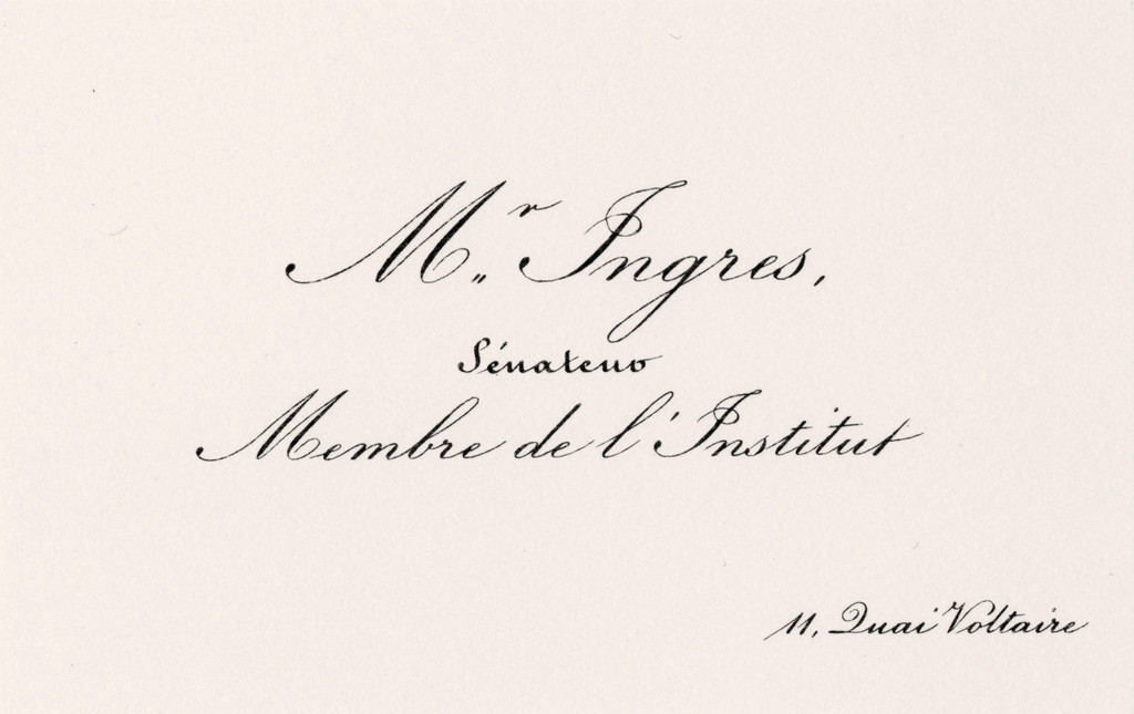
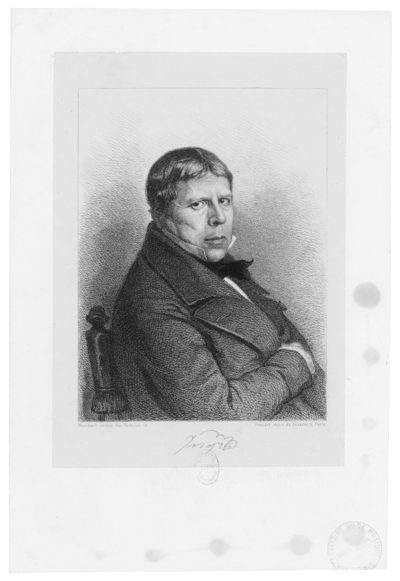
Fuori dall’Arena (Out of the Arena) is the title attributed to this Pietro Fontana etching. Fontana, a contemporary of Canova and fellow Italian, was his favorite engraver. And he is undoubtedly its veritable creator, since unlike most of Fontana’s clients, he was no stranger to brush or chisel. But the question remains : what arena or battleground is here portrayed ? That of the human condition, abandoned at last in favor of heavenly delights – just desserts for a life spent in large part in the service of the omnipresent Catholic Church, not to mention that his half-brother Giovanni Francesco Sartori was the Bishop of Mindo ? Or the war that he was obliged to wage in order to impose and perpetuate his artistic conceptions – no easy task seeing as a new wave of young artists was already busy rejecting them ? Or simply the political, military, aristocratic, ecclesiastical and social elite into which, very early on and with stupefying ease this son of a stonecutter inserted himself, experiencing nary a glitch in a career spanning nearly fifty years ? Or a European continent shaken to its core by the political and social upheavals brought about by the French Revolution ? Or, to quote Starobinski : “That desire for eternity through form [that] arrives at a moment when History has its foot on the gas pedal” ?
Canova settled in Rome in 1780, and became a member of the Academy of San Luca in 1800. He led a solitary existence given over to fanatical work habits. His efforts were crowned by numerous honors, and soon he was rich. This prosperity made of Canova a businessman-artist, a kind of precursor to contemporary art stars – somewhere between Frank Gehry, Daniel Buren and Jeff Koons. Though he refused in his lifetime to designate a disciple among his students, he would never have been able to bring to fruition such a vast and prolific body of work without his team of assistants, whose every move he choreographed like a ballet master. He was not the only artist to go this route, and subsequently figures such as Frederick Winslow Taylor and Henry Ford proceeded in much the same fashion. All of this took place in Canova’s studio on via San Giacomo, in Rome. He systematically had multiple copies of his works made, each time (partially) reinvented, ensuring that his work reached audiences far beyond Italy : in France, England, Austria, Tsarist Russia and the New World. A great admirer of Bernini, Canova through sheer hard work became one of the pillars of Neoclassicism ; his Theseus and the Minotaur, produced between 1781 and 1783, is its manifesto of sorts.
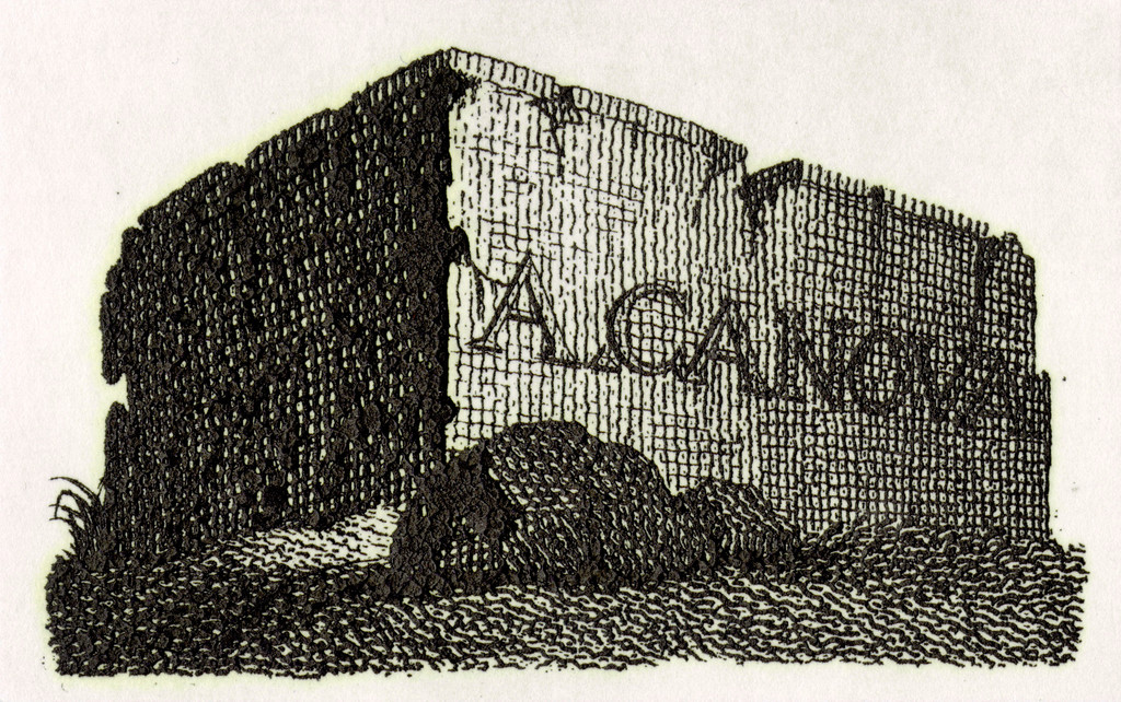
But what does the block of marble engraved on that card – apparently about to explode, its surface carefully bush-hammered, adorned with an understated upper molding – actually represent ? The cracks the artist has outlined prevent the viewer from ascertaining if the tomb has been excavated : if it has not, we are perhaps dealing with the base of a statue of Canova himself, or one of his works – Hercules and Lichas, Polyhymnia, or Sleeping Nymph come to mind ; if it has, we might be dealing with the tomb itself serving as the base of the statue of the deceased, such as he had sculpted for the papal tombs of Clement XIII and Clement XIV, which he worked on concurrently in 1783 : two works considered at that time to be revolutionary because of the unheimlich emptiness they produce in their very core. However, absent statue – destroyed ? lost ? – or solitary tomb of the artist, this block of marble implicitly projects its protagonist into an elsewhere that turns his present into an already faraway past, transmuted by the alchemy of time toward a new Antiquity. The holder of this visiting card infused with the black light that Victor Hugo is said to have seen on his deathbed, was himself neither living nor dead ; he was floating in a kind of purgatory that could signify eternal oblivion or everlasting glory. In both cases, the tomb is empty.
Eternity is also the motor behind another card linked to Canova, giving access to the numerous happy few who were lucky enough to be invited to the Rome funeral of the celeberrimo scultore. Canova died in Venice on October 13, 1822 ; his funeral was held three days later – the time necessary for a resurrection – in St. Mark’s Basilica, but the Romans took more than three months to put together the spectacular stagecraft that for one day, on January 31, 1823, transformed The Church of the Twelve Holy Apostles into an ephemeral museum to the glory of Rome’s adopted son. This card bears the heraldic badge of the San Luca Academy – with its slogan “AEQUA POTESTAS” taken from a line of Horace, alongside the symbols of the artist’s multi-faceted talents : chisel, brush and compass – yet it is articulated around an ouroboros, the image of a serpent devouring its own tail, symbol of eternal return.
In truth, if Canova was able to ensure the immortality of his name and work, it is thanks in part to the pragmatism and efficiency with which in 1815 he negotiated the return of works plundered by Napoleonic troops, an achievement pursued in concert with one of his few close friends, Antoine-Chrysostome Quatremère de Quincy – and which led Pius VII to ennoble him with the enviable title of Marquis of Ischia. However, it was at Possagno, his native village, lying in the shadow of the Monte Tomba, that the artist built the two towers that would forever guarantee posthumous fame : the high blind facade of the cast gallery, which looks like a burial site, and whose layout presents close architectural affinities with one of the most famous and most modern antiquities museums of its time, the Vatican’s Museo Chiaramonti, created by Canova for Pius VII in 1807 ; the Tempio Canoviano, monumental Neoclassical church based on Rome’s Pantheon for the volumes, and the Athens Parthenon for its architectural order, the cornerstone of which he set on July 11, 1819. It was a structure for which he was at once the architect, sponsor, and rightful addressee – with due reverence to the Holy Trinity, to which it is officially dedicated. His mortal remains are there now, along with those of his half-brother, in an urn worthy of his immoderation, inspired by the one he had himself designed for Horatio Nelson ; as for his heart, it is still in the pyramid tomb he had planned for Titian, in the Santa Maria Gloriosa dei Frari, in Venice. Built by his students on the profoundly singular model (for the first time in history, figures deliberately turned their backs on the spectator) of the one he had devised for the archduchess Maria Christina, Duchess of Teschen (who died in 1798) in the Augustinian Church of the Hofburg Palace in Vienna.
— His epitaph ?
— HIC CANOVA.

Antonio and Sergej Androsov, Mario Guderzo, Giuseppe Pavanello Canova
Canova, Milan, Skira, 2003

Paolo Misciattelli Mocenigo Soranzo
L’Arte di presentarsi: Il biglietto da visita a Roma nel Settecento, Roma, Palombi Editori, 1985

Giuseppe Pavanello (ed.)
Il Carteggio Canova-Quatremère de Quincy, 1785–1822, Ponzano, Vianello, 2005

Jean Starobinski
1789: Les Emblèmes de la raison, Paris, Gallimard, 1973

Gino Severini — In any case, these days, painters no longer know anything of the real laws of fine art, or are only aware of vague general rules ; I don’t mean “dead formulas” that are taught at the School of Fine Arts, whose shortcomings are demonstrated by the results.
The brightest artists, however, are beginning to realize that it is not possible to create anything solid out of vagaries, fantasy or good taste, and in fact, that nothing good is possible without an education.
We are beginning to understand the urgent need to remake education ; obviously, not to paper over the cracks of old-fashioned teaching like at the School of Fine Arts, but an Edifice, a completely new Monument, built from the ground up, one that is driven by the eternal laws of construction, that are the foundations of art in every age, which in no way prevents different eras from differentiating themselves.

Gino Severini
“1921: Introduction et historique: Du cubisme au classicisme”, Écrits sur l’Art, Paris, Diagonales, 1987
(Passage quoted in extenso, our translation)

Dakota Devos — One of the most esteemed German sculptors of his time, Johann Gottfried Schadow’s brilliance lay in his ability to reconcile the order, rationality, solemnity and patriotism of Neoclassicism with the seemingly antithetical impulses of the Baroque and Romantic styles, the respective popularity of which swelled at the beginning and end of his career.
Schadow’s early training introduced him to a mélange of influences, which he eagerly adopted and mastered. Born in 1764, the son of a tailor, Schadow began his artistic education at the age of fifteen as an indentured apprentice in the Royal Sculpture Workshop. His natural gifts quickly drew the attention of the head of the workshop, the Flemish Neoclassical sculptor Jean-Pierre-Antoine Tassaert. The master sculptor nurtured Schadow’s precocious talents, adding to his workshop duties courses at the Berlin Art Academy, as well as daily drawing lessons with Tassaert’s wife, the Parisian miniaturist Marie-Edmée Moreau, who worked in the style of Rococo painter François Boucher.
Meanwhile, Schadow’s frequent visits to the famed literary salon of Henriette Herz and his engagement there in discussions with Frederician Berlin’s greatest minds in poetry, philosophy and the natural sciences fostered his aesthetic and intellectual engagement with Enlightenment ideals of harmony, reason and proportion.

The erudite and vivacious salonnière was the subject of Schadow’s first commissioned work, a bust completed in 1783, when Schadow was only nineteen years old. The clay bust of Herz encapsulated the varied aesthetic teachings Schadow had absorbed in his early career. Portraying Herz with regular, symmetrical proportions, a steady, fixed gaze, knowing expression and classically inspired tunic and coiffure, Schadow’s style fit squarely amid that of his Neoclassical peers, such as Tassaert, Houdon, Sergel and Thorvaldsen. Yet, slightly parted lips, as though on the verge of speech, imbued the bust with a subtle dynamism and contemporaneity. Likewise, the dramatic play of light and shadow introduced by the sitter’s turned head and weightily draped tunic, and the refined handling of surface by which Schadow precisely invoked locks of hair, voluminous cloth and smooth, supple flesh reveald characteristically Baroque and Romantic tendencies, presaging the stylistic balance that would come to characterize Schadow’s oeuvre.
In 1785 Schadow left Berlin for Rome to elope with Marianne Devidels, whose father supported the pair while Schadow studied works of classical antiquity, attended the academy of Swiss sculptor Alexander Trippel, and developed friendships with some of the great European sculptors of the day, most notably, Antonio Canova. Schadow was deeply influenced by Canova’s insistence that sculptors create ‘modern classics’ by looking to antiquities for inspiration, but designing with originality, independent of a commission or specified installation location.
These Roman years were a period of great maturation for the young sculptor, who received international recognition after winning the prestigious Concorso di Balestra award. When he returned to Berlin at the age of 24, Schadow was already one of the most celebrated sculptors on the Continent, succeeding the recently deceased Tassaert as head of the Royal Sculpture Workshop. In addition to this prestigious occupation, Schadow was appointed by the King of Prussia, Friedrich Wilhelm II, as Court Sculptor, in which capacity he carried out state projects – mostly portraits, memorials and monuments – that cemented his fame and established his aesthetic as the epitome of taste and beauty for the time.

Ex libris (more probably than a visiting card) of Gottfried Schadow (possibly engraved by Eberhard Henne?), c. 1804. Collection and copyright Kunstbibliothek, Staatliche Museen zu Berlin. - © Oracles: Artists’ Calling Cards

Ex libris (more probably than a visiting card) of Gottfried Schadow (possibly engraved by Eberhard Henne?), c. 1804. Collection and copyright Kunstbibliothek, Staatliche Museen zu Berlin.

In the first decade after Schadow’s return to Berlin he produced some of his most important and acclaimed works, which married typically Neoclassical design with a sense of tender emotiveness in his subjects. Two seminal examples where the Tombstone for Count Alexander von der Mark (1788–90) and the Prinzessinengruppe (1795–97), his double portrait of the young sister princesses, Louisa and Frederika. In 1795 Schadow also molded the Quadriga, a horsedrawn chariot commanded by Victory, to top the Brandenburg Gate. An enduring landmark of Berlin and Germany, this triumphal monument to peace was designed in conjunction with fellow Royal Court appointee, architect Carl Gotthard Langhans. The two artists quoted classical examples in their final design – Langhans looking to the Propylaea of the Athenian Acropolis and Schadow to the Roman Triumphal Quadriga decorating the facade of Saint Mark’s Basilica in Venice.
Though Friedrich Wilhem II favored Schadow’s classicizing style, in 1800 the esteemed poet and statesman Johann Wolfgang von Goethe wrote condemningly of the Realism Schadow promoted in the Royal Sculpture Workshop, deeming this style too great a departure from antique examples. Goethe believed sculpture achieved its most noble expression in idealized portraits, so denounced the naturalistic features and contemporary dress of Schadow’s portraits as quotidian and prosaic. Eventually, the two titans of Prussian cultural history met in person in 1816, when the poet modeled for a commissioned medallion. Schadow’s final composition struck a balance between Naturalism and Neoclassicism that even Goethe admired; the unmistakable specificity of Goethe’s features was counterpoised by Schadow’s choice to represent Goethe in profile, recalling an emperor on a Roman coin.
Schadow had an impactful career as a teacher to the next generation of sculptors, becoming in 1815 director of the Royal Academy of Art. His students included Christian Friedrich Tieck and Christian Daniel Rauch as well as his second-born son, Friedrich Wilhelm von Schadow, who became an acclaimed painter of the Romantic era. Schadow was esteemed as well for his writings about the proportions and physiognomy of the peoples of different nations, which circulated widely in an instructive book of drawings. While he is rightfully known best for his sculptural works, he was also a talented draftsman and drawing played a crucial role in his artistic process. Studies and diagrams helped Schadow experiment freely with poses and features before committing to them in a plastic medium. Whereas Schadow’s final sculptures were restrained and highly finished works of art, his drawings frequently betrayed his imagination and sense of humor through the playfulness of both his command of line and treatment of subject matter – as evidenced by the wealth of caricatures he produced.
The floridly looping hand of Schadow’s calling card seems to impart this jauntier side of the artist, perhaps a truer representation of his character than the somber monuments for which he gained fame. The card, printed on white coated paper, unadorned with designs or imagery, bears simply the artist’s name and title – Gottfried Schadow, Director der Königlichen Academie der Künste – in black, slightly raised ink. The handwritten script was an intentional choice that starkly contrasted with the highly designed cards of Schadow’s contemporaries whose customized insignia were a part of their branding (see, for example, his colleague Langhans’ card). Schadow’s voice comes through his distinctive, gestural scrawl with the intimacy of a personally written letter to its recipient. This emotional sensitivity shone through all Schadow’s works, ultimately making him one of the greats of Neoclassicism.

Bernhard Maaz (ed.)
Johann Gottfried Schadow und die Kunst seiner Zeit, Cologne, M. DuMont Schauberg, 1994

Hans Mackowsky
Die Bildwerke Gottfried Schadows, Berlin, Deutscher Verein für Kunstwissenschaft, 1951

Gudrun Schmidt
Schadow in Rom: Zeichnungen von Johann Gottfried Schadow aus den Jahren 1785 bis 1787, Berlin, Stiftung Archiv Akademie der Künste, 2003

Elisabeth Jobin — In 1811, having just completed his apprenticeship as an engraver, nineteen-year-old Johann Adam Klein (1792–1875) moved from his native Nuremberg to Vienna. This was the outset of a young adulthood spent for the most part crisscrossing Europe from his native Bavaria to the Austro-Hungarian Empire, from Switzerland to Italy. The horse adorning his visiting card thus prefigures his many travels – and his Romantic penchant for roaming and rambling across country. A close look at his long career even suggests that Klein drew his creative force from movement, and he did not run out of stream until he settled in Munich for good in 1839.
Vienna was the crucible of the early 19th-century bourgeois Biedermeier style. Surrounded by a group of artists close to the emperor’s family, Klein produced mostly etchings and watercolors for a nascent middle class born of the Industrial Revolution. Very much a man of his time, Klein’s works reflect the ideals of comfort and prosperity of a bourgeoisie intent on asserting its status through the acquisition of artworks calibrated to its conservative values.

Printed in 1814, his business card, the principal tool for the distribution of his artworks, likewise catered to these bourgeois ideals. Klein had already made a name for himself, while earning his stripes back in Nuremberg, through his masterful paintings of animals, especially horses. Throughout his career these motifs were to enliven his idyllic Germanic landscapes with a view to satisfying the nationalistic appetites of well-heeled clients. Klein strategically set his sights on building a reputation as a painter close to nature, hence the trotting horse on his card – a small-scale anatomical feat that speaks volumes about his gift for close observation.
The animal is carrying on its back all the tools a Romantic painter would require for a day’s work en plein air, including not only an easel, but also the artist’s mahlstick amongst the paintbrushes in the thumbhole of his palette. So the artist’s paraphernalia presages – albeit without divulging – the landscape he would render over the course of each outing. The three horizontal lines beneath the horse’s feet provide hints of geographic space – and invite the card’s recipient to set forth as well : to the artist’s studio to see the finished fruits of his nature excursions.
Although the props pictured on the card are the painter’s attributes, Klein opted to present himself as an engraver on the portfolio tied to the easel : J. A. Klein, Kupferstecher. Wohnt in der Josephstadt. Längen Gaße 66 (J. A. Klein, Copperplate engraver. Lives in Josephstadt. Längen Gasse 66). There are two ways to interpret this surprising discrepancy between the stated technique (etching) and the one depicted (painting). Besides the obvious advantage of engravings over paintings in terms of reproducibility, Klein, who would occasionally put down his stylus to pick up an oil or watercolor brush instead, might have wanted to point out his technical versatility. But he might also have meant to give a demonstration of the exceptional quality of his engravings, capable of evoking the colors of a palette without actually using any.
Two years later, including a year travelling across the Rhineland, Klein returned to Vienna. He promptly produced a new calling card featuring the same tools – replete with palette and easel – but with a little dog this time around. Like the horse on the 1814 card, the animal is staring the prospective patron rather familiarly straight in the eye, as if to encourage us to solicit the artist’s services. In 1816, on the other hand, Klein no longer presented himself as an engraver, but as a painter. This change was probably to invite commissions from a wealthier clientele, as well as to signal Klein’s artistic development. The novice engraver had now, after his first years in the imperial capital, become an experienced painter.
The two cards are alike, however, in the resolutely figurative nature of their composition. Typical exemplars of an artist’s visiting card in the Biedermeier era, their mission goes beyond mere utilitarian information : they aim to showcase the artist’s technical and compositional acumen. Ostensibly serving to supplement the text, each card’s persuasive ornamental argument ends up prevailing over, even wholly absorbing, its purely informative function : the Klein’s profession and address are incorporated into the composition, inscribed, like a signboard, on the portfolio carried on the horse’s back. This primacy of picture over text was to be reversed at the end of the Biedermeier period, which saw a drastic return to sobriety on visiting cards. Text and image were then divorced, as more and more attention came to be focused on typography. The advent of modern art at the end of the century would eventually do away with pictures on artists’ visiting cards once and for all.

Christelle Rochette — When Greuze arrived in Paris towards 1750, the practice of art was undergoing a profound change. Since the beginning of the 18th century, the tastes of art lovers and collectors had been the main influence on the development of styles. Dutch and Flemish painting was in fashion. The most eminent of the history painters were tending to set aside the great religious and dramatic subjects to devote themselves to more pleasant, entertaining themes, suitable to adorn the walls of newly planned, intimate interiors: the courtly scenes of Antoine Watteau or the pastorals of François Boucher are a fine illustration of the pronounced taste of the times for a prominently decorative painting, reflecting a well-to-do society with libertine tastes. But one of the most characteristic aspects of this period is to be found in an inclination for feelings, sensibility (some would say sentimentality) depicted as true virtue.

Haughty and unyielding in character, Greuze showed himself to be quite insensitive to the manners required by Parisian society and at the court. From his very arrival in the capital he drew attention to his boorishness by refusing to paint the portrait of the Dauphine of France, arguing that he did not like “faces that are painted already”. Being interested by nothing but his art, he distinguished himself from his contemporaries by his austere ways. However, in his review of the Salon of 1763, Diderot paints a flattering portrait of him : “He has spirit and sensitivity. He is enthusiastic about his art ; he makes endless studies. […] He is ceaselessly observing […]. Once he thinks of a subject he is obsessed by it, it follows him everywhere.”
But, possessed of his talent, Greuze refused to bend to the rules of academic teaching. The Academy’s refusal to admit him as a history painter can largely be put down to the personality of the artist. For an artist who sought the “grade” of history painter had to treat a subject dictated by the Academy ; they were weary of the painter’s vanity and his propensity to think himself above the laws they had themselves instituted since 1648.
Admission was granted in two stages. The artist (painter, sculptor, engraver) first had to be approved by presenting one or more significant examples of his work. After a favorable vote by the jury, the newly approved academician had to work on his reception piece (painting, sculpture etc.) based on a subject imposed by the academic jury. Once received as academicians, the artists could exhibit at the Salon, a favored place to make your name among enthusiasts and collectors.
At the Salons of 1763 and 1765, Greuze showed principally portraits. However his style was evolving. He turned more and more towards historical subjects, wishing to be acknowledged as a history painter.
Finally, in 1769, some fourteen years after his approval, Greuze presented his reception piece to the Academy : The Emperor Septimius Severus and Caracalla, a painting depicting the Roman emperor reproaching his son Caracalla for wanting to have him killed during the parades in Scotland (Musée du Louvre, Paris). It is clear that the painter has studied Antiquity to arrive at the depiction of this episode in Roman history, little known elsewhere. The scene is taken from Roman History by Dion Cassius. Greuze has also sought inspiration in L’Antiquité expliquée (Antiquity Explained) by Don Bernard de Montfaucon for his representation of the furniture and costumes. This painting finally reflects the influence of the artist’s journey to Italy (1755–1757), both in the types of figures inspired by busts and antique statues, and in the overall composition which is steeped in the lessons of Nicolas Poussin, a painter unanimously admired in France since the 17 th century, many of whose works Greuze had encountered in Rome. The relationship both in the frieze-like disposition of figures and in the taste for architectural details between Septimus Severus and Poussin’s Death of Germanicus (1628), a painting which Greuze would have been able to admire at the Barberini Palace, went strangely unrecognized by the contemporary public. Thinking to dazzle the jury with a work belonging to history painting, the highest ranked genre in the academic hierarchy, he suffered a humiliation from which he would never recover, by being in fact accepted, but only as a genre painter. Presented at the Salon of 1769, the painting was very harshly criticized : “Neither composition, nor drawing, nor expression, nor brushwork” (Beaucousin). Diderot’s opinion is also damning : “the painting is worthless” (Denis Diderot, “Correspondance IX: Au président de Brosses,” Correspondance générale, 1755)
To complete the irony, the picture entitled Child Playing with a Dog (London, private coll.), illustrating the kind of charming theme which Greuze had made his hallmark for a wide public, was unanimously acclaimed. It seemed that the artist must forever confine himself to the style which had made him famous, genre painting. Cut to the quick, Greuze broke his links with the official world of the Academy. From now on, he refused to exhibit at the Salon and made his own exhibition space at his studio. Sure of his talent and strengthened by his popularity, the artist even went so far as to present his works at the same time as the Salon of the Academy was taking place, setting himself up in competition. The conclusion which could be drawn from the failure of Septimus Severus is that Greuze, twenty years ahead of his time, was presenting a Neoclassical painting in the style which would create David’s fortune.

Christelle Rochette
Jean-Baptiste Greuze (1825–1905) et les collections du Musée Greuze de Tournus, Tournus, Hôtel-Dieu/Musée Greuze, 2000
(Passages quoted in extenso)