My teaching gives me both joy and sorrow.
That’s another thing, know the rules because then you can ignore, bend and break the rules.
My teaching gives me both joy and sorrow.
That’s another thing, know the rules because then you can ignore, bend and break the rules.
Aurélie jacquet — On November 27, 1960, the one-off daily newspaper Dimanche, le journal d’un seul jour, ran a most unusual headline: “Un homme dans l’espace!” (A man in space!)
And indeed the front-page picture shows a man hurling himself into the void, apparently flying away. That was only five months before Yuri Gagarin was to become the first man in space on the Vostok 1 mission. But on that day, November 27, the spaceman was Yves Klein. For that single instant he was suspended forever in space, the invisible realm to which he devoted his life. He died a year and a half after this performance.
His gallerist, Iris Clert, said Klein did not know how to paint but wanted to be an artist all the same. He aspired to revolutionize art, which, as he saw it, went beyond form, even beyond physical materiality. Art was life.

Klein said he had “fought against his vocation” as an artist by leaving for Japan in 1952 to pursue his dream of studying Japanese and judo. And yet he discovered this martial art purely by chance whilst practicing French boxing at a police officers’ club in Nice, his hometown. During his boxing lessons, some other men at the back of the gym were practicing jujutsu, at first, and later judo. He immediately took to judo, in which he found a perfect balance between mind and body, or between his Rosicrucian (Christian Hermeticist) aspirations and his own relationship to space. He returned to France a year later with a 4th Dan black belt, a very high ranking, especially for such a young man, and began writing the first volume of a diptych on the theory of judo, which Grasset ventured to publish in 1954. In Les Fondements du Judo (The Foundations of Judo), Klein used frames from the 16 mm films he had shot in Japan to illustrate the movements involved in each kata. Kano¯ Jigoro¯ , founder of judo said : “In the katas (forms) is found the spirit of judo, without which it is impossible to perceive the goal.”
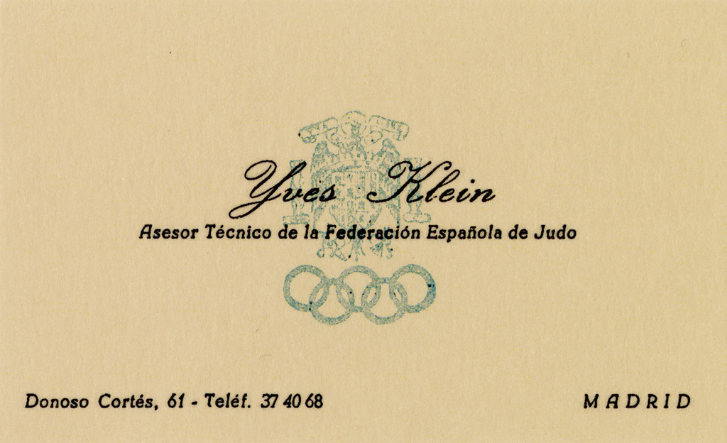
In those days Klein was one of the only French judokas to have been trained at the Kodokan in Tokyo. Because his approach was far less violent and far more spiritual than the prevailing practice of judo in Europe at the time, it was deemed non-compliant in France, so he moved to Spain to teach there. He started up a judo club in Madrid and vigorously promoted it, printing his first business card as a judo instructor. He saw judo as a means of accessing the harmony of his own body and even taught “sensibility as a mode of acquisition”, having his pupils fight blindfolded or with their ears plugged, for example. He maintained that it was essential to feel one’s body and that of one’s opponent by calling on instinct rather than thought. His friend and fellow artist Jean Tinguely, however, said Klein was “incapable of keeping his calm”. Fascinated by motion, he could repeat the same movement over and over again to the point of exhaustion, though it was never a reproduction, but a uniquely created form each time. Similarly, he would try to melt into a crowd when he was abroad by imitating the gestures of people around him ; in a certain sense, he wanted to disappear.
Throughout his life, Klein seems to have been obsessed with the same questions, whether in his way of life, his Rosicrucian thought or his capacity as a judoka and artist.
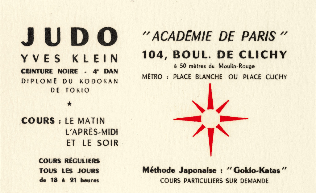
So it stood to reason that the judoka should hang his own paintings in his dojos, particularly in the club he started up at 104 boulevard de Clichy. Klein began painting while still teaching judo at the American Students and Artists Center, among other establishments, to support himself. He was not interested in form, but in achieving an effective motion of the roller in his monochrome paintings, which he associated with a form of meditation. Pure color was the “sensual expression of the spirituality of the human soul”, red corresponding to life, gold to the absolute and blue to the spiritual realm. He wanted the viewer of a painting to be in a sufficiently receptive state to enter “into possession of his inner life” in “this void symbolized by spiritual fulfillment”. By arranging his paintings in the dojo, Klein gave shape to a spiritual relationship, symbolizing the culmination of mental development his pupils were to attain through the practice of judo.
Concurrently, he set out to conquer the art scene as swiftly as he had achieved his judoka level. There was a very close connection between judo and art, and he did not hesitate to show his films about judo at the Monday salon held by his mother, abstract painter Marie Raymond, where he met a number of artists, including Raymond Hains and Jacques de la Villeglé.
Klein was obsessed with the idea of experiencing an endless instant. This was already in evidence when he cut up his 16 mm films to illustrate his first book and when he set out to trace a judo match by making visible the imprints left by the judokas’ bodies on the tatami, at once reminiscent of the “permanent shadows” left by the bodies vaporized in the atomic blast in Hiroshima and clearly prefiguring Klein’s Anthropométries (Anthropometry). Watching supersonic airplanes fly over Madrid in 1951, he elaborated his theory that time would soon be vanquished, which would enable man to access an endless present, and a multitude of movements in a single movement that is suspended forever.
Known for excelling in aerial motion, Klein undertook his Saut dans le vide as a form of “dynamic levitation”, an “optimum utilization of energy”. His assistant, Jean Vareilles, witnessed his leap into the void on October 16, 1960 : “Yves says to me one day : ‘Listen, you’ve got to come with some friends, I’m going to leap from the third floor and you’ll pick me up.’ Oh those artists ! I didn’t quite see what he was getting at. […] So on a Sunday morning several of us came with a tarp, we laid a mattress underneath and Yves took a first leap to see if he didn’t hit the ground, then ten times in a row doing the bird kata. Spread eagle. It was extraordinary.” The bird is the most aesthetic kata, the one that precisely represents the concept of the void on which judo is based, like a “promise of fulfillment”. He had trained for this leap in his dojo at Fontenay-aux-Roses, right across from where he then accomplished his entry into the void. Naturally, the picture published on the front page of his faux Dimanche newspaper is a photomontage of three separate shots. The first shot shows about a dozen judokas holding a tarpaulin to catch Klein’s body.
In performing this leap, Klein was as much a judoka as he was an artist. His two lives fused for an instant, immortalized by photographers Harry Shunk and János Kender, in which his two careers reached their apogee. Art historian Nicolas Charlet writes that he then “gave his black belt and his Kodokan badge to his assistant, Jean Vareilles, and handed his kimono to his youngest pupil, Gérard Zlotykamien (age twenty), a meaningful gesture comparable to a warrior laying down his weapons”.
“I know kung fu” says Neo, before sparring with Morpheus on the mat. “Do you believe that my being stronger or faster has anything to do with my muscles in this place ?” asks Morpheus. “What are you waiting for, you’re faster than this. Don’t think you are, know you are.” Let us recall the “bullet time” trick Lana and Lilly Wachowski used in their 1999 film The Matrix, placing cameras in a full circle around the actors to create the illusion of multiple movements occurring in frozen time. As the story unfolds, Neo breaks free from the dream world, the illusion generated by the Matrix to prevent us from seeing the real world. Revealed as “the One” by the Oracle, he can break all the rules by manipulating perceived reality in order to lead the insurrection of mankind against the machine.
Similarly, Yves Klein may have achieved his goal of transcending time, the fourth dimension, by leaping into the void. Through this act, at any rate, he pioneered the gesture of “the One” for many artists who subsequently ventured into the field of performance art. Ultimately, he also anticipated the current age marked by a quest to explore space and the immaterial world.
Nicolas Charlet
Les Écrits d’Yves Klein, Paris, Transédition, 2005
François Cheng
Vide et plein: Le Langage pictural chinois, Paris, Éditions du Seuil, 1991
Iris Clert
Iris-Time: L’Artventure, Paris, Éditions Denoël, 1978
Yves Klein
The Foundations of Judo, London,
The Everyday Press, 2009
Yves Klein — Pure, existential space was regularly winking at me, and this sensation of total freedom attracted me so powerfully that I painted some monochrome surfaces just to “see”, to “see” with my own eyes what existential sensibility granted me: absolute freedom! But each time I could neither imagine nor think of the possibility of considering this as a painting, a picture, until the day when I said: Why not ?
Jacques Caumont, Jennifer Gough-Cooper (eds.)
Yves Klein, 1928–1962, Selected Writings, London, Tate Gallery Publications, 1974
(Passage quoted in extenso, our translation)
Werner David Feist — The job of teaching typographic design and looking after us graphic design students went to Schmidtchen [Joost Schmidt], who met with us regularly and very informally. In his serious yet relaxed manner Schmidtchen made us consider and create basic letterforms, as well as study their origins and development. This eventually led to our own attempts at constructing entire sans-serif alphabets. Both Herbert Bayer and Josef Albers had designed geometrically derived alphabets, none of them esthetically or optically convincing enough to be chosen for casting by any of the important type foundries. The philosophy behind these endeavors was a call for geometrically consistent, clean, rational and legible typefaces. Though this uncompromising thinking was not wholly successful, it threw out a challenge to the international graphic design industry which would produce great results over the following twenty years. In fairly quick succession, a number of type studios in various countries created font designs – Kabel, Standards, Folio, Univers and Helvetica – that satisfied contemporary demand for a sober, clean and legible image that was representative of an industrialized, unsentimental, technologically sophisticated society.

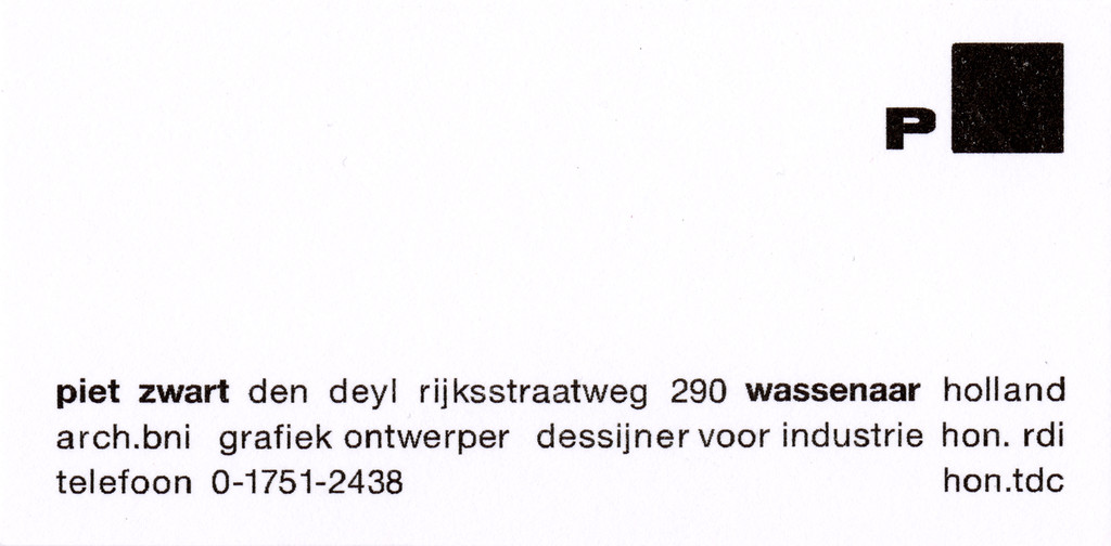
I cannot withhold my personal feeling that the reservations the Bauhaus (and even many of today’s graphic designers) had towards serif typefaces, most of which originated in the 17th and 18th centuries, resulted from a disregard for or ignorance of reading optics and the mistaken idea that serifs, and even some curls, are cumbersome, out-dated decorations and uncalled-for flourishes. This idea was decisively contradicted by the extensive research undertaken by British type designer Stanley Morison when he created the Times New Roman typeface for The Times newspaper in London in 1930. The trouble was that none of the Bauhaus typographers were active as professional type designers. Despite this, Bauhaus typography has had a decisive influence. The freedom with which we approached the printed page – angled type, asymmetry, the use of elements such as large dots and heavy lines, the bold use of space – made our work an exhilarating, liberating exercise. From time to time a cheerful and stimulating Dutchman – Piet Zwart – would come for a week or so to show us his latest work and we always felt excited about his bold, freewheeling font designs.
Piet Zwart, Collars, b/w photograph, 1930. Copyright Stichting Beeldrecht, Amstelveen.
He had great fun mixing letter sizes and different fonts and showing no respect whatsoever for several hundred years’ worth of tradition. Two or three times during the years 1928–1929, Karel Teige, a different personality with a different message, visited from Prague. While Piet Zwart was lanky, tall and funny, Teige was short, intense and serious. An innovative designer of books and a thoughtful conductor of seminars, we became very close to Teige and I liked his gentle, soft-spoken ways. During my long stay in Prague, which began only two years later, I met him again on several occasions. What I still remember quite vividly are his typographic interpretations of poetry, because he succeeded in investing letters with meaning and an emphasis beyond their mere representation of sound.
Werner David Feist
My Years at the Bauhaus, Berlin, Bauhaus-Archiv, 2012
(Passage quoted in extenso)
Oskar Schlemmer — My teaching gives me both joy and sorrow. This latter because the students react so little to things that really should interest them, partly out of incompetence, partly out of the laziness for which this place is notorious.
Oskar Schlemmer
“Diary End of May, 1928”, The Letters and Diaries of Oskar Schlemmer, Middletown, CT, Wesleyan University Press, 1972
(Passage quoted in extenso)
Angela Lampe — In 1925 the Bauhaus moved from placid Weimar to the modern industrial city of Dessau, where it underwent several reforms. The workshops morphed into so-called “laboratories” for research and development of new products modeled on industry. The Bauhaus was subsequently recognized as an institution of higher education by the regional government of Saxony-Anhalt and officially titled a “Hochschule für Gestaltung”, a “school of design” authorized to issue academic degrees. The faculty were no longer called Masters, but bore the official title of Professor – a promotion that naturally required printing corresponding business cards. In the wake of this overhaul in Dessau, Paul Klee and Wassily Kandinsky, with whom he now shared a duplex house, were allowed to offer free painting classes in addition to their theory courses. Their students had to explain their artistic intentions and the methods with which they believed they had carried out those intentions. In this subjective approach, the two painters went against the Bauhaus’s Constructivist bent, spearheaded by László Moholy-Nagy ever since 1923, when he took the place of esoteric Swiss painter Johannes Itten teaching the preliminary course. The Hungarian artist’s Malerei, Fotografie, Film, a seminal treatise on problems in modern visual design, was published in the Bauhaus book series in 1928. So the old-fashioned painters faced mounting hostility. Ise Gropius noted in her diary (entirely in Bauhaus-style lower case): “The age of the painters at the bauhaus really seems over, they’re out of touch with the actual core of the current work and are having an almost inhibiting rather than nurturing effect.” (Ise Gropius, “Tagebuch 3.2.1927”.) In 1928, when her husband, Walter Gropius, handed the helm over to Swiss architect Hannes Meyer, the ideological gulf only widened at the Bauhaus. Volksbedarf statt Luxusbedarf (The needs of the people, not the need for luxury) became the watchword. To the politically-minded architect, meeting basic human needs clearly took precedence over artistic considerations. Meyer even made fun of the “clover field of young Bauhaus artists bred by quaint painterly individualists.” (ibid.)


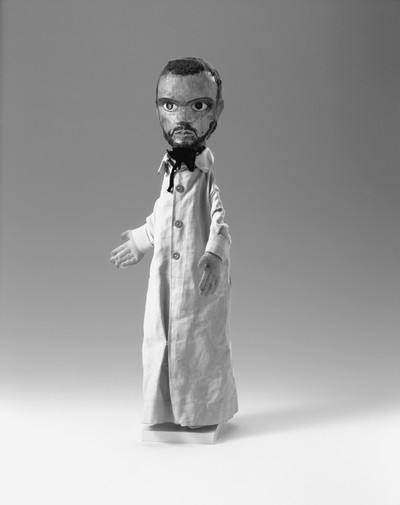
Hand puppet of Paul Klee made by Marianne Ahlfeld-Heymann when she was a student at Bauhaus, Weimar, 1925. Photograph and copyright Bauhaus-Archiv, Berlin.
Klee reacted to the institution’s unrelenting rationalization and technologization in his own way : with subtle irony. He published an article in the Bauhaus journal entitled “Exakte Versuche in Bereich der Kunst” (“Exact Experiments in the Realm of Art”), in which he wrote : “we construct and construct and yet intuition is still a good thing. one can do considerable things without it, but not everything. one can go on for a long time doing several and various things, but not everything. […] we ought to give assignments like : construct a secret. sancta ratio chaotica ! scholastic, and laughable ! and yet that would be the assignment if construction were deemed all-encompassing.
But rest assured, construction is not all-encompassing. Our virtue lies in this : by cultivating exactitude we have laid the foundations for a specific science of aesthetics, including the unknown quantity X. a virtue of necessity. ‘The school lives, long live the school !’”
As so often, Klee, whose work and teaching was marked by a search for equilibrium, tried to mediate between the polarities and keep the opposing sides in a state of perpetual suspension. The figure of the tightrope walker came to symbolize his constant balancing act during the Bauhaus years. But it was above all his well-known masterpiece Grenzen des Verstandes (The Bounds of the Intellect, 1927, Munich Pinakothek der Moderne) – and not merely its title – that marked out Klee’s critical position : the pair of eyes embedded in a filigree stereometric construction in the bottom half of the painting looks like an optical apparatus overwhelmed by all the simultaneous stimuli. The only way to insight, to the light, symbolized by a red orb in the top third of the picture, is for the mind to climb spindly ladders. To Professor Paul Klee, the modern technical outlook remained an inadequate tool without intuition.
Christine Hopfengart, Michael Baumgartner
Paul Klee: Leben und Werk, Ostfildern, Hatje Cantz Verlag, 2012
Christian Geelhaar (ed.)
Paul Klee Schriften: Rezensionen und Aufsätze, Cologne, DuMont Buchverlag, 1976
Pierre Leguillon — From 1987 until 2013, CalArts, the private art school in Los Angeles, counted among its teaching staff one of the most unconventional educators in the field of contemporary graphic design. Now retired, one need only visit his website – with its graphics entirely handmade from post-it notes, collages and press cuttings – to realize that Fella turns all typographic logic underlying desktop publishing software on its head.
If vernacular is one of the words – along with entropy perhaps – that is heard most frequently from all self-respecting art students these days, it is fair to say that in Ed Fella’s practice, it resonates in quite a unique way. Equipped with a Polaroid SX-70 camera, Fella has walked up and down the streets of Los Angeles collecting all kinds of typographic fragments : signs, posters, handwritten announcements, road signs and parking signs, graffiti and stencils etc. It would be wrong to say that there is no selection process or framing involved in what Fella takes, far from it. But what is true is that, beyond any judgment of taste, his camera does not discriminate between what appears in front of the lens, as long as it is a letter or a sign. As he explains to Michael Dooley : “I don’t like to use terms like ‘good’, ‘bad’, ‘beautiful’, ‘ugly’, because they continually take on different meanings. The 18th century thought that beauty was in the eye of the beholder, but it’s in the culture of the beholder. Every culture has its own standards of beauty. Design has opened up to accept high culture and low culture, the vernacular, amateur art, outsider art, so-called primitive art and just about everything else you can identify or catalog : it’s all part of the mix.” (“An Interview with Edward Fella”, Emigre, No. 30, 1994).


His square format Polaroids are arranged in groups of 9, creating a grid that one also finds, for example, in several of Sol LeWitt’s books. The images are classified according to what the letters and signs appear on ; the fragments recomposed to form an illegible but feasible set of words. Letters and language are destroyed in favor of a regenerative process.
Ed Fella has had a very unusual career path : “In my case, I’m an anomaly because I didn’t go to graduate school until I was 47 years old, so my early schooling was in high school and then I worked for 30 years, so all that schooling was on-the-job-training with real life and industry experience. When I arrived at graduate school I already had a good idea of what I was doing. I didn’t go to school to become a better graphic designer, I was already at the top of my profession, I went to graduate school to become an educator and to continue experimental design – because experimentally, you can continue forever, right ? You can always be better, but once you’re a working professional, then you’re getting jobs like everybody else is, and occasionally you win an award and sometimes you get some notice, and maybe you fail or the client dumps you, which is only natural when you’re working at a professional level of proficiency. So graduate school became a kick-start to something altogether different. Everything from then on became experimental and that became my signature style, because I didn’t have that during my professional career, but it’s an exception with everybody, some designers do have it from day one.” (Roberto Farruggio, “10 questions with Ed Fella”, website of the photographer, May 2013).
Taking these photographs as a starting point, the photocopied or scanned letters underwent many distortions before being used to create flyers or posters, many of which advertised conferences or events taking place at CalArts, even though many were made after the events had happened already.
Today, Fella is working with some of his earliest drawings and collages, sampling them as a VJ might, like in the small fanzine he created that was published in 2016 by Innen in Geneva : Work And/Or Rework Lot’s of “Re’s”, if not all that much revelation ! A genuinely youthful enterprise, therefore.
His work and his books, widely circulated among students, continue to be a precious source of instruction on how to break all the rules.
“I once did a T-shirt for the CalArts students that said : ‘Don’t do what they say’, so I crossed out the don’t and added a do so it ended up being ‘Do do what they say’, which has a double meaning. ‘Do do what they say’, but maybe some of the things they say are ‘doo-doo’ so you have to make up your mind, right ? You’re still doing what they say, do do what they say, but also question them, it might just be doo-doo. But it’s for the student to decide. But don’t deny them – at least do do what they say, before you decide to question them. So it does have this kind of double meaning. Same goes with the rules : learn the rules, and when you do break them, the exception then becomes broken in an exceptional manner, not in a stupid manner – that’s not really the idea. The idea is to break the rules in an exceptional manner. And also accept that you can’t just break the rule every time because then you’re just making mud pies. There’s still a structure behind everything. That’s another thing, know the rules because then you can ignore, bend and break the rules. But by knowing them, you know the structure that’s underneath everything. Even breaking the rule can become the structure itself.”
Lewis Blackwell (ed.)
Edward Fella: Letters on America, New York, Princeton Architectural Press, 2000
Émilie Lamy (ed.)
Ed Fella: Documents, Marseille, Fotokino, 2011