A store for women and by women, the sisters embraced the opportunity to promote a cohesive lifestyle initiative beyond the usual seamstress designing and selling clothing – and the progressive elements in society were more than willing to invest in such a notion.
Elisabeth Jobin — At the turn of the 20th century, visiting cards disposed of figurative decoration to make way for typography, which would now become the main focus. This paradigm shift also impacted Austria, where the Vienna Secession – emulator of the English Arts & Crafts movement – sought to reintroduce simple design into the fine arts, including the graphic arts. Aspiring to the added value of traditional craftsmanship based on symmetry, the furniture, everyday objects and prints that resulted from this shift were the harbingers of an ideal conception of beauty that was characterized by simplicity. Indeed, the aim was to strip implements of any superfluous ornamentation in order to restore them to their primary utilitarian function, without falling back into a system of industrial-style mass production, which was considered too disembodied.
Following the recent emergence of postcards in Austria, visiting cards were very quickly taken over by this new trend. Many of these used, in an exemplary manner, the Modernist visual language created by the Wiener Werkstätte (Vienna Workshops), which was established in the imperial capital in 1903. Often considered precursors of Jugendstil and Bauhaus, these workshops allocated an entire floor to the graphic arts. Tasked with developing a specific visual language for their enterprise, these craftsmen exploited the aesthetic value of typography for artistic and commercial ends. Their prints therefore distinguished themselves by the symmetrical layout of thick angular type derived from block letters, placed inside a black frame. Featuring the initials WW and adorned with geometric motifs, the cards they produced harnessed the aesthetic potential of the Roman alphabet.


Borrowing its visual style from the prewar Wiener Werkstätte, furniture maker Anton Herrgesell’s visiting card is a direct product of this movement. What’s more, it is probable that Anton’s son, Moritz Herrgesell, designed it – his stylized initials appear in the bottom right-hand corner, enclosed in a circle that integrates harmoniously with the rest of the design. The younger Herrgesell had in fact studied under Josef Hoffmann, one of the founders of the Wiener Werkstätte, before working for his father. He shows himself to be particularly aware of the Vienna Workshops’ visual communication strategies : he took on their avant-garde graphic language in order to be associated with their renown.
At the end of World War I, however, the formal arrangement of artists’ visiting cards in Austria would undergo some important typographic changes. Indeed, the Gothic alphabet, whose use was questioned in the 19th century, would soon make a forceful comeback. The use of Roman characters, also referred to as Antiqua, lost ground in the 1920s when Sütterlinschrift (Sütterlin script) became the only handwriting script taught in schools. Many artists adopted it : more flexible and modern than the traditional Fraktur – or Gothic writing – it was derived from, this lettering was, moreover, specific to German-speaking areas. Its use therefore marks one of the last episodes of the long-standing “Antiqua-Fraktur” dispute that pitted partisans of so-called universal fonts against the defenders of a more Germanic form of writing.
Still, it would be wrong to equate Sütterlin with a general attitude of inward-looking nationalism : on the contrary, its dynamic lines were responsive to the Jugendstil aesthetic that was popular at that time. Visiting cards of the day reflect the enthusiasm artists had for this script, like those created – probably in the 1920s – by the Viennese brothers Leo and Hans Frank. Academy-trained painters, both opted for Sütterlin. While Leo simply adorned the card he drew for his wife, Lene, with her name, Hans’s card states his profession as a painter and includes his studio’s address : Maler Hans Frank, Wien 4, Schelleing. 46. They are both copperplate engravings, a medium perfectly suited to calligraphic ornamentation, that makes the most of Sütterlin’s slender strokes, which are alternately rounded and angular. This lettering lends the cards an intimacy and spontaneity that is lacking in Anton Herrgesell’s card.Hans Frank’s choice of typography does not make him less receptive to the Wiener Werkstätte movement : he even exhibited some of his work in their studios not long before the war. When he made his card, however, Sütterlin was no doubt more appropriate for a visiting card than block letters, which were more often used by craftsmen. Let us not forget that the design of these small identity-related accessories were supposed to point to the profession of those who carried them.
Doris Bauer
Die Möbelwerkstätte Herrgesell unter besonderer Berücksichtigung des künstlerischen Schaffens von Moritz Herrgesell, Diploma thesis, University of Vienna, 2008
Kati Gegenheimer — By the time Schwestern Flöge opened in July of 1904, the undeniable slippage between art and life in Viennese culture had become central to the mission and beliefs of the Vienna Secession (and later the Wiener Werkstätte). In line with the times, the “Flöge Sisters”, Emilie, Pauline and Helene, opened their store with a steadfast investment in the fundamental relationship between life, art and fashion. The salon’s success was amplified by their pointed abandonment of the French way of dressing, loosening and abandoning corsets, through the Dress Reform Movement. Their endeavor to open a fashion salon during an art and culture renaissance in Vienna positioned Schwestern Flöge as the first modern “concept store” of their time. A store for women and by women, the sisters embraced the opportunity to promote a cohesive lifestyle initiative beyond the usual seamstress designing and selling clothing – and the progressive elements in society were more than willing to invest in such a notion. Schwestern Flöge provided an opportunity for women to buy clothing for themselves rather than for men to look at them wearing clothes – a truly feminist concept.


Their branding was genius and straightforward, beginning with their stylish of-the-time business card designed by Emilie Flöge’s partner (and first president of the Vienna Secession), Gustav Klimt. With the salon’s interior designed in the Wiener Werkstätte’s signature black and white (by Werkstätte founders Josef Hoffmann and Koloman Moser), the sisters created a space for a high-style fashion revolution in Vienna. The overall branding of Schwestern Flöge was not so different from what major fashion houses do today to grow brand loyalty and recognizability : the use of fashion photography, collaborations between Emilie and Klimt, as well as the popular dissemination of Schwestern Flöge’s signature designs, including through Klimt’s paintings (and even on Emilie herself). The arts ruled Viennese thought and culture in the early 1900s, and this change in thinking provided the perfect platform for Parisian trends to be transcended by the movements and forward thinkers operating in Vienna at that time, who implemented a new style as a way of life.
Perhaps the best way to think about this business card is to imagine ourselves as time travelers searching for the latest fashions and accessories in Vienna of that time. The Schwestern Flöge card has a metered tempo to it, with repetitious marks that resemble a footpath or a map for a pilgrimage to a divine place of worship. The card’s ornamental quality places frame after frame around the text, as if to emphasize the endless quality and value of the information found on the card. In designing the card, it is as if Klimt could not resist the urge to turn a commercial card made for his muse into a work of art – a central belief in his life and practice was the unity of the visual world.
The serif typeface used for the street address, Mariahilferstrasse 1B, and the emboldened telephone number, 1621 appear very business-like. However, pleasure creeps in to the shop’s logo, which is hand-drawn by Klimt. This change from a more formal typographical design to the hand-drawn also leads me to wonder if part of the card was a kind of “stock image” or template used for business cards, derived from the graphic designs made famous by the Wiener Werkstätte, or if it was truly all Klimt’s design and concept. Perched on four straight black lines in a bold line weight, letters in capitals read :
SCHWESTERN
FLÖGE
WIEN
CASA PICCOLA
FLÖGE
WIEN
CASA PICCOLA
The text is handwritten in varied line weight, and expresses personality through drawing rather than typography, in a similar way to turn of the century Art Nouveau-style lettering that we are familiar with, and even Klimt’s signature on his paintings. Noting that the salon was at Casa Piccola also acknowledges its location at a fertile social gathering space, with its café on the ground floor that was a place to see and be seen in Vienna.
The final detail of note on this squat rectangular business card is the repeated hand-drawn outline, resembling lines of folk art embroidery. It runs continuously around the name on the card, mirroring the attention to well-crafted embellishments in the Schwestern Flöge’s fashion designs as well as Emilie’s personal collection of costume embroidery, which was exhibited in the salon. These lines proclaim and emphasize the importance of the business name while also enclosing it within a design that references textiles beyond the European tradition. This reflexive drawing motion adorning the name reflects the style and philosophy associated with the brand, the location, and the voice you would hear at the other end of the telephone, should you happen to call the number.
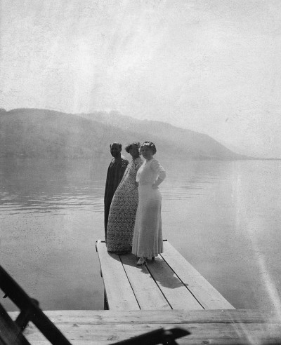
Gustav Klimt, Emilie Flöge (in the center) and her sister Helene on a pier at Lake Attersee, Austria, 1905. Photographer unknown, Imagno archives, Vienna.
The salon remained open until 1938, the year Hitler entered Vienna. Upon arrival, he aimed to erase all evidence of the progressive thinking and aspirations that had grown in Viennese society, including the successful salon. Much of the salon’s custom furniture and fixtures were rendered worthless and left behind, the few artefacts that were saved by Emilie and her staff were later destroyed in a fire. The openness cultivated by the movements in Vienna, and the people that supported them, were ultimately thwarted by larger social ideologies. And so again, another retraction of time, a pulled thread in history that would need sewing again, stitch by stitch.
Wolfgang G. Fischer
Gustav Klimt & Emilie Flöge: An Artist and His Muse, London, Lund Humphries, 1992
Tobias G. Natter, Gerbert Frodl (eds.)
Klimt’s Women, New Haven, CT, Yale University Press, 2000
Radu Stern
Against Fashion: Clothing as Art, 1850–1930, Cambridge, MA,The MIT Press, 2004
Elana Shapira — Emmy Zweybrück’s professional authority as a Viennese designer and art teacher is captured in the two-color visiting card (1929) that graphic artist Rudolf Köhl designed for her: on the first line is her forename “Emmy”, on the second is her surname “Zweybrück”, on the third her married name “Prochaska”, and on the fourth and last line her city “Wien”. It is a minimalist arrangement made up of two colors and two elements: thin dark blue letters and three thin horizontal red lines. The card’s minimalism demonstrates her rejection of superficial prettiness and speaks an international modern language. When Zweybrück used this visiting card in the late 1920s and early 1930s, she was the director of her own design workshops and private applied arts school for girls, a school Köhl (1896–1966) had taught typography and graphic design at since 1927. Renowned British-Austrian art critic Amelia Sarah Levetus remarked at the time, “Zweybrück is an art pedagogue in the highest sense of this term ; she is also an able craftswoman in many crafts” (Amelia Sarah Levetus, “The Zweybrück School of Drawing and Applied Art in Vienna,” The Studio, 1926). But, there is a further educational message in her visiting card, one that also fits Köhl’s own style, showing as it does the mathematical precision of a harmonious composition:
E M M Y
ZWEYBRÜCK
PROCHASKA
W I E N
(four letters)
(nine letters)
(nine letters)
(four letters)
ZWEYBRÜCK
PROCHASKA
W I E N
(four letters)
(nine letters)
(nine letters)
(four letters)
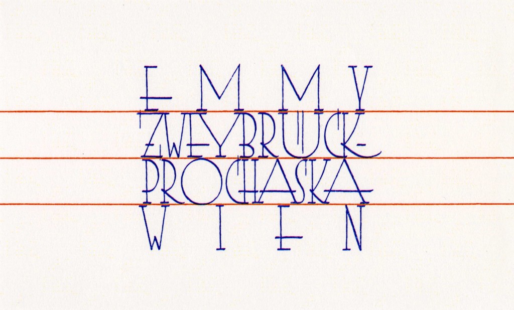

Köhl’s letters are variations on Antiqua lettering, a personal adaptation of a Viennese typographic art. The elegant thin letters with no decorative framing call for comparisons with works by two prominent graphic designers of the 1920s: the first is the elegant red typeface found in Julius Klinger’s book Poster Art in Vienna ; the second is the elegant typeface found in Joseph Binder’s famous poster advertising the Vienna Music and Theater Festival in September and October of 1924. The red lines are possibly reminiscent of the lines in a notebook, which evokes the idea of the creative process of “practicing” to achieve beautiful handwriting within a coherent, symmetrical whole. This also reflects Zweybrück’s teaching aims as documented by Levetus: “The children early arrive at an understanding of form and balance, the use of color and material, and attain to an exactness and neatness of execution.”
Emmy Zweybrück-Prochaska had solid foundations for making a successful career for herself. From 1908 to 1913 she studied at the progressive Vienna School of Arts and Crafts, where her teachers were internationally renowned and well connected in Europe and in the United States, and her uncle Franz Zweybrück was the respected editor-in-chief of the official state newspaper Wiener Zeitung. Yet, these advantages do not lessen the fact that her actual success was due to her talent as a designer who had mastered textile embroidery, designed ceramics, fashion pieces, packaging and children’s toys, and garnered praise for her illustrated children’s books. As noted above, she was a charismatic art educator who knew how to be a role model to her students and encouraged them to find their own creative language. As a smart businesswoman, she won major textile design contracts in Germany (with the SS Bremen liner company) and in England (with J & P Coats, Britain’s largest multinational textile company). She creatively adapted the latest fabric designs as well as local folk and religious imagery.
At the Vienna School of Arts and Crafts, Zweybrück studied under Kolo Moser, one of the founding members of the Wiener Werkstätte, and Franz Cižek, an internationally renowned art educator who encouraged children’s creative freedom. Moser noted in Zweybrück’s final diploma that she had a distinct sense of color and ornament and also praised her decorative skills. Zweybrück began her career just before the start of the World War I and, in 1914, she married Ernst Prochaska. That same year, she established her workshops and opened her school. In contrast to most Viennese private art schools at the end of the 19th and early 20th centuries, Zweybrück-Prochaska not only offered drawing and painting, but also classes in different applied arts including textiles work and wood work. Her private art school for girls was recognized by the government and, at the end of each year, the school’s 150 or so students would exhibit their work. Mature students were given the chance to practice what they had learned in Zweybrück’s workshops.
After her first breakthrough in Hugo Heller’s Vienna Art Salon, Zweybrück showed work in two German exhibitions : at the International Exhibition of the Book Industry and Graphic Arts (Bugra) in Leipzig and the Werkbund Exhibition in Cologne in 1914. She was a member of several design associations : the Association of Austrian Women Artists, the German Association of Craftsmen-Craftswomen, the Austrian Association of Craftswomen and Craftsmen as well as the Viennese Arts and Crafts Association. By 1915, Zweybrück’s school was already receiving high praise and being recommended by the journal Deutsche Kunst und Dekoration. In 1918, the same journal reported on the success of her workshops and spoke of her interior designs for wealthy clients in Vienna, Brno (Czech Republic) and other cities, which could compete with other studios.
At the end of the First World War, came the end of the Austro-Hungarian Empire, and a new democratic Austrian Republic was founded. In November 1918, women received the right to vote in Austria. By the early 1920s women increasingly claimed the right to participate in the public sphere in Vienna. Zweybrück was not the only female designer to achieve national and international fame : ceramicist Vally Wieselthier and architect Liane Zimbler were also successful and highly respected. But these women designers had to prove their professional abilities as well as their stylistic uniqueness in order to maintain their high reputations. Zweybrück was praised for her superb technique and striking imagery by two German journals in particular : Deutsche Kunst und Dekoration (German art and decoration) and later Stickereien und Spitzen (Embroidery and lace).
Very early in her career, Zweybrück developed an international network. In 1930, Zweybrück was recruited by American educator, collector, artist and philanthropist Elma Pratt to teach at the International School of Art (ISA). It is possible that Franz Cižek, who taught Zweybrück at the Vienna School of Arts and Crafts and who had worked with Pratt in Vienna, had recommended Zweybrück to Pratt. The ISA organized a series of year-round workshops in various European cities and rural areas. Zweybrück was one of the most outstanding and dedicated guest artists. She taught in Austria for the ISA, as well as in the United States where she conducted workshops in cities such as New York, Chicago, Louisville, Wilkes-Barre, Minneapolis, Des Moines and Seattle. Zweybrück continued to work and publish in Germany even after the Nazi regime took over in the mid-1930s, leading some to suggest that she adapted Fascist ecclesial iconography into her embroidery (Sandra Heffernan, “Politics and Trade in Design : Emmy Zweybrück-Prochaska’s Influential Textile Designs in Needlework Development Scheme Collections”, Textile, No. 5, 2007).
After emigrating to the United States in 1939, Zweybrück continued to work as a designer and art educator. In the 1940s she worked for the American Crayon Company as director of two studios in New York and Los Angeles, and during the 1950s she edited the company’s journal Everyday Art : News and Comment on the Future of School and Industrial Arts. Zweybrück drew on her own progressive education agenda when referring to the company’s aim to also train its customers, “both professional and amateur, to recognize and create good design, to use the materials it manufactures well and correctly, and to acquire the best techniques for their own creative expression” (Emmy Zweybrück, “The Style of American Crayon”, Print, Vol. X, No. 1, September/October, 1955). In the United States, Zweybrück was part of the Austrian émigré and exile network. In 1946, two émigré architects, Leopold Kleiner and Ernst Schwadron, designed Zweybrück’s apartment in New York. She may also have encouraged the Crayon Company to commission renowned émigré architect, Richard Neutra, to build the company’s Pacific Coast studio.
Köhl’s visiting card for Zweybrück beautifully documents her legacy as a successful woman designer who also directed, with great success, her own design workshops and art school for girls in interwar Vienna.
Nicole Ruth Cardassilaris
Bringing Cultures Together: Elma Pratt, Her International School of Art, and Her Collection of International Folk Art at the Miami University Art Museum, M. A. Thesis, University of Cincinnati, 2008
Friedrich C. Heller
Emmy Zweybrück: Werkstätte und Schule, Vienna, Praesens Verlag, 2017
Paul Klobučar
“Emmy Zweybrück, ihre Werkstätte und ihre Schule”, Deutsche Kunst und Dekoration, Basel, Birkhäuser, 2016 (1918)
Kyrill Charbonnel — Robert Mallet-Stevens was seventeen years old when he entered the École Spéciale d’Architecture on boulevard Raspail in Paris in 1903. As a child, he had been surrounded by art and artists: his father, Maurice André Mallet, was an expert in painting and one of the first to recognize Impressionists such as Sisley, Pissarro, Monet, Degas and Manet ; and his mother, Juliette Stevens, was the daughter of the great Belgian art collector Arthur Stevens.

More importantly, however, between 1905 and 1910 the Viennese architect Josef Hoffmann built a house for his uncle Adolphe Stoclet in Brussels – the Stoclet Palace. It is therefore likely that the young Mallet-Stevens met Hoffmann, by then a friend of the Stoclet family, whom he often visited during the building work and on subsequent visits. Josef Hoffmann had been a student of Otto Wagner – member of the Vienna Secession – and had just founded the Wiener Werkstätte, a collection of workshops that brought artists, craftsmen and architects together (along the lines of the Arts and Crafts movement in Great Britain that so influenced Hoffmann’s designs). Robert was very impressed by Hoffmann’s work and meeting him no doubt allowed the young student to develop his vocabulary as an architect, as much in terms of his creative expression as the elements of his compositions. It is probable that, in 1910, he spent six months working in Hoffmann’s studio in Vienna, which could explain the use of perspective views that make his drawing style so recognizable, as seen in his famous series Une cité moderne (A Modern City), published in 1922. The Stoclet family connections undoubtedly also helped the young Mallet-Stevens disseminate his ideas early on in his career. His contemporaries and, in some cases rivals, such as Le Corbusier and Auguste Perret, criticized him for serving a bourgeois and elitist clientele for whom he built villas, mansions and even a castle : the property of the famous patrons of the arts, the Vicomte and the Vicomtesse de Noailles, built between 1923 and 1928 on the hills of Hyères, on the French Riviera, features prominently in Man Ray’s 1929 film Les Mystères du Château du Dé (The Mysteries of the Chateau of Dice).
Jacqueline Salmon, La chambre des fleurs décorée par van Doesburg, from the series Villa Noailles, Mallet-Stevens, Hyères, b/w photograph, 1996. Collection Centre Pompidou, Musée national d’Art moderne, Paris. Courtesy of the artist, Paris.
The use of ornament at the beginning of the 20th century became one of Modernity’s main points of contention. Its use, synonymous with an attachment to the past, did not correspond to the ideals of the Modern Movement ; Adolf Loos called it a “crime”. The Stoclet’s Palace most obvious feature is the emphasis placed on geometry and its plain, uncluttered exterior ; it is characterized by the subtle use of decoration, which highlights the building’s lines and contributes to the creation of a unified whole.
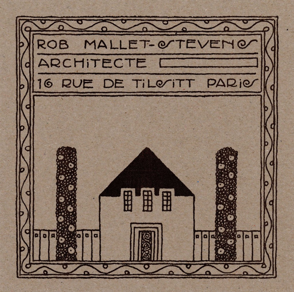
Mallet-Stevens’s calling card, which resembles an architectural cartouche, draws on all his earliest influences. The architect chose to illustrate his profession by drawing a house with an enclosed garden. The absence of any of Mallet-Stevens’s personal archives – which were destroyed after his death at his request – makes the dating of many of his works difficult. One of the clues used for dating documents is the author’s signature, which changes over time. This calling card includes the word “architect” followed by a small rectangle. The only other place one finds this detail is in the signature of his project Dessins d’un théâtre (Drawings of a theater) from 1911. Furthermore, the sinusoidal motif that borders the card also only appears in this theatre project, on the awnings and the windows that sit atop the three doors of the building.
The card mirrors the style of an earlier version that dates from 1910 and gives the same address. Mallet-Stevens lived in the 8th arrondissement of Paris, in rue de Tilsitt – that curves round the Champs-Élysées roundabout –, an area already mainly inhabited by the bourgeoisie and the city’s financiers.
On this second version of the card, the lower part of the garden fence recedes into the background and the lines are finer. But Mallet-Stevens has faithfully reproduced the house : a simple square opened up by a rectangular entrance, the door decorated with a spiral pattern – a foretaste of the designs he would produce in future collaborations with the skilled metalworker Jean Prouvé. The three windows on the upper level appear to break free from the house’s triangular roof. As with the Stoclet Palace, one guesses the presence of a stairway by the vertical opening located on the building’s facade. In many projects, this vertical shaft is the backbone around which are arranged a succession of horizontal planes, outlining roofs, windows, terraces, bedrooms, living rooms and lounges etc. This ascending line allows the architect to distribute circulation routes within the space and to establish a viewpoint, like from a watchtower.
Curious and familiar with the cultural developments of his time, Mallet-Stevens undoubtedly knew the work of German architect Peter Behrens. The building that appears on the card was probably borrowed from one of his designs. The first version of this card, dating from 1910, broadly copies the building Behrens created in Oldenburg in 1905 for the Nordwestdeutsche Kunstausstellung (Northwest German Art Exhibition). By then, Behrens was already a big name in the small world of art journals that proliferated at that time, having first found success with the rise of Art Nouveau. Walter Gropius, Mies van der Rohe and Le Corbusier all worked in his studio.
For Behrens, Hoffmann, Le Corbusier, Mallet-Stevens and many other modern architects, simplified geometric shapes would replace ornament – still so prevalent at that time. In Une Cité Moderne, this geometrization is featured through the consistent use of black lines on white backgrounds and perspective effects. Nonetheless, Mallet-Stevens never completely ruled out the use of ornament, and Le Corbusier reproached him for this – excluding him from the first Congrès International d’Architecture Moderne (CIAM) in 1928 –, as did Theo van Doesburg, who disapproved of his “photogenic” approach to architecture. At a conference in 1925, Mallet-Stevens declared : “Modern architecture has substituted decorative detail for the overall design. Buildings are enormous sculptures, the light striking their large, clearly defined surfaces ; they are colossal structures carved from a huge mass.” Their volumes are made up of simple shapes that are stacked together, highlighting some of their functions.
Mallet-Stevens was, above all, trying to defend the Modern Movement. He fought against the most conservative advocates of an academic Neoclassical architectural style that considered imitation a prerequisite for any form of creation. Like many of his contemporaries in the field of the arts and technology, he sought to free himself from the weight of history, from the culture of accumulation and eclecticism of the 19th century. However, critics and his peers often chastised him for maintaining a particular relationship to the idea of borrowing. They pointed to obvious similarities to the work of the Dutch De Stijl group, founded by van Doesburg – it was he who introduced the Dutch architect to the Parisian scene (Claude Mignot, “De Stijl et l’architecture en France”, Revue de l’Art, Vol. 72, No. 1, 1986). “The architecture that we refer to as ‘modern’ is of our time, it corresponds to our lives and tries to match up to our ideals,” said Mallet-Stevens. Architects had to respond to the changes in society : “The home of tomorrow will be practical, livable, healthy and light, because that is its real purpose. If [architects] resolve these issues, they will create an order of beauty that is not, in and of itself, inferior to any other. Such meaningful systems lead to the disappearance of all applied decoration. The hand itself will be the decorative motif, through structures and shapes that fill the air […] What we build will be simple and clean ; buildings will be made to suit their intended purpose, and no longer subject to pastiche. This new architecture will re-establish the reign of reason : it has no other motive.”
The desire to merge different arts and technologies was another one of the Modern Movement’s main aims. An example of this is Mallet-Stevens’s contribution to the art of cinema and the work he did on around 10 films between 1919 and 1929. He used film as an instrument of communication that he considered to be superior to any building or exhibition : “To the deepest countryside and to the most far-off lands, he brought new formats and new techniques, the art of today.” Posterity mainly recalls L’Inhumaine (The Inhuman Woman) by Marcel L’Herbier, a film that Mallet-Stevens contributed a great deal to. This film can be seen as a synthesis of modern artistic trends, similar in spirit to the approach the Bauhaus took in designing the Experimental House. Working alongside Fernand Léger, among others, Mallet-Stevens designed the laboratory that the film’s main protagonist uses to resuscitate the object of his love, poisoned by one of his rivals. He also designed the villa that the main female character lives in : the villa’s geometric exterior envelopes the small world that this roaring twenties generation reside in, a generation that sought to reinvent life after the disaster of World War I. It is the age of the automobile, of speed, of dancing, of Montparnasse, the Foxtrot and the Charleston. Paradoxically, this severe, plain, clean architecture that, according to Mallet-Stevens, must “re-establish the reign of reason” showcases a society in search of excitement, excess and joy – the complete opposite of the values that Le Corbusier was trying to promote in the journal L’Esprit nouveau (founded in 1920), in which he advocated the idea of the nuclear family in helping structure the home, as well as of course firmly rejecting any notion of ornamentation.
Yve-Alain Bois, Bruno Reichlin, Nancy J. Troy
De Stijl et l’architecture en France, Brussels, Mardaga, 1985
Olivier Cinqualbre (ed.)
Robert Mallet-Stevens: l’œuvre complète, Paris, Éditions du Centre Pompidou, 2005
Jean-Pierre Lyonnet (ed.)
Robert Mallet-Stevens, architecte, Paris, 15 square de Vergennes, 2005
Eduard F. Sekler
L’œuvre architecturale de Josef Hoffmann: monographie et catalogue des œuvres, Brussels, P. Mardaga, 1986
Alan Windsor
Peter Behrens: Architecte et designer, Brussels, Mardaga, 1984
Jeanne Quéheillard — Cells in a state of constant agitation, humoral fluids, perpetual movement – these are the sorts of mental images elicited by Nathalie Du Pasquier’s decorative surfaces. The business card she designed in 1983 for her mother, Jacqueline du Pasquier, chief curator and director of the Musée des Arts Décoratifs in Bordeaux, was no exception. Jacqueline’s personal information (name, job title, address, phone number) is printed on a band running across the middle of the card between two yellow bands containing floating white “paramecia” with black stripes, purportedly magnified a thousand-fold under a microscope. Aside from this biological metaphor, a reference to Nathalie Du Pasquier’s father’s profession as a biologist, the card attests to the mother and daughter’s collaboration and intersecting careers in contemporary art.
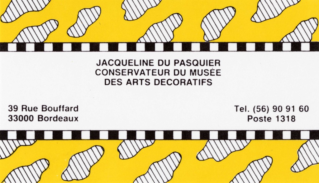

As innocuous as the card may have been in the daughter’s eyes, it was a shock to certain traditionalist standard-bearers of Bordeaux’s Musée des Arts Décoratifs steeped in 18th-century art. Jacqueline du Pasquier had already taken a stance and withstood some hefty confrontations. Having rearranged the interior of the Hôtel de Lalande with a view to imbuing the museum with the atmosphere of an 18th-century Bordeaux townhouse, in 1985 she began holding exhibitions of contemporary design by the likes of the French duo Garouste & Bonetti, the Memphis Group and its cofounder George Sowden, the Italian company Danese and Jean Prouvé.
Through this business card for her mother, Nathalie Du Pasquier introduced a “viral” object in Bordeaux, her home town, concomitantly bearing witness to her own artistic career. When she went to Milan in 1979, British designer George Sowden promptly encouraged her to work on drawing, which she practiced daily as an autodidact, and to find a way to have her drawings printed by the textile mills that were located in and around Milan at the time. For the first Memphis exhibit in 1981, Sowden invited her to design silk-screened fabrics and paper for the decorated surfaces of his objects, and this is how Nathalie Du Pasquier made her way into the Memphis Group. The style of her motifs, influenced by her travels in Africa, India and Australia, is that of a feverish exultation that electrifies each and every object.

Nathalie Du Pasquier, Sketches for Doors, felt-tip pen on paper, 1983. Courtesy of the artist, Milan.
Before 1988 she would occasionally run into the Italian artist Piero Fornasetti fetching his newspaper on via Brera in Milan. Fornasetti had developed his very own methods of printing his drawings on materials like glass, metal, wood and ceramic. He made facetious collages including everything from bicycles, owls, pen nibs, decks of cards, acrobats and harlequins to ruins, obelisks, architecture and even body parts. Fornasetti applied images as patterns or trompe-l’oeils to the surfaces of various everyday objects, such as furniture, plates, scarves and wallpaper. His images are regarded by some people as biographical in nature – and what could be more natural for a business card ! His twenty cyclists on a tandem testify to his love for biking, a pastime he had relished since early childhood and later on with his son, Barnaba, who has kept the Fornasetti brand going to this day. Piero Fornasetti’s picture of the cyclists has since been reproduced (by Cole & Son, London) on a wallpaper frieze with nine bikers, called Multiplette. Incidentally, “multiplette” is also used as the French translation of “omnioculars”, the magic binoculars used to watch quidditch matches in Harry Potter.
This is where the connection between Piero Fornasetti and Nathalie Du Pasquier comes to an end, for they create different relationships between an object and its covering. By applying pictures to various materials, Fornasetti demonstrates a relative independence between the object and its surface. It is the transferal of the images that counts. In Nathalie Du Pasquier, on the other hand, each surface is a skin. “When you change something’s surface, you change the object,” she explains. Herein lies the pleasure of an art that breaks with Modernist dictates to give modern decorative art a decor.
Stuart Bertolotti-Bailey — For a stretch of time in the late 1990s I knew that my most treasured possession was officially worth one Dutch Guilder. A quick online calculation tells me that this would have been equivalent to 0.45 Euros – except the Euro was only an abstract idea and not in physical circulation until 2002 when it replaced the Guilder along with twenty-one other currencies. Today, the phantom value of one Guilder has apparently increased to 0.65 Euros.

The economy of influence is an entirely different matter. In the Autumn of 1997 I had made a modest pilgrimage to Arnhem in the Netherlands to visit the then relatively uncelebrated graphic designer Karel Martens, whose work I had admired since the design historian Robin Kinross had introduced me to it perhaps a year beforehand. Karel’s work was something of a revelation for me : serious and principled yet also somehow free and easy. It continued the formal tendencies of continental Modernism – form following function, unfussy and neutral, a distinct sense of “truth to materials” – but also captured the joy of simply making stuff. Counter to Modernist design’s reputation for being cold and clinical, this was unusually warm work. It was also what Robin once called “answerable”, which is a word that’s also since taken on a talismanic aspect for me. What he means is that the work speaks for itself, straightforwardly and without pretension. It doesn’t require the designer or an advocate to point out what’s smart about it.
Karel and I spent the day rifling and talking through bits and pieces of his work in a disused radio station that he was soon to collaborate on turning into the Werkplaats Typografie, a staunchly independent design school now in its nineteenth year. He had just finished the design of a series of standard phone cards for the Dutch national telecom company PTT, an institution with a long but soon to be wiped-out tradition of working with vanguard designers. A key aspect of Karel’s work is how his free play with printing at home bleeds into his commercial work in the studio. He would – and I expect still does – typically make prints from small bits of plastic and metal (strips of Meccano, washers and hinges) and other found objects, overlapping found shapes and colors to form unusually intense and magnetic compounds of color that he calls “druksels”.
The phone cards are a perfect example of this carrying-over from after-hours hobbyism to the professional day job, or equally from fine to applied art depending on how you want to read the influence. The real point being, of course, is that there is no distinction. The chip side of each card carries the value in denominations of 1, 5, 10, 25, 50, 2.5 and 7.5 Guilders set in bold condensed Futura along with some small print instructions, a couple of logos and a slender red arrow. Flip it over and you’ll find a field of overprinted numbers, their quantity and size proportionate to the card’s initial value so the more expensive ones have more numbers – which makes sense as the user can afford to make more calls. The gridded arrangement and overprinted colors duplicate the form of many of Karel’s druksels, such as the one that wraps around the cover of his 1996 monograph Printed Matter. What’s new is that the free patterning is now tethered to fixed meaning. Moreover, the set of numbers on each card are not randomly chosen but determined by a letter-number code based on the words of the Dutch national anthem.
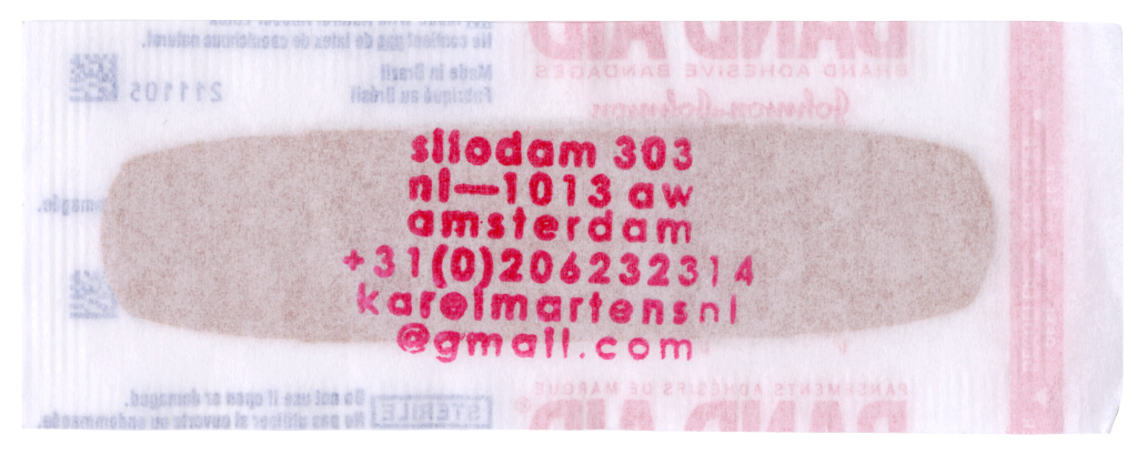
As I was about to leave Arnhem, Karel handed me one of the cards – with a difference. When the series was released he’d bought a stack of the cheapest ones in order to stamp on his address and hand out to friends and acquaintances. This overachieving calling card then doubles as a carrier of the caller’s work, not to mention a minor gift of communication – perhaps worth a five minute chat at local rates back then.
Cut to two decades later. Another cheap, quotidian object turned into another mini-gift by another pink rubberstamp with a new address that again manages to be tongue-in-cheek while actually practical. Karel might not have designed the substrate this time, but it’s a compact summary of his graphic toolbox : the straightforward contrast of that red and blue print, that big and small type, that squared-off translucent paper and rounded opaque plaster, and especially that vertical strip with the holes, are all quintessential Martens. Different time, same sensibility : a wallet-size memento that may well prove useful in an emergency.
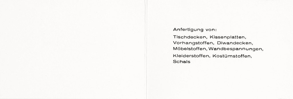
Ying Sze Pek — The white card made with a simple half-fold tells us plainly that Käthe Schmidt (1905–1994), a handweaver located in Bydgoszcz, can be contacted by telephone at “888”. In 1934, the ethnic German (Auslandsdeutsche) Schmidt established her short-lived weaving studio in her hometown, which had recently been ceded to Poland. Following her training in Hamburg, Sylt, Dessau and Berlin, Schmidt returned to the Pomeranian city, which until 1920 was the West Prussian territory of Bromberg. The calling card’s sans-serif font gives a nod to Schmidt’s time at the Bauhaus, the most prominent of the institutions at which she studied, even though it reinstates the capitalization of proper names abandoned by the school’s avant-garde typographers. Schmidt (later Käthe Rose-Schmidt or Katja Rose following her marriage to fellow Bauhäusler Hajo Rose, names retained after their divorce) was a member of the weaving workshop, a section of the design school where women were well represented in terms of faculty appointments and student enrollment. During Schmidt’s time at the Bauhaus, the workshop was headed by the weaver Otti Berger and, succeeding her, the interior designer Lilly Reich. A student at the Bauhaus in Dessau and in Berlin from 1931 to 1933, Schmidt experienced the institution’s tumultuous last years, including its brush with Nazi authorities.

In fact, years later Schmidt would claim that the Bauhaus was not her first choice of school. Already equipped with weaving experience through voluntary apprenticeships, Schmidt sought placement at a tertiary college where she could sit the apprenticeship examination (Gesellenprüfung) required for certification as a weaver. Her preferred institution in Halle would not acknowledge “foreign” Germans rendered stateless by territorial shifts following the war. Having been educated at a grammar school (Gymnasium), Schmidt had no prior art training. At the Bauhaus, she was faced with the mandatory Vorkurs, the renowned preliminary course in which students learnt the properties of colors, materials and forms through experimentation. During her four consecutive semesters at the Bauhaus, Schmidt took courses in drawing by Josef Albers and Wassily Kandinsky, lettering with Joost Schmidt and psychology with Karlfried Graf Dürckheim, among others. Schmidt was certainly acquainted with other developments in modern culture, as her brief enrollment in German Expressionist dancer Mary Wigman’s school in 1931 attests. Nonetheless, the Bauhaus professors or “masters”, whose works were so central to Modernism in the country and Europe, offered her an introduction to modern visual art. During her schooling she encountered paintings by Klee and Kandinsky, and also those by Lyonel Feininger, whose works she loved the most.
The first work that Schmidt produced at Bauhaus was a long piece of fabric skeined with threads of yellow, orange and blue, woven with a motley array of materials including wool, cellophane and beaded yarn. Exhibited at Schmidt’s 1983 retrospective at the Bauhaus-Archiv in Berlin, this experimental work still survives today, alongside a few other fabric samples and designs from her student years. Schmidt commented, “The desire to prove myself artistically was awakened in me [through the Vorkurs]. I wanted to form pictures at the loom, thread by thread, without following a fixed design.” As Schmidt has noted, this wish was not to be fulfilled during her student years. Schmidt was only able to create such works during the decades of weaving and teaching after leaving the Bauhaus.
Architecture was always prioritized at the highest of the “arts” at the Bauhaus, with its most promising students accepted into the corresponding course of study. The distribution of genders across the institution’s workshops overlapped with such hierarchies, and the women of the weaving workshop were determined to show that theirs was not a lesser craft. An inspirational figure for Schmidt would have been Otti Berger, the weaving “master” during her first Bauhaus semester, who produced important theoretical writings relating to her practice. Berger cautioned against thinking of textile design as a kind of ornamentation, a taboo in the Modernist aesthetic : woven fabric, comprised of interlocking warp and woof, was a kind of architectonic structure. The weavers’ textiles thus accorded with the famous Bauhaus design principle that form follows function (Gestaltung durch Struktur). In her other writings, Berger described a uniquely “tactile” knowledge that could, literally, be grasped through contact with differentiated textures and materials.
As Schmidt’s school documents testify, she left the Bauhaus skilled in handweaving and in the design of woven fabrics. She was also able to operate the counterbalance loom and the Jacquard machine, industrial weaving techniques that were introduced at the weaving workshop’s inception. One of the institution’s more commercially successful products, Bauhaus textiles were marketed and sold to the public. In the brief interim, with Europe on the verge of war, this functional aspect to Schmidt’s art served her well. Her handwoven textiles, her calling card suggests, could be used in “the fabrication of : tablecloths, cushion panels, curtain fabrics, divan covers, upholstery fabrics, wall coverings, clothing fabrics, costume fabrics, scarves.” This practical list, printed in austere monochrome, belies the varicolored, multi-textured exuberance of her textiles – objects in which form and function, technique and expression, life and art, are indelibly intertwined.
Magdalena Droste (ed.)
Katja Rose: Weberei am Bauhaus 1931 bis 1933. Bildwebereien 1964 bis 1983, Berlin, Bauhaus-Archiv, 1983
T’ai Smith
Bauhaus Weaving Theory: From Feminine Craft to Mode of Design, Minneapolis, MN, University of Minnesota Press, 2014
Sigrid Wortmann Weltge
Bauhaus Textiles: Women Artists and the Weaving Workshop, London, Thames and Hudson, 1993
Adrien Mouginot — Hector Guimard’s graphic identity first appeared to a wider public on April 4, 1899, in an exhibition at Les Salons du Figaro. The architect exhibited watercolors and colorized photographs of his Castel Béranger, the first Art Nouveau-style residential building to be built in Paris. He took pains to design the poster for the show himself, on which the lettering looms large, delicately drawn and animated by the use of various font weights and contours. Guimard was heavily inspired by the typographic style of Eugène Grasset, who drew his letters with a stylus.
In 1901, this “Guimard identity” (Charles Peignot, “Les Peignot : Georges, Charles”, Communication et langages, Vol. 59, No. 1, 1984) was still present in the cast-iron elements of the entrances to Paris Metro stations. As the lettering of the word “métropolitain” and of the names of the stations was designed not so much for signage as for decorative purposes, Guimard made the most of this opportunity to give his creativity free rein. He took his inspiration from Auriol, a typeface designed by George Auriol in 1903, which he found highly representative of Art Nouveau. It was important to the architect, it should be noted in passing, to use a typeface based on handwritten lettering.
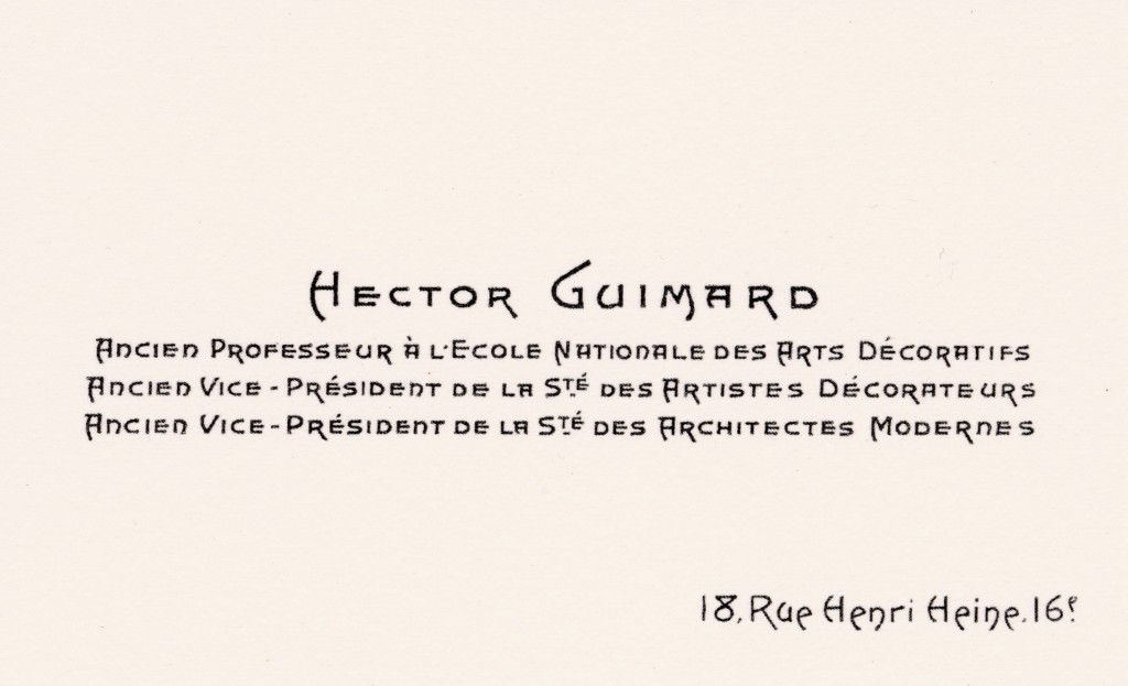
After working on the Paris Metro, Guimard started up his own company called Fontes Artistiques pour Constructions, Articles de Jardin et Sépultures : Style Guimard (Artistic cast-iron elements for constructions, gardens and tombs : Guimard style). For the rest of his career he would continue using the lettering that adorns the front door of Castel Béranger to sign his various and sundry watercolors and technical drawings as well as his buildings. He designed his own name, in other words, in the manner of an artist initialing his works or a modern entrepreneur (prefiguring the advent of corporate identity) ensuring his own visibility on the buildings he puts up.

In 1890, the École Nationale des Arts Décoratifs (ENAD) merged with its women’s section, the École Nationale de Dessin pour les Jeunes Filles, which made it necessary to restructure the curriculum. Guimard, an ENAD alumnus, was tapped by the school’s director, Louvrier de Lajolais, to teach descriptive geometry and perspective alongside his former teacher of architecture, Charles Génuys. Six years later, after an incident still unknown to this day, Génuys asked Guimard to teach some of his classes, too – at a time when Guimard was hard at work on Castel Béranger.
Finding it hard to reconcile the demands of top-notch teaching with his professional pursuits, he handed in his resignation. But the school director refused to accept it. Louvrier de Lajolais overestimated his friend and adamantly insisted he stick to his teaching timetable unchanged. Guimard’s teaching proceeded to take an unexpected turn, alternating between frequent tardiness, assorted antics and his amusing accounts in the classroom of his first forays into professional architecture. The teacher went as far as to question his place in the school in front of his students. His faculty file and his correspondence with Louvrier de Lajolais clearly and unabashedly exhibit his attitude, his versatile, excessive, egocentric character, though always admixed with his surprisingly disarming charm. Guimard’s attention increasingly came to be focused on his professional life : he re-submitted his resignation in 1900 – which was accepted this time around by the ENAD administration without any remorse. It was not until twenty-six years later that Hector Guimard would eventually be honored for his pedagogical efforts, named professor emeritus in 1926 for his teaching at the École Nationale des Arts Décoratifs.
The construction of the building at 18 rue Henri Heine was completed that very year. After the war, Guimard had streamlined his earlier aesthetic to accord greater importance to natural light and sanitary facilities. He had also begun exploring the use of less noble materials. It should be noted that when the Art Deco movement took off, the “Guimard style” began to look old-fashioned and the Hôtel Guimard was no longer deemed worthy to serve as the architect’s flagship and iconic edifice.
The building’s facade is a nod to the Art Nouveau aesthetic. Its general symmetry, with taller windows than in the neighboring buildings and narrow vertical slits above the entrance, pays tribute to the distinctive stylistic features of Victor Horta’s Hôtel Tassel in Brussels.
Guimard retained the use of cast iron for the railings and lightened and enlivened its majestic facade by applying a combination of cut stone and light brick. The top floor under the roof is devoid of any medieval elements. Guimard surprises us yet again with a sumptuously decorated stairway, for which he chose natural lighting, filtered through colorless glass bricks set in the staircase masonry. A very sober balustrade – although cadenced with gentle curves – runs elegantly the whole length of the stairway.
Castel Béranger had already won him the 1898 award for best Paris facade, and the Hôtel Guimard garnered him a second one in 1928. This edifice was the crowning achievement of Guimard’s final creative period, in which he was to adopt a moderate, intelligent Art Deco style, although incorporating telltale traces of his beloved Art Nouveau.
By municipal decree, in 1886 the new street was named rue Henri-Heine after the great 19th-century German poet and satirical essayist Heinrich Heine. In his 20-volume Promenades dans toutes les rues de Paris par arrondissements, Marquis Félix de Rochegude retraces the history of Paris’s streets in the form of a series of strolls through each arrondissement in 1910. The volume on the 16th arrondissement reports there was still only a single house on the rue Henri-Heine at the time, built on the property of one Michel M. Heine. The brothers Michel and Armand Heine (the German poet’s cousins), partners in the Fould Oppenheim bank (est. 1795), liquidated it to set up their own family bank in 1876.
Incidentally, the rue Henri-Heine was the only street in Paris to be rechristened in World War II by the Nazi occupiers, who replaced the Jewish poet’s name with rue Jean-Sébastien-Bach from November 26, 1942, to July 7, 1945. In 1909 Guimard had married the American Jewish painter Adeline Oppenheim (an intriguing coincidence of names, even if she was no relation to the Oppenheims of the Fould Oppenheim bank), and they lived on the rue Henri-Heine before fleeing the war and the imminent Nazi threat in 1938. Guimard died, largely forgotten, in a hotel in Manhattan.
Marie-Laure Crosnier-Leconte, Philippe Thiébaut (eds.)
Guimard, Paris, Musée d’Orsay; Lyon, Musée des Arts décoratifs et des Tissus; Paris, Réunion des Musées Nationaux, 1992
Marquis Félix de Rochegude
Promenades dans toutes les rues de Paris par arrondissements, Paris, Librairie Hachette et Cie, 1910
Georges Vigne
Hector Guimard, Paris, Charles Moreau, 2003
Georges Vigne
Hector Guimard: Le geste magnifique de l’art nouveau, Carnets d’architectes, Paris, Éditions du Patrimoine, 2016